Designer Blog #4
The biggest complaint we got from the previous playtest was a total lack of player feedback, so improving feedback was the main focus of Sprint 4.
For this build, I reduced the damage the enemies deal dramatically, since most of the playtesters in the previous build died early in all the levels. Besides, in this playtest, I was less interested in enemies and difficulty as I was in seeing how the playtesters would interpret the new feedback elements. The difficulty of the game will change as the level designers just got their hands on the special enemy types, and the tutorial has yet to be implemented.
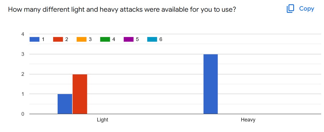
Audio feedback for attacks was added to the game. It became immediately noticeable how bad our lack of feedback had been when upon putting the sounds in for each attack, it became extremely obvious that the attack system was not functioning correctly. It was repeating the same attack over and over again, because the window to trigger the second attack was way too small. We were able to get it fixed in time for the third build. Sound effects made it clear to the development team that there were more than 2 attacks, but the playtesters didn't seem to think so. Most thought they only had one light and one heavy attack.
Few people grab until you tell them you can. Figuring out that you can grab enemies is not intuitive. You have to strike enemies with a heavy attack, and nothing about the colorful spheres or the animations slated to replace them tells the player an enemy is ready to be grabbed unless they already know what the signs mean. This should be a focus for the tutorial, since only 2 playtesters figured out how to grab on their own, and the ability to grab and throw your teammates is the main draw of the game.
Damage numbers were added to show the amount of damage the players' deal in white and the amount they take from enemies in red. This actually kind of worked. Playtesters could tell what the numbers meant (at least the ones used to playing video games). The only problem is, even if they could tell how much damage they were dealing, they still had no idea how much health the enemies had left, so the numerical values were basically meaningless beyond telling the players "this attack is stronger."
I was against putting health bars on the enemies, since the high volume of enemies in this game means that the screen would get cluttered pretty fast if every enemy has a health bar. While the specific numeric value of each enemies' health may be overkill, giving the player some indication of how injured enemies are would make it easier for players to tell which enemies of a group they may be fighting are injured and easier to finish off to reduce the size of the group. I would like a blood effect overlaid on their texture to communicate this without putting 3-5 more health bars on screen.
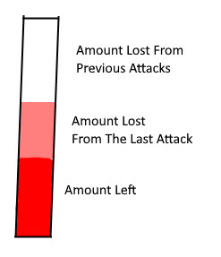
Feedback was added to the player's health and stamina bars to show how much health or stamina they lost in the last instance they lost some of either. The point of this was to communicate every loss of resources to the player. In this build, enemies only deal 1 damage, so the effect was invisible on the health bar, but was still very visible on the stamina bar... or so I thought.
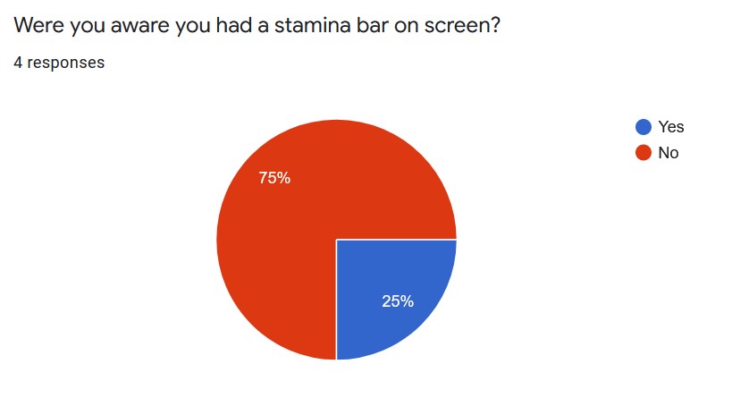
The effect was white in the build, but so was the background behind the stamina bar. I think because of this, no one noticed this subtle effect. Though, only one playtester even noticed there was a stamina bar. Stamina bars in video games usually aren't blue. I probably should've changed it to green before the build. The amount of time the diminishing effect remains on screen is currently a fraction of a second as well, and the player doesn't have any attacks that consume enough stamina for the effect to be more than a small blip of white on the bottom of the screen when most players are looking at their character instead of the HUD.
We should implement the finished HUD elements from our 2D artist as soon as possible, so we can test this feature with the HUD we're currently planning on using in the end product to test without the white-on-white issue. There is currently a bug with the HUD that causes it to scale incorrectly with different resolutions, so the screen players are playing on affects how easy it is to see their HUD. It may also be necessary to move the HUD to the character's position, since that's where the players' are focusing their attention the most. This would require the 2D artist to make a completely new HUD pretty late in development however, so I'd like to explore options to make the current one more serviceable, in addition to testing a prototype of an on-character HUD with playtesters.
Leave a comment
Log in with itch.io to leave a comment.