Design Blog 6 - Into the Woods
Hello again from the Design of Into the Woods!
Probably a little bit late on the party to this one, but I figured that it would be worth documenting a little bit more of the design choices that I made when creating the game that you have before you. Similar to the way that I did the last blog, I want to talk a little bit more about the elements that make the game rather than talking about the progress that was made this sprint. That being said, the topic of this particular blog is going to be the items that you can collect in the game! Stick with me, there is quite a bit that goes into this one.
The Inspiration
I believe that I talked about this a little bit last time, but a lot of this game was inspired by The Binding of Isaac. That being said, when it came to the items that I wanted for this game, I wanted them to be something that would be helpful to the player and enhance their gameplay experience. Thankfully, Isaac has a lot of items that can serve as an inspiration; also not thankfully, Isaac has a lot of items that you can collect. What I ended up doing was looking at the items in Isaac only as a jumping off point and allowed the playthroughs of the game in my head (before it was made and it was all in the Game Design Document) to guide what kinds of things that the player would find useful. With the game that I had designed, I felt that the following kinds of advantages/perks would make the most sense for the player:
- more health
- an extra life
- more potion ingredients
- stronger attack
- some kind of "shield" from damage
- getting into night rooms during the day
- double shot...?
- targeted attacks
With that in mind, I set to work!
The Visual
Once I had figured out what I wanted those items to be, it was up to my imagination to figure out what kinds of things those items would be. Funny enough, there are little jokes in everything that I had designed. Whether it was visually or the actual item, each of them has a story that I am so happy that my 3D modeler, Talia, brought to life!
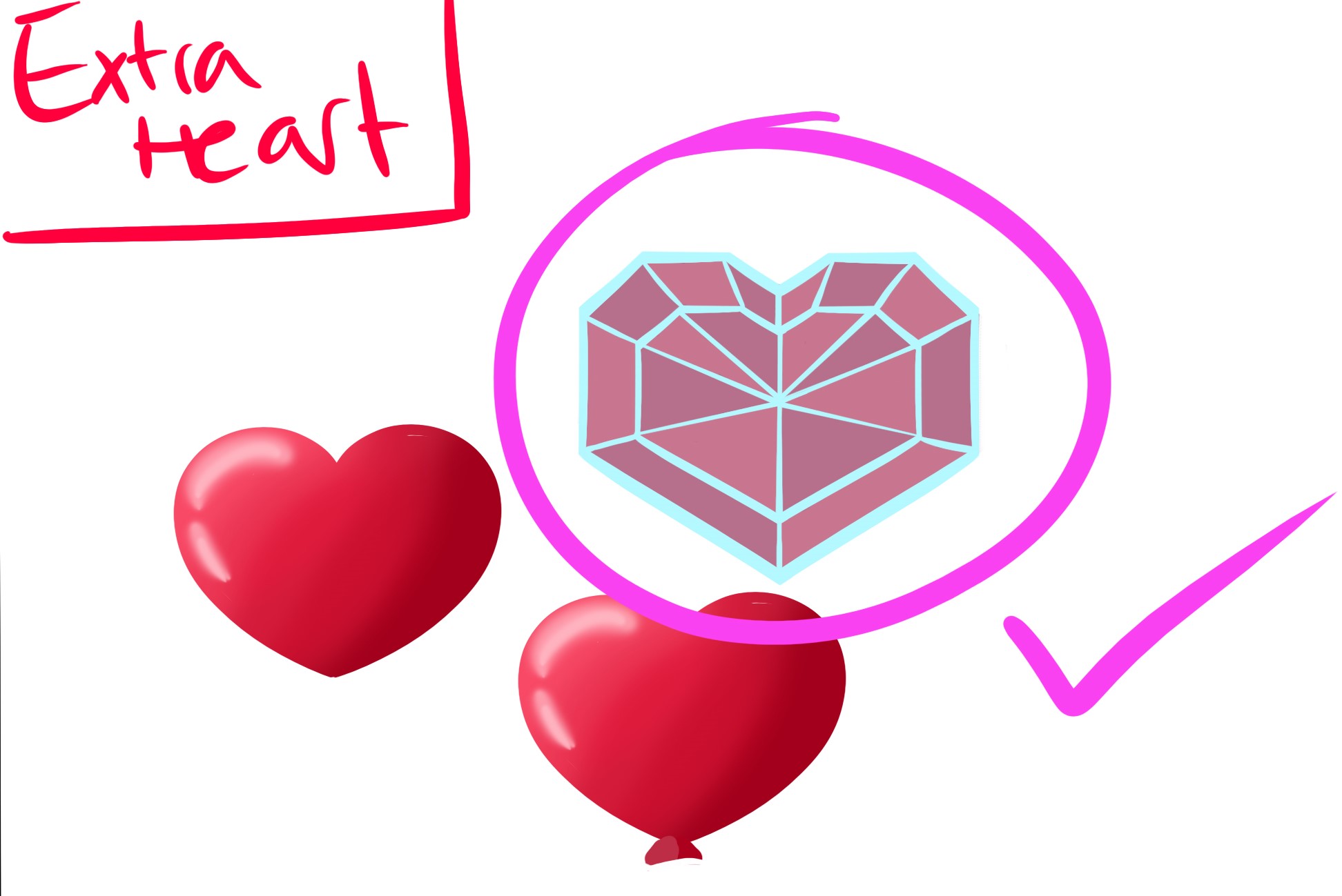
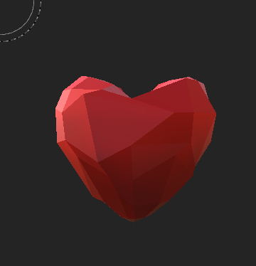
Extra Hearts
These were easy...they were hearts. Talia gave me a couple of iterations of what this item might look like, but going off this idea of "whimsy" that I brought to the game, I wanted it to be something magical. We settled on this idea of a crystal heart that looks amazing both as a concept and as a final model.
Totem
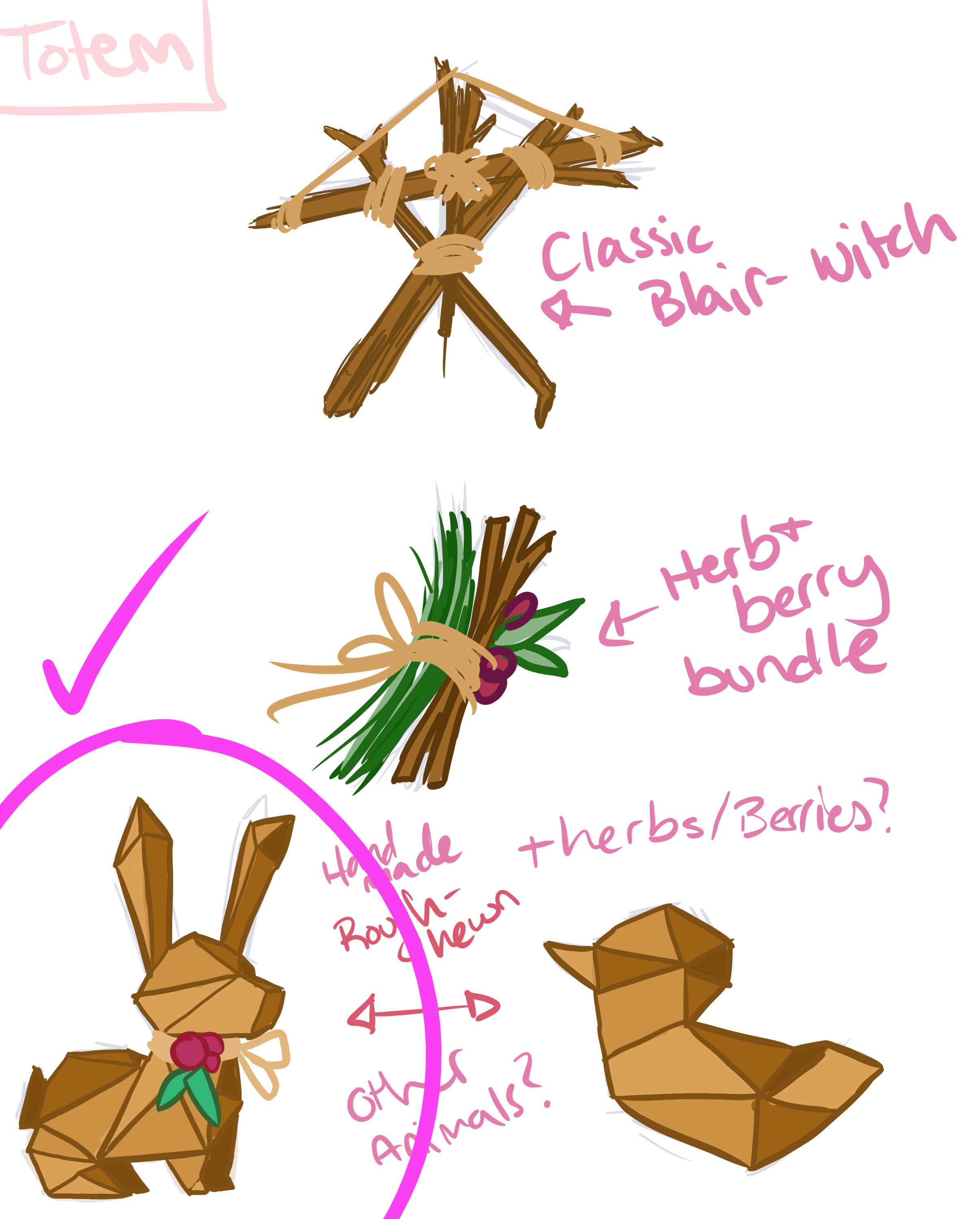
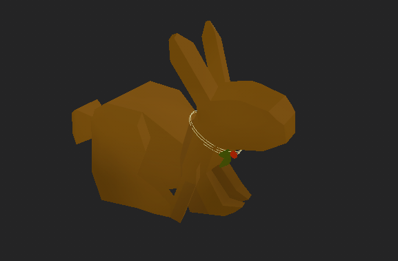
It is definitely not a secret to anyone that I love the game Minecraft. The inspiration for this item actually came from that game and the concept of the "Totem of Undying". Though I didn't want the item to be exactly that, I told Talia where the inspiration came from. When she mocked up a couple of concepts for me, I was blown away, but also knew exactly what I wanted to see in these. She made one that looked like a rabbit and I couldn't turn that down. Anyone else who knows me knows how much rabbits mean to me personally, but also are reflected in my "gamer tag". Additionally, rabbits have always reminded me of my grandfather and that was just its own little Easter Egg that I was happy to put in the game.
Lucky Penny
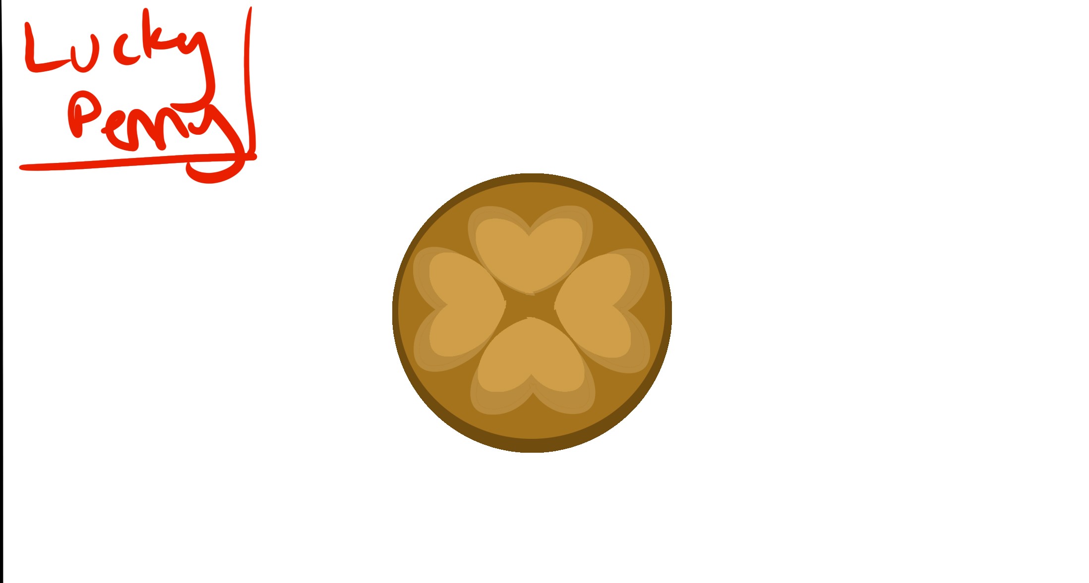
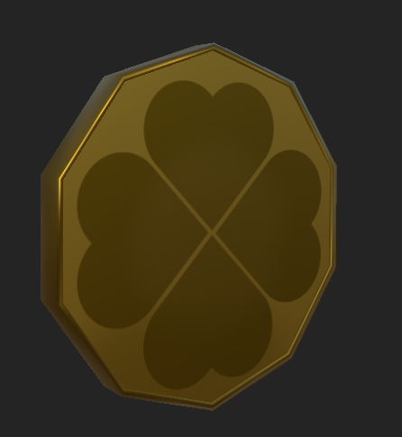
When it came to the lucky penny, I thought what would be luckier than getting two instead of one? Remember that old saying "find a penny, pick it up, and then all day you'll have good luck"? Well, even if you don't, now you know it and that is where the idea of the lucky penny came from. It's the two for one special on potion ingredients! The first design that Talia came up with really hit the nail on the head. It was just supposed to be this little coin and, funny enough, the design she came up with looks like a cookie that I like...so it all just happened and looked perfect.
Attack Candy
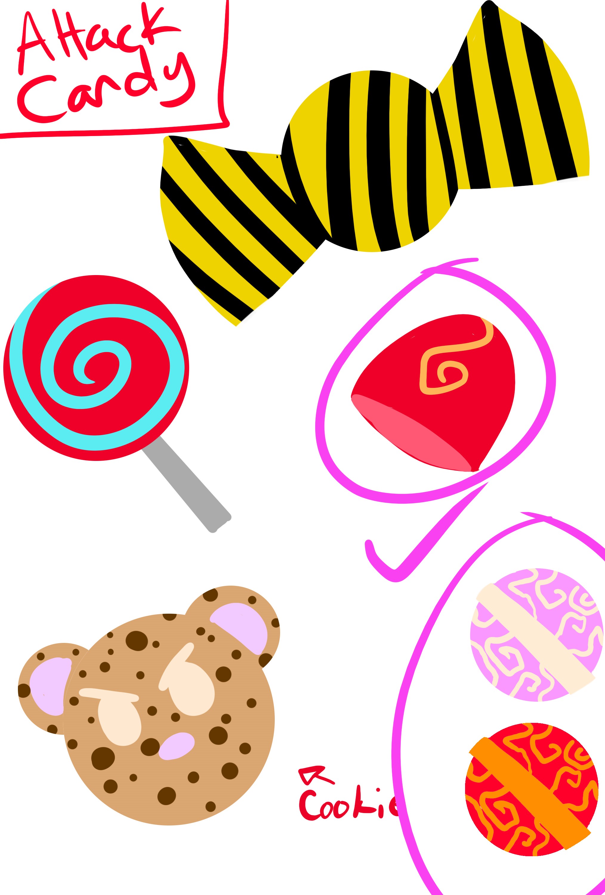
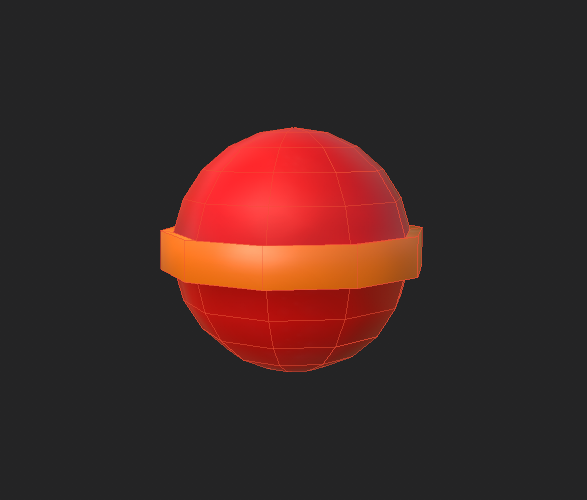
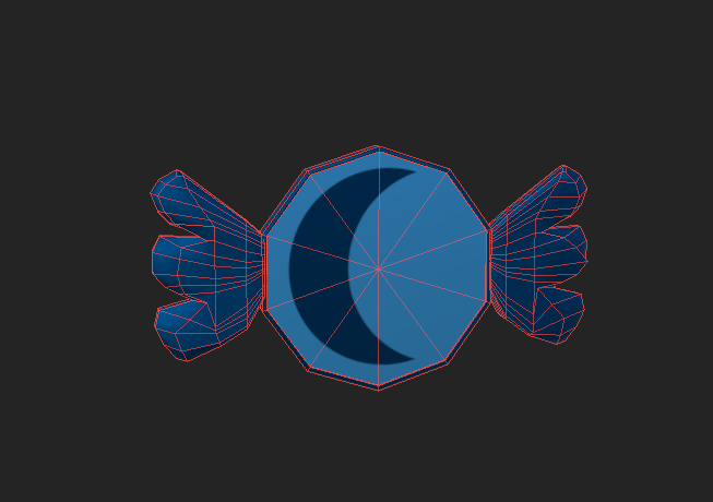
This game required an attack, but it was meant to be a cute game. I couldn't really think of anything that would be cute and also provide a stronger attack until I thought of the movie Princess and the Frog and the scene with Mama Odie when she offers the frogs from candy with special abilities. It sounds silly, but then I thought that candy would be something that was enhancing to the player. Talia came up with some amazing concepts, but I wanted something that was red (because when I think of attack, I think of the color red). She came up with two things I really liked, but we settled on the circular design because we knew that it would be distinct in both shape and color.
Balloon Bouquet
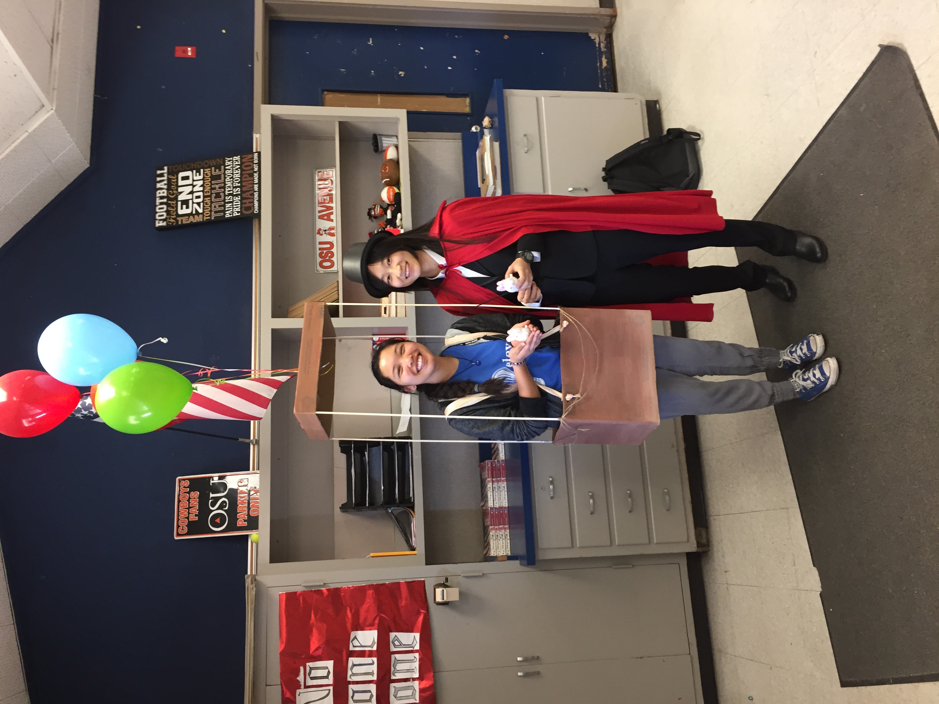
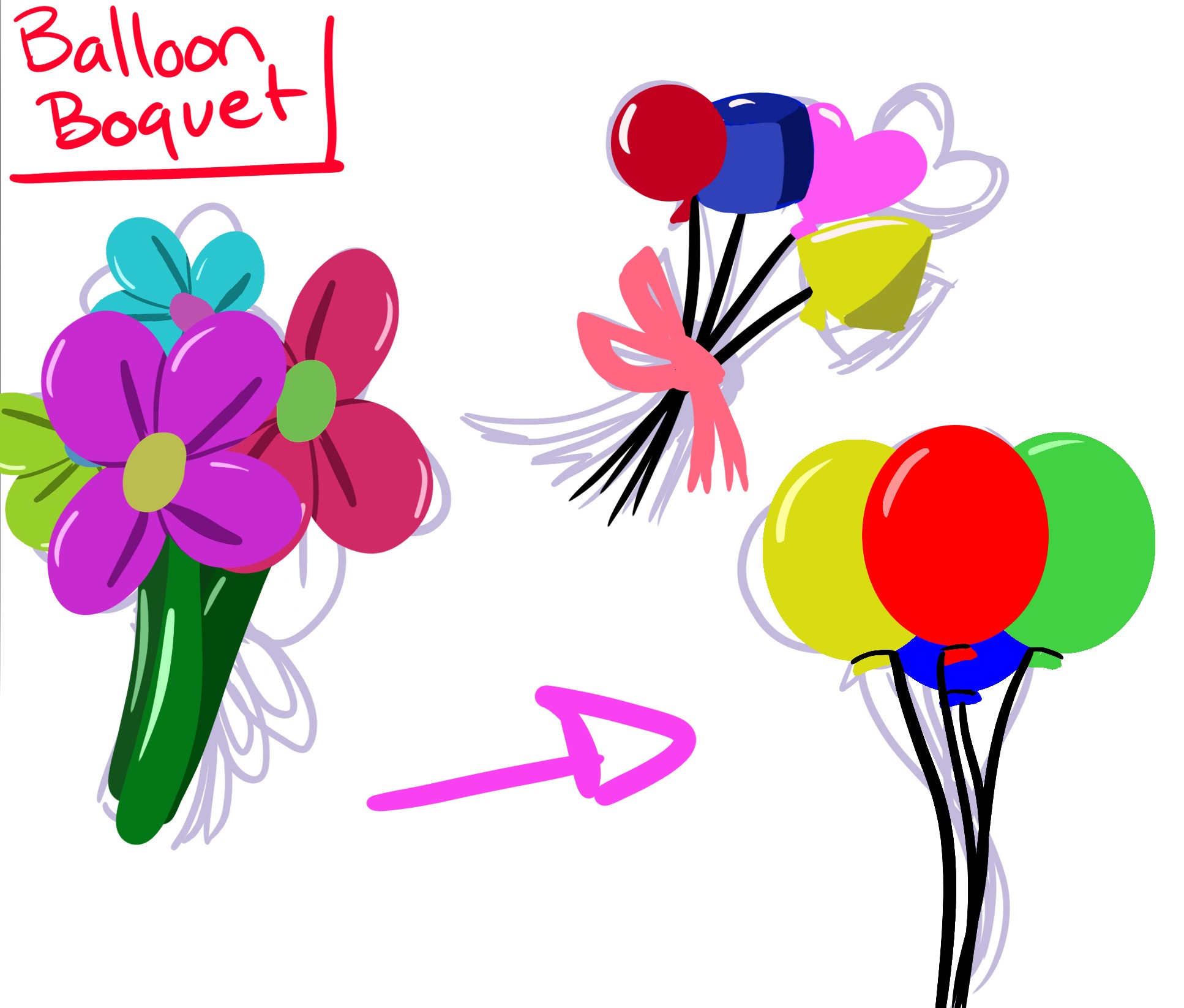
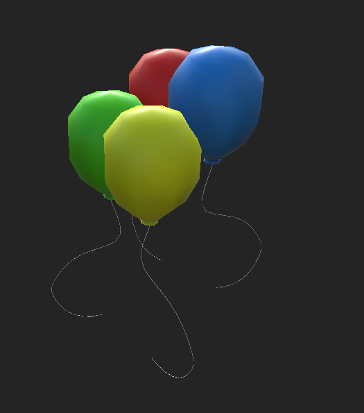
For this item, it was back to the idea of "a shield, but not just a shield, and kind of cute". I immediately thought of the idea of being a kid and having these balloons floating behind you. This was not only something that was charming, but if your balloons were popped, it was a sad time. Thinking about it now, I have a hilarious picture of me with balloons attached to me and that really captured this idea I had in my head of what it might look like in the game. Talia came up with some great concepts, but we went with something simple, because that was all it needed to be!
Night Owl Token
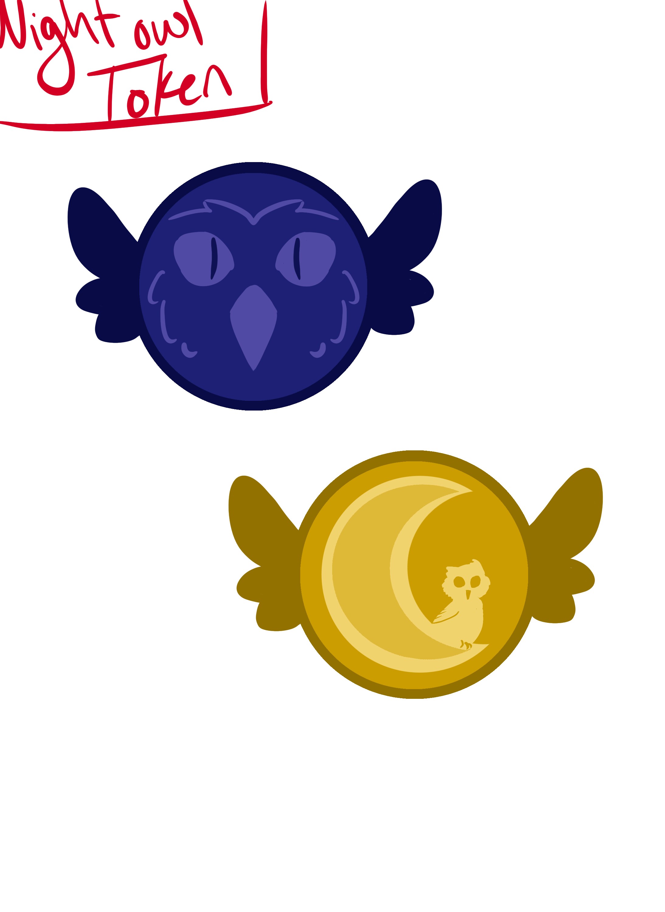
This idea seems pretty obvious, but I thought a lot about when you are up late at night, they call you a night owl. Additionally, if you have read the Percy Jackson and the Olympians or the Heroes of Olympus series, there is a mention of Athena and, more specifically, later, the Mark of Athena which is this coin with an owl on it. This was the idea I had thought of and also had told Talia when we were designing the look of it. Talia's addition of the wings on the coin just gave it everything it needed and really added the whimsical charm that I was looking for.
Two Peas in a Pod
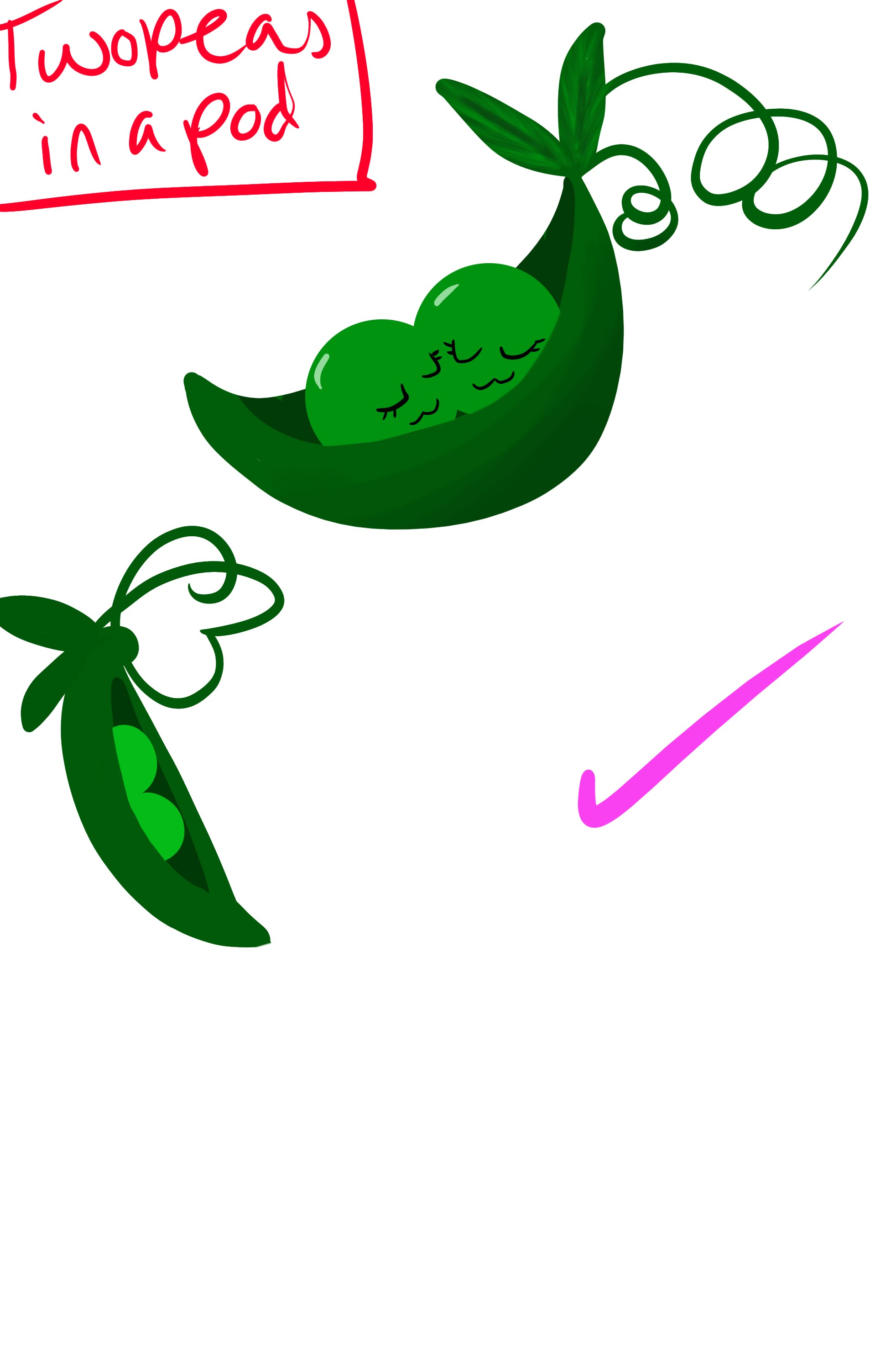
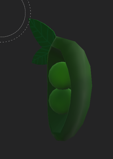
When I thought about a double shot, I have no idea why my brain went to the idea of "oh this spell needs a buddy" and that's where the peas in a pod came from. I loved the little peas in the pod from Toy Story and that's where my brain went to. Had I thought of that when I told Talia to design the look of it, that would have been some excellent reference, but she pulled the design right out of my head! Not to mention, this is literally one of my favorite items in the game.
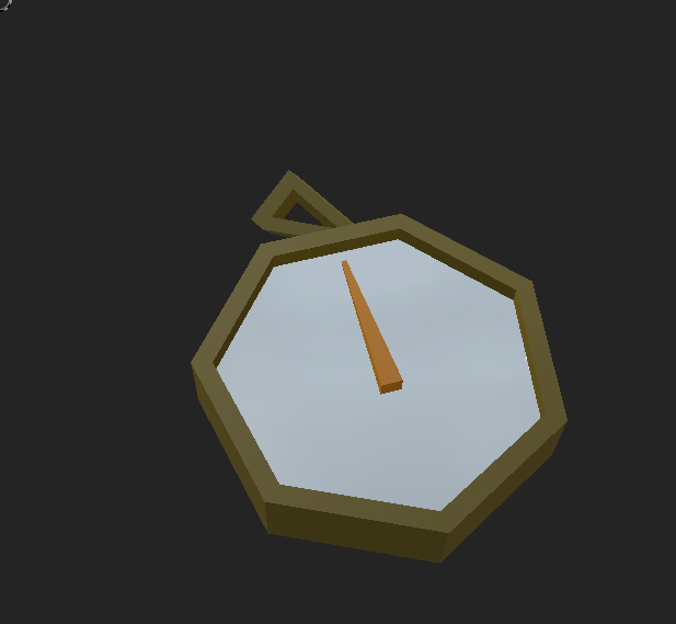
Compass
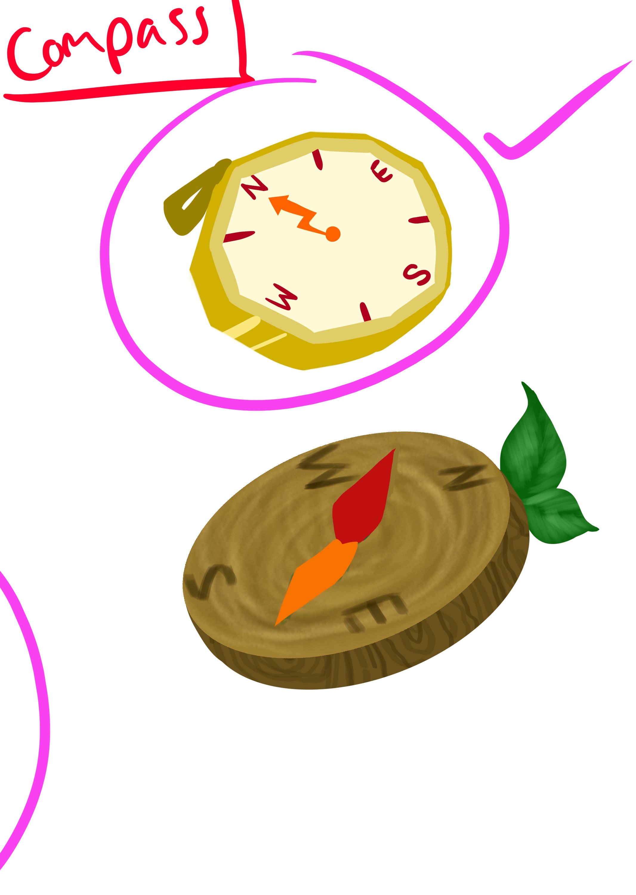
I thought of the behavior of the compass before I actually figured out what I wanted it to be. When I had the behavior down, I thought of things that would be a target. It was at that point where I thought of the idea of a compass as a guide for things and, thus, the compass item was born. I had always imagined a golden compass and Talia really knocked it out of the park on this one too. It went through a couple of iterations for the 3D model itself, but the simple design of the final product was really what I loved.
Avocado
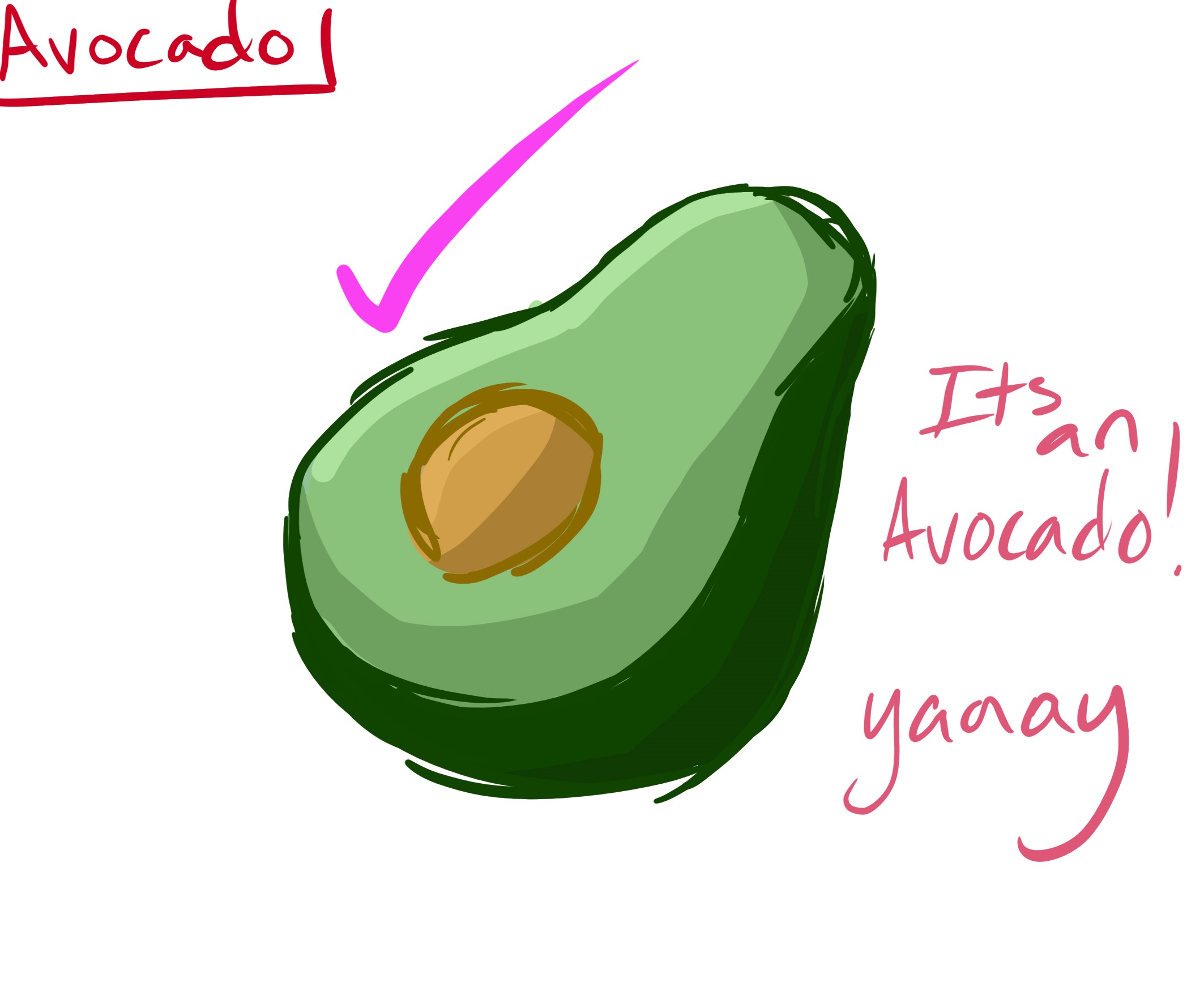
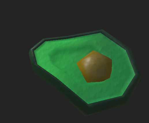
This one is hilarious. If you ever watched vines...like the videos...that is exactly where this came from. The idea of having an extra heart was something that I wanted, but I didn't just want it to be a heart. I thought of what you might be feeling when you get that extra heart and then I was like..."thaaaanks"...then I thought "It's an avocado! Thaaaaanks." Need a say much more?
Lasting Comments
I hope that gave you a little bit more insight into the things that went on in this game and the things that you can collect while playing. I had a ton of fun making all these things and I sure hope that you get to use some of them. :) Definitely leave some comments if you have any questions about the items, I would love to share my designer knowledge with you. If you would like to know more about the progress that we made on this sprint, I invite you to read the Into the Woods Production Blog from my producer, Nathan.
To my team from this sprint, thank you for all that you do and I cannot wait to see what you create in this last sprint. I am happy to say that everything is feature complete at this point and there are just some little extra things that will put the icing on the cake! For those of you that have read to this point, thank you for being here and I cannot wait to show you this final product!
From our team to you, thank you, and see you again soon! 🧙♂️
-Into the Woods Dev Team
Get Into The Woods
Into The Woods
Will you step up to recover what you lost, or will you remain lost in the woods?
| Status | In development |
| Author | CAGD |
| Tags | Dungeon Crawler, Exploration, Fantasy, Magic, random-generation, Roguelike, Singleplayer, Top-Down, Unity |
More posts
- Into the Woods - Postmortem (Design)May 24, 2021
- Production Blog 7- Into the WoodsMay 22, 2021
- Production Blog 6- Into the WoodsMay 06, 2021
- Production Blog 5- Into the WoodsApr 22, 2021
- Design Blog 5 - Into the WoodsApr 22, 2021
- Production Blog 4- Into the WoodsApr 08, 2021
- Design Blog 4 - Into the WoodsApr 05, 2021
- Production Blog 3- Into the WoodsMar 25, 2021
- Design Blog 3 - Into the WoodsMar 25, 2021
Leave a comment
Log in with itch.io to leave a comment.