Design Blog 5 - Into the Woods
Welcome back to the Design Side of Into the Woods!
Another sprint has gone by and holy WOW the progress of this team has been amazing! For this design blog, I would like to try something a little bit different. I will talk about the playtest results, but what I would really like to do is talk about a very specific design part of the game thus far. If you would like to read about all the progress of the game and the work that was done this sprint, I invite you to check out the Into the Woods Production Blog!
So let's get to it!
Playtesting
We are almost at the home stretch and the build after this one will be feature complete. That being said, the game is nearly done and that is such a weird thing to say! There are some places here and there where I would like to add a little bit more polishing and there are some areas that need some attention, but I am so super happy with everything that is happening. The four things that I really wanted to touch on with this build were the world, enemies, day/night cycle, and the user experience.
The Playtesters
We didn't have a whole ton of folks playing the game, but those who did I was happy they did! We got some pretty good feedback from them and they fell into the categories I hoped for in terms of target audience. :) Top category identified this time: explorers!
The World
Previously, I have been talking about the world as the generation system, but this time, there was more there! Thus, I changed this category to talk about the whole world rather than just the generation of the system. That being said, players felt like items had a purpose again! It has taken me a long time to get to the point where the items felt useful for the player, so I am happy that all of these things that we have put effort into are actually giving some kind of purpose for people. Where things were getting a little bit tricky was that some rooms felt a little bit cramped (which I aim to fix with the level designers) and that the players wanted to see more world. What I mean by this is that right now the game just feels like a plane floating in space. I want to create this beautiful forest immersion and right now, that is currently not happening for the player.
Enemies and Things
As of this playtest, folks felt much better about being locked in the room with the enemies. It felt less like they were at a disadvantage and more that it was part of the challenge of the game. Where there needed a little bit more improvement was that, because there were two boss enemies now, the second one just didn't feel as strong. I will be talking a little bit more about all these creatures later in the blog, so stick around!
Day/Night Cycle
As of this build, folks could tell when it was day and when it was night! I have no idea what changed...but I didn't change anything....sooooo yea. On another note though, the issue that was at hand was that folks were feeling like there was not much of a purpose to the night just yet. Either that, or they had an issue figuring out where the night-only rooms were.
User Experience
Something that I really wanted to touch on with this was whether or not people wanted to be more equipped when they went out for the adventure. Based off of their feedback, more people were wishing that they had additional spells/potion recipes at the very beginning. While I hear that, I am not sure that I really want to go that route. Imagine each spell like a different gun in a rouge-like shooter game. What might be helpful is to give the other spells a little bit more purpose.....but still trying to figure that part out.
Overall Comments
The one thing that I really loved here was that people were challenged by the game, but they still had fun playing! As a designer, that was my biggest challenge. I definitely do not play games the same way that others do and challenging games for me are literally anything that isn't just a click-and-play game. Making a game that was challenging for others was a huge feat for me and the fact that folks think it does have a little bit of a challenge to it makes me feel good. The last thing that I wanted to touch on was that people were finally understanding what the purpose of the game was! There is a tiny bit of a narrative in this game and I was happy that folks were picking up on it. That being said, please enjoy my favorite answer to "What was the objective of the game?"
The Creature Feature
In this blog, I want to do something a little bit different: I want to give you a little bit of an in-depth analysis of how all the enemies are designed and why they were designed the way that they were. Now that all of the AI types are in the game, I figured it would be the perfect time to have this! With each class of enemies, I will chat with you a little bit about not only their visual style but also the different behaviors that they have.
The Inspiration
When I was initially making this game, I had this huge idea in my head and I was worried that it was going to be way too large of a scale for the semester. After running it past some friends, they told me that it was something that was too small for the scope that I could have for the game. I showed them my design document that was in progress and one of the biggest pieces of feedback that they gave me was that I needed more enemies and more items. The best thing that they could have told me was that I needed to look at The Binding of Issac. Right away, I went to Steam, purchased the game, and saw a little bit about how the enemies behaved and things that might be useful for the player.
One of the biggest challenges about the enemies that I had was I wanted to make sure that each of them felt different from the other. It was very important to me that you didn't feel like you were fighting the same thing over and over as you travel between rooms. That being said, I created 3 different classes that would become stronger as you inclined in the class...
The A-Type Enemies - Rocky, Icey, and Bloody
The idea for these enemies was the idea of a stationary turret. I wanted something that would cause havoc in the room, but would not always require the player to move around the room non-stop. It was not meant to chase you but still hinder you from remaining in one place the whole time. A standard version of this enemy was just shooting projectiles, a second was meant to freeze the player, and the third one was meant to cause bleed damage to the player. I thought about giving the one with bleed damage also freeze damage, but that seemed like something that would make it super strong to be a standard enemy. On top of that, I wanted to make sure that each of these enemies felt different from the others.
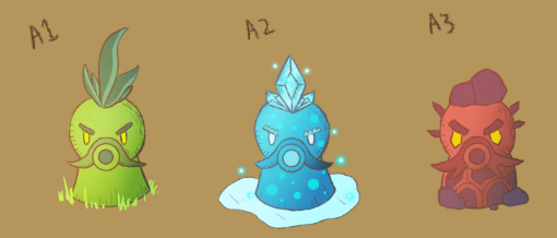
In terms of the design of the enemies, one of the games I loved as a kid was Plants Vs. Zombies. One of my favorite plants is the pea shooters and those were some of the inspirations both for the style of the character as well as the way that they were animated and moving. When talking with Atley, I told him that I wanted each of the shooters to have a distinct color so that you knew immediately which kind of damage you were about to be hit with. Another element of that was making sure that the bullets from those enemies were also color-coded as well.
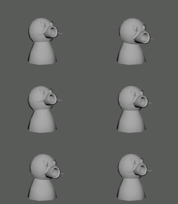
The B-Type Enemies - Runny, Bomby, and Shieldy
These ones were a unique challenge because I wanted the player to have to watch where they were going as they were moving around the room. The idea of that was that the player could not just serpentine around the room and think that they were going to survive if they did that. That being said, these little guys have some of my favorite components to them. The first variation would just run around and keep the player moving throughout the space, the second would drop bombs around, and the third one would have a shield to protect it from harm.
In terms of the visual style, this one was a little bit harder for me to tell Atley what I wanted. At the end, I still got something great! Atley has this amazing talent to make things that are just perfect and I really had to bank on that for this design in particular. These little guys looked menacing, but they didn't look like something that would automatically hunt you down and get you.
The C-Type Enemies - Chasey, Blasty, and Twoey
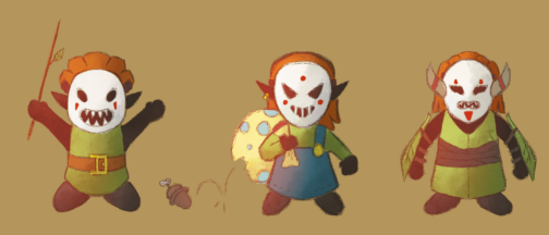
Arguably, these are my favorite enemies. Not only was the design everything that I wanted and more, but the way that they behave was perfect for me. Conversely to the last set of enemies, I wanted something that was going to force the player to keep moving throughout the space. I wanted the player to feel the pressure of something coming to them and swarming. The first variation of these enemies was just your average chaser, the second detonated upon contact with the player (and chased you until detonation), and the third one not only chased you, but split into two when it had been first hit.
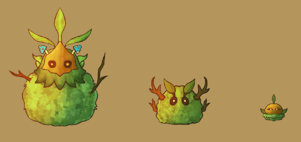
Visually, these ones are stunning. I don't know what about them makes me so happy, but I want to show you the models that were made. One thing that I had told Atley was that I wanted to keep a little bit of a color progression as well with the levels that the enemies came in (variations 1, 2, and 3). Each of them would abide by its own distinct color: green, blue, and red, respectively. When I asked for a little bit more blue in the third variation of the enemy in this class, Atley delivered so adorably and Erika really took it and ran. I love all these enemies so much.; it's like they were ripped right off the concept.

The Bosses
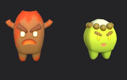
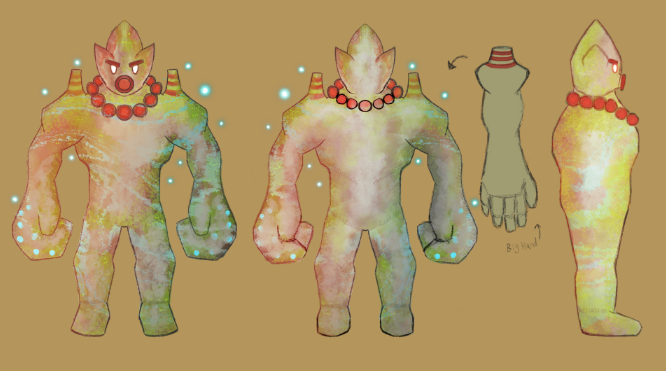
When it came to the boss enemies, I wanted them to come from the enemies that you fought on the way there. The reasoning behind that was it would ingrain this idea that the smaller ones were protecting the larger ones. The first boss was a creation of the A-Type enemies and the second boss was a creation of the C-Type enemies (it felt weird to have a very passive boss like those of the B-Type enemies). The first boss that was a turret would force the player to avoid being hit at all costs as it was a mixture of all three of its basic types. As of right now, actually, the second boss is a little bit still in progress due to feedback from the players, but the idea was that this boss would exist in waves and not be able to just die after the first impact or by being a bullet sponge.
The design for the first boss actually went through 2 iterations. I loved the first thing that Atley created because it beautifully captured all the enemies of its type and had a flair of its own. After looking again and realizing its behavior, it occurred to me that we would need a little bit of a redesign so that it matched the behavior it carried. Atley was able to take the elements that I really liked from the first iteration and put them in the seocnd. Both iterations can be seen below.
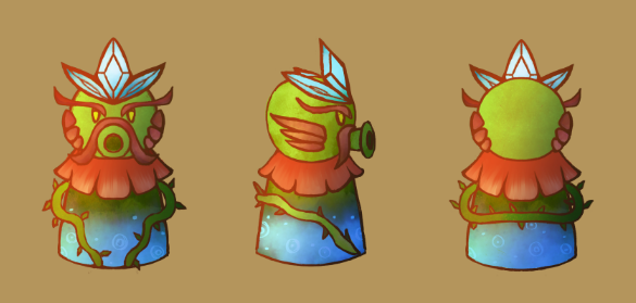
When it came to the design of Boss B, I didn't give Atley too much direction, but the final product he showed me was out of this world. Something that I told everyone was a theme of these creatures was that they would be "terrifyingly adorable". Atley really killed it with this one and I could not be more thankful to have an artist that takes the physical behavior of the character and brings it to life! The thing that I especially loved about this one is all the attention to detail. Each of them belong together as well as with the world we have built around them.
Lasting Comments
I hope that you enjoyed that something a little bit different and definitely leave some comments if you have any questions about these enemies! I would love to elaborate more on them! That being said, I am so incredibly proud every sprint of all the things that my team does and continues to do. I am over the moon to share with you the final product (though that is a little ways away still) because I know whatever it will be is going to be great!
To my team, thank you for all your hard work and dedication. I really could not make this a reality without you all. For those of you who have made it to the end of this blog, thank you fro coming along for the journey and I hope that we see you again soon! If you have not yet gotten the opportunity, I invite you to download the build and play the game!
From our team to you, thank you, and see you again soon! 🧙♂️
-Into the Woods Dev Team
Files
Get Into The Woods
Into The Woods
Will you step up to recover what you lost, or will you remain lost in the woods?
| Status | In development |
| Author | CAGD |
| Tags | Dungeon Crawler, Exploration, Fantasy, Magic, random-generation, Roguelike, Singleplayer, Top-Down, Unity |
More posts
- Into the Woods - Postmortem (Design)May 24, 2021
- Design Blog 6 - Into the WoodsMay 24, 2021
- Production Blog 7- Into the WoodsMay 22, 2021
- Production Blog 6- Into the WoodsMay 06, 2021
- Production Blog 5- Into the WoodsApr 22, 2021
- Production Blog 4- Into the WoodsApr 08, 2021
- Design Blog 4 - Into the WoodsApr 05, 2021
- Production Blog 3- Into the WoodsMar 25, 2021
- Design Blog 3 - Into the WoodsMar 25, 2021
Leave a comment
Log in with itch.io to leave a comment.