Dev Blog #2 - Shapeshift Dungeon
Hello and welcome to Dev Blog #2 of Shapeshift Dungeon with your host (game designer) Sky! Rather than talk about all the assets that we produced (there were a lot!), I'm going to focus this time on the design process. This last sprint of production was all about getting the core gameplay complete for the first play-testable build of the game. This meant a bit of crunch time from the programming team (including myself) to make sure that players could open the game and play without help or game breaking bugs. Not only that, but we also needed to collect feedback from our play-testers that was meaningful and informative. Due to Covid, we are unable to meet in person and actually watch our play-testers try out the game. To get around this issue, we are using a google form which is linked within the game to collect responses from individual players. Both the pause menu and game over screen of the game (there is no main menu yet) have a button which immediately links to this google form page. More on the questions and answers of that later...
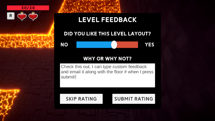
I also looked into implementing a method in which play-testers could provide feedback on individual dungeon layouts from within the game, so that level designers could get actionable feedback on each and every level that they had built so far. Check it out!


This was surprisingly easy to set up thanks to an old forum post with code already set up to allow sending emails from within Unity. This has already proven to be an invaluable tool to provide information that we would not have otherwise. This allows the level designers to receive clear feedback to make adjustments on, and will help to improve the levels they make moving forward. Another great thing about this setup is that we can send other information in these emails, such as the player's health, potions used, floors cleared, etc. in order to see patterns or oddities that will help the game design moving forward. For example, some players never used their potions before dying, which tells me that either they didn't realize they could heal, or they didn't realize they were low on health. Both possibilities are things that we can easily address for the next build.
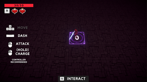
Another major feature that needed implementation for our first round of play-testing was a controls screen of some sort to show players how to actually play the game. To address this, I cooked up this panel of the game's movement and attack inputs:

The button inputs are grayed out as they are performed by the player, which tells them that they did it properly and also shows them which inputs they haven't tried yet. Additionally, I was able to hook this up to the new Unity input system such that it auto-detects your input device and displays button icons specific to your controller. This includes mouse & keyboard (as shown), Xbox Controller, and PlayStation Controller. This allows players with any standard device to quickly and easily learn the game's controls, and based on the feedback from players I believe it worked! The 4 buttons in the panel are removed from the player's HUD as soon as the first dungeon room is started in order to avoid unnecessary clutter on the screen.
There's two more inputs you may likely have noticed, the Potion button and Interact button, which are displayed at the top left and bottom center respectively. More specifically, the Potion button icon is displayed next to the potions, which tells players what it does at a glance. And the Interact button only pops up at the bottom of the screen when an interactable object (such as the center tile or an item) are nearby. This tells players which button to press ONLY when they need to press it, not before or after. This is because the Interact button is not integral to movement, combat, or healing, and therefore is not important for the player to memorize. I haven't received a single point of feedback in regards to these HUD elements so far, so I can only assume they are working as intended :)
Alright, NOW I'll talk about the google form. So, I'll list out each of the Questions asked and the common Answers we got:
1. How familiar are you with the Roguelike genre? (scale of 1-4)
This is a baseline question to see how well the play-testers fit into the target audience of the game. More than 80% of players listed a 3 or 4, indicating that they were quite familiar with Roguelikes. This is great, since many of the players are familiar enough to compare this game to other things they have played and provide feedback accordingly. And of the 20% of players who are not familiar, they can give an outside perspective, and we can see if these players still find the game fun.
2. What was your favorite moment or aspect of what you just played?
Almost universally, the response we got here was that people loved the Shapeshifting of the Dungeon, true to the game's name. The look of the tiles moving up and down, the camera zoom out, and the little bit of depth of field really help sell this as an awesome part of the game, glad to hear it!
3. What was the most frustrating moment or aspect?
There were a wider variety of responses here, but by far the most common was the controls of the player. Not the button inputs, but the feel of moving and attacking was clunky and unpleasant overall. I more or less knew that this was an issue beforehand, but it's definitely moved up my priority list of things to fix and improve upon.
4. Was there anything you wanted to do that you couldn’t?
Again, a variety of responses, some useful and actionable, some not. A common ask was for the ability to jump, which... I do not want to add as it will vastly complicate the current simplicity of moving, dashing, and attacking. A jump not only needs an animation and programming (that's the easy part), but you then need to re-design levels, enemies, and more in order to accommodate the jump mechanic and make sure players can't break the game with it. I believe players are really just wanting easier traversal of the vertical space, so I will ask the level designers to make level traversal (especially vertically) easier by adding more stair tiles and such.
5. Were the controls intuitive and responsive? If not, what would you change?
For the most part, yes. The button inputs are mostly good, the feel of the player is mostly bad, as mentioned. So we'll be working on that for sure.
6. How engaged did you feel while playing? (scale of 1-4)
I'm happy to report that only one player gave a rating of 1, four players gave a rating of 2, eleven players rated 3, and ten rated 4. This lines up closely with the percentage of players who were familiar with Roguelikes, but to my surprise, only 1 player who said they were not familiar with Roguelikes rated their level of fun as less than a 3. So... the game is mostly fun, and the people who didn't have fun were likely the more hardcore players. Good start for the first build I'd say!
7. How would you rate the game's difficulty? (scale of 1-4)
Now THIS is a funny statistic. Based on the level feedback emails, I know that there were only a handful of players who even made it to floor 5. The game will eventually have 30 floors. Therefore, the game is hard, right? Well, according to the play-testers a whopping 84% rated the game a 2 or 3. There were only 2 players who rated the game as very hard (4), and also 2 players that rated it as very easy(1). I think this is either a case of misreporting by the players, or just that they don't have any reference as to how well they should be playing.
8. Did you encounter any bugs while playing?
Some players saw no bugs (AWESOME), a few mentioned that they were able to get atop the floating skull enemy (a known problem w/ the placeholder player attack animation), and a few players mentioned bugs that I took note of and will be dealing with later. Very helpful.
9. Any other feedback you would like to provide?
Many players wrote that they had fun, or that the game looks awesome, and that they are looking forward to more. Love to hear it! There were also some more good pieces of feedback that I took note of.
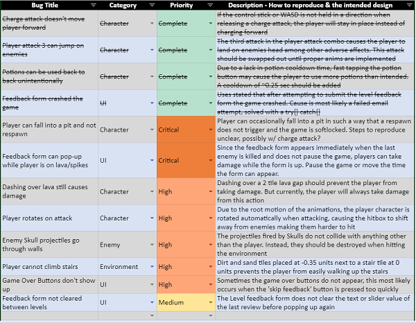
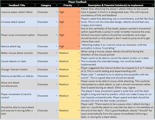
The final thing to do after playtesting had concluded was to compile all this feedback into a meaningful format to start taking action on it. To do this, I created two new excel spreadsheet pages, a Bug Log and a Player Feedback list, both of which are prioritized.


These are shared with the team so that anyone can look at and address issues that touch their own systems. I have already taken care of a couple of critical bugs, and will be working to fix as many as I can before the end of the next sprint. That's pretty much it for now, thanks for reading :)
Till next time!
- Shapeshift Dungeon Team
Files
Get Shapeshift Dungeon
Shapeshift Dungeon
One Room Roguelike
| Status | In development |
| Author | CAGD |
| Genre | Action |
| Tags | Controller, Dungeon Crawler, Hack and Slash, Procedural Generation, Roguelike, Singleplayer, Third Person, Unity |
More posts
- Dev Blog Postmortem - Shapeshift DungeonMay 24, 2021
- Production Blog Postmortem - Shapeshift DungeonMay 21, 2021
- Dev Blog #6 - Shapeshift DungeonMay 06, 2021
- Production Blog #6 - Shapeshift DungeonMay 06, 2021
- Dev Blog #5 - Shapeshift DungeonApr 22, 2021
- Production Blog #5 - Shapeshift DungeonApr 22, 2021
- Production Blog #4 - Shapeshift DungeonApr 08, 2021
- Dev Blog #4 - Shapeshift DungeonApr 08, 2021
- Dev Blog #3 - Shapeshift DungeonMar 25, 2021
- Production Blog #3 - Shapeshift DungeonMar 25, 2021
Leave a comment
Log in with itch.io to leave a comment.