Design Blog 1
Hello, my name is Michael Insley, and I’m the designer for Clay Striker, an on rails, first person shooter that aims to combine the experience of shotgun sports with arcade style, fast paced action. You play as Don, a down on his luck competition shooter that is practicing for an upcoming event, the Clay Striker Regional. We have a great team, all CAGD students in their final year. For more information on the team and production, visit our producers blog, here.
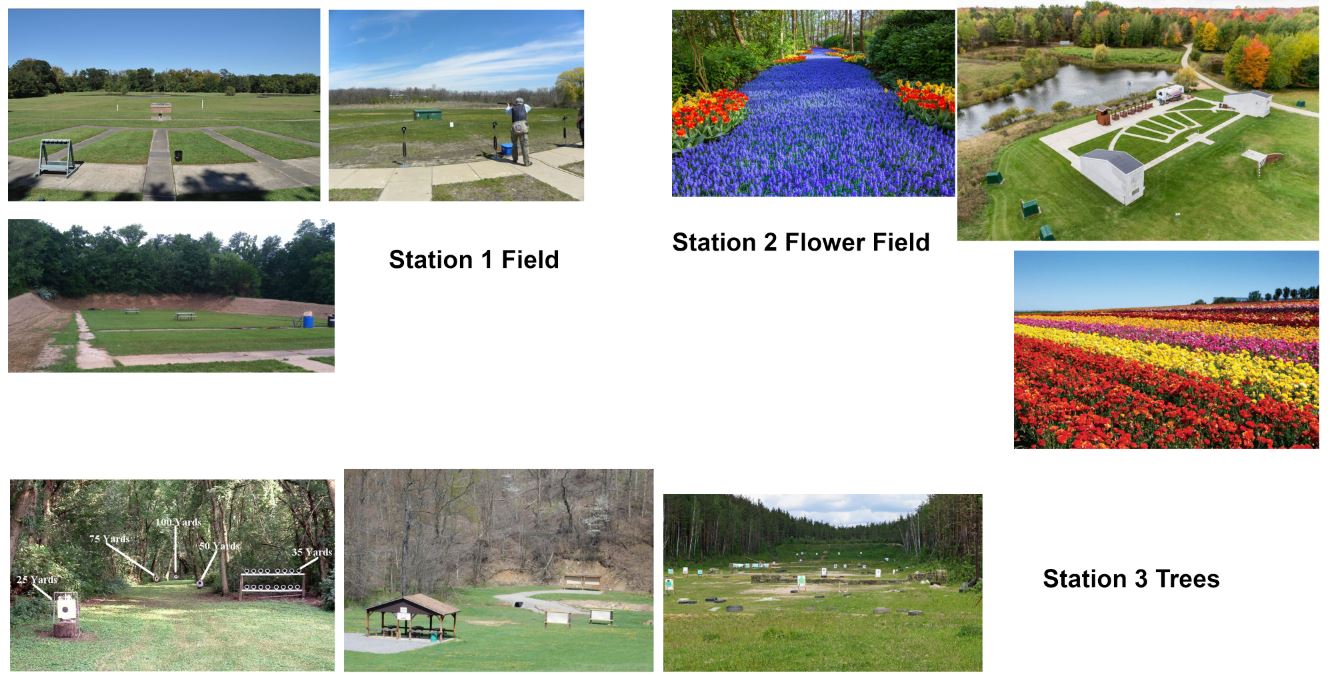
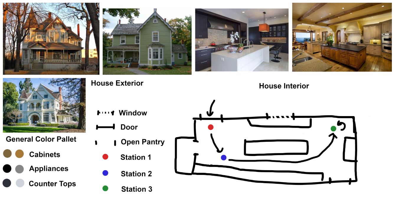
For this sprint, I focused on design work primarily, and started on some models as well. The design work was the most important, obviously, since we needed it to truly progress with the project. I started with an asset list and gathered reference for that asset list. After talking with my producer and bouncing ideas off of each other, I got the assets for the first four levels down in a document. We decided to start with a typical shooting range theme for the first level, with props that would be found there, bunkers, shooting houses, flowers. For the second level, a combination pumpkin patch and carnival, since it’s close to fall. For the last two levels, we decided on a house on the hill kind of thing, with the outside garden being one level, and the kitchen being the fourth.
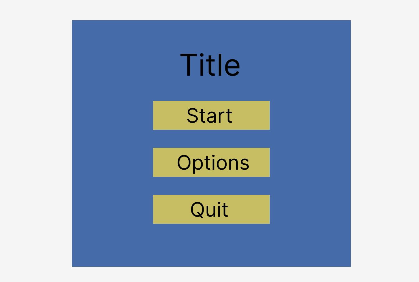
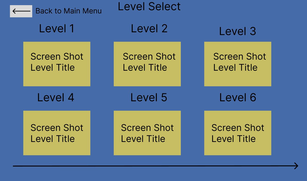
I got the treatment done fairly early, I had most of the information already, so it wasn’t difficult or time consuming. Then I got started on some UI wireframes, so we could get a good look at what the menus and HUD would look like. I made the wireframes with an online tool I hadn’t used before, Figma. I wasn’t too interested in going into much detail on these wireframes, that’s not the point of these, and Figma didn’t have too many options for super advanced diagrams, plus with my lack of experience with this tool, meant that I couldn’t come up with anything complex anyway. I ended up with wireframes for the main menu, options screen, pause screen, level select screen, and an overall layout for the flow for the menus. They were all very simple, I’ve always liked very simple UI layouts, especially when the game doesn't have all that much to tell you.
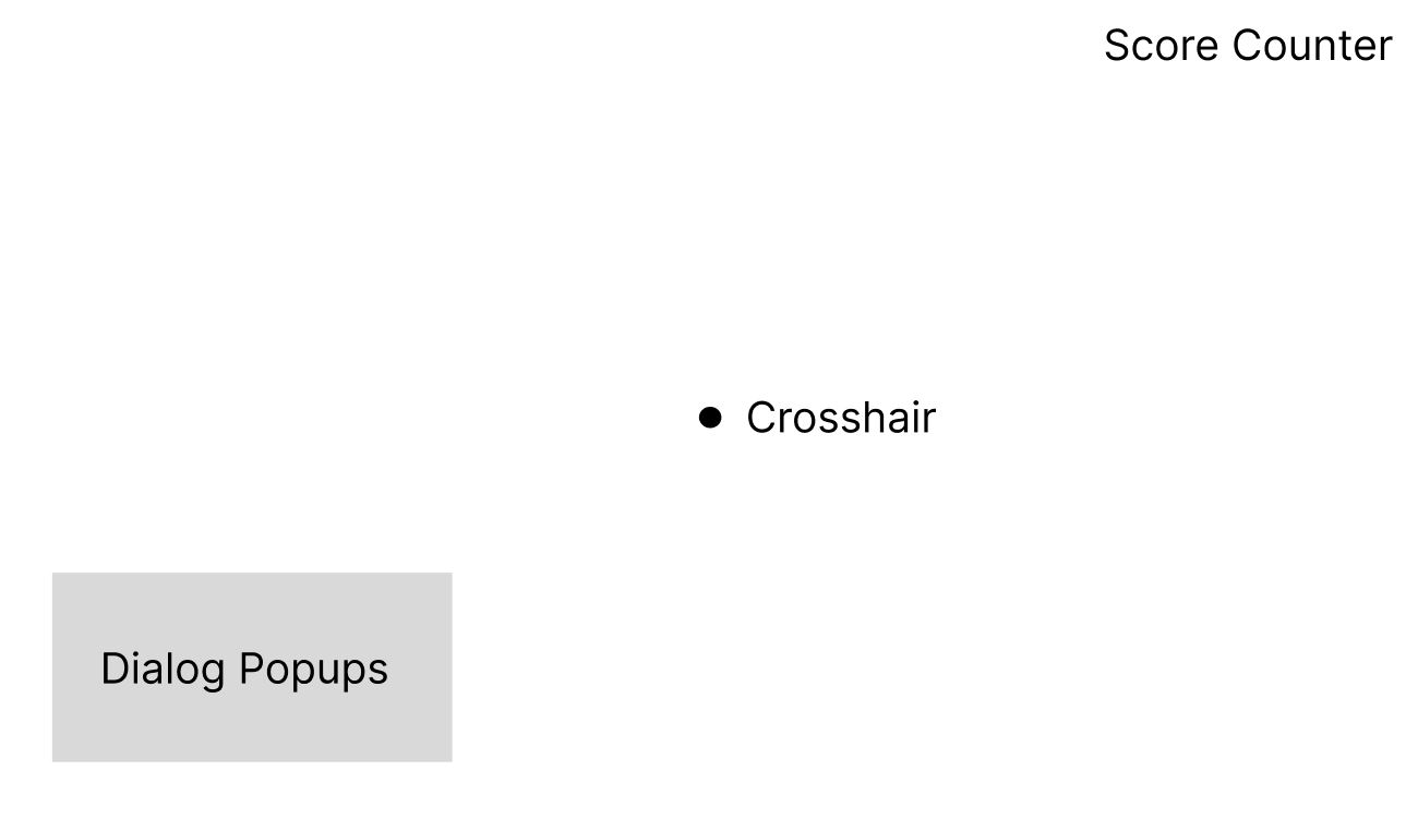
For the HUD layout, I only had three major elements, a crosshair, a score indicator, and a dialog box for the shooting buddy character we plan on having. Clay Striker doesn't have all that much information that needs to be told to the player through the UI, I want a lot of the information to be expressed with the objects in the game, and for the player to have very clear sight lines so that we have as much space on screen to use for target placement.
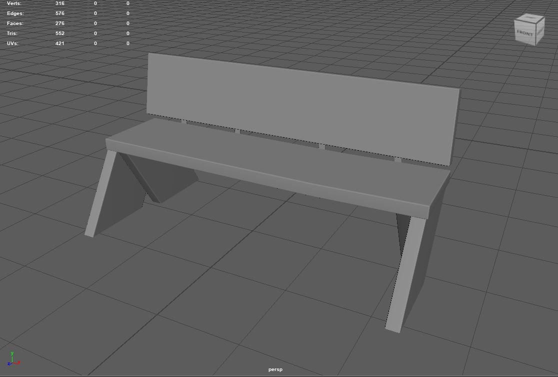
Then I worked on a couple of the models we needed, specifically a wooden bench for the first level, a bunker for the first level, and the clay target that the player will be shooting. The bench was pretty simple, functionally it was just rectangles with bevels. As for the overall design, I landed on a very simple design that, once textured, should look like an old, weathered bench.
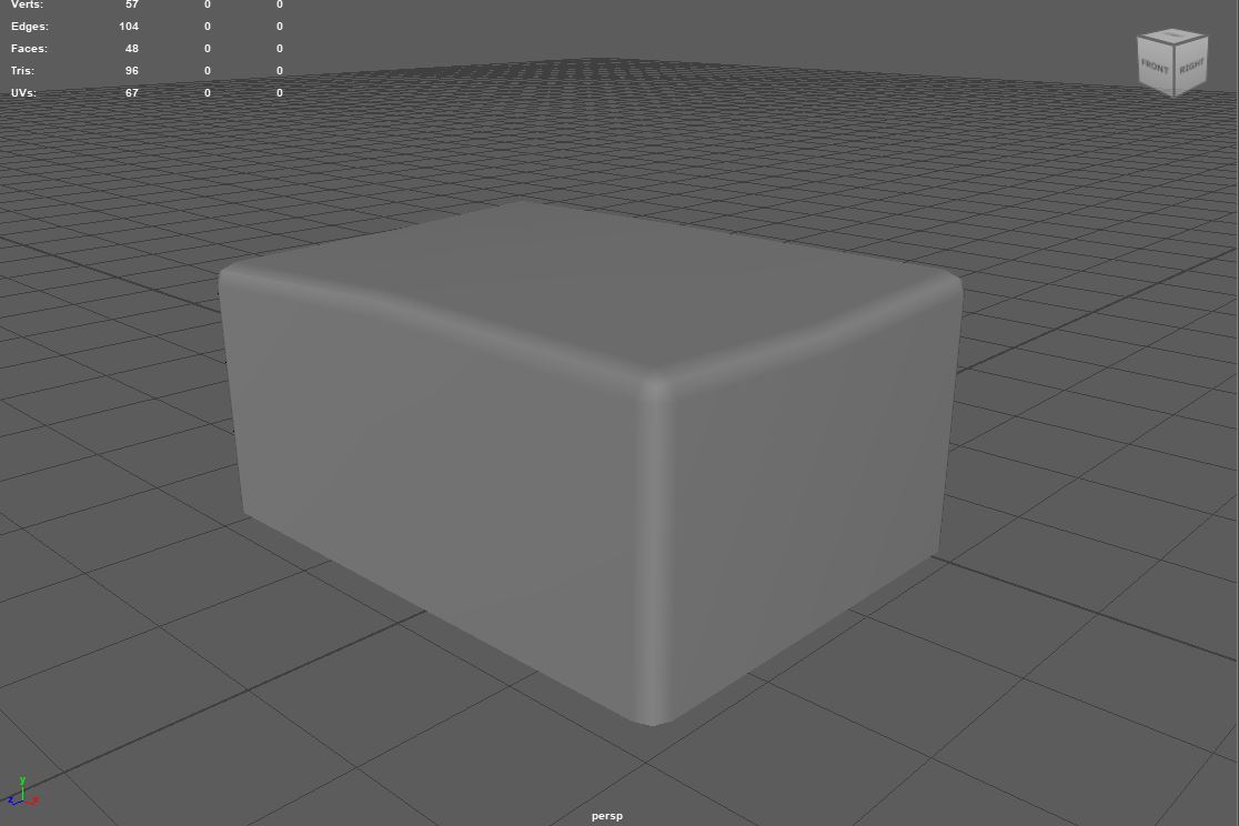
The bunker model is something that is meant to be something where targets get launched from. They are generally reinforced, because they are meant to be downrange and at least loosely shot at. I decided to go for a very basic weathered and damaged concrete look, rather than a more constructed house, like some of the references that I managed to find. I thought it would be better to have a less distinctive profile, so we would have more flexibility using it in different orientations.
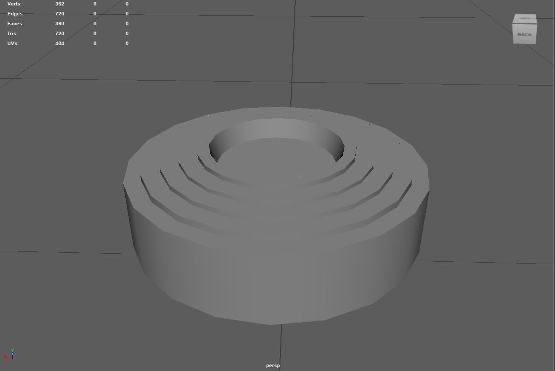
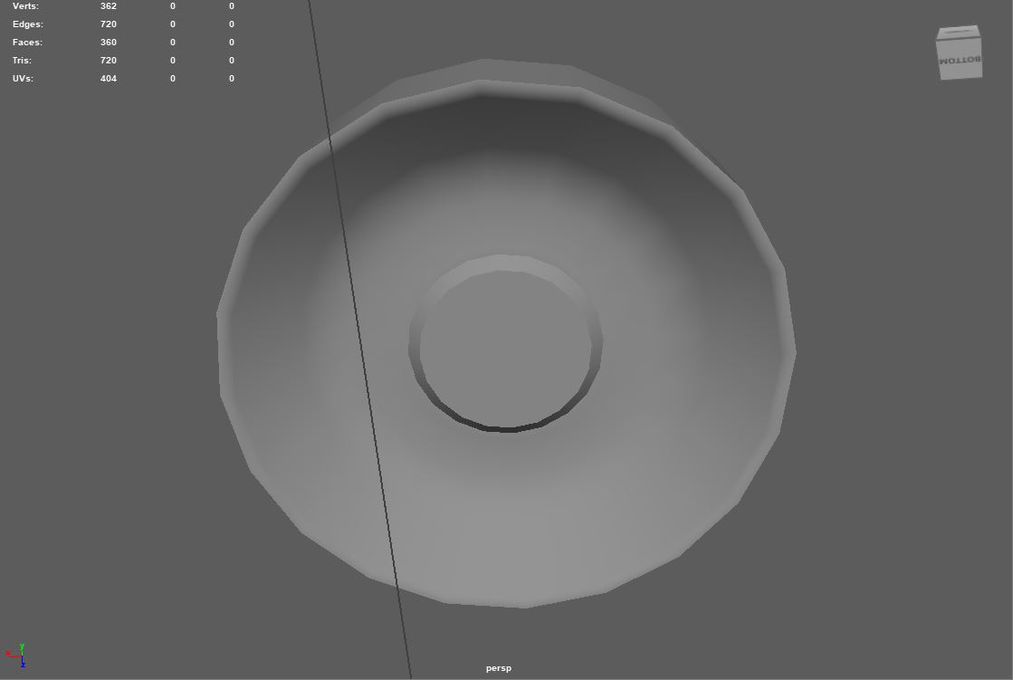
The clay target was the last model I worked on in the sprint. It's fairly important, since it’s going to be used on every course. I started with looking at the reference, and just extruded based on the reference. I made sure there were details on both sides, since either side could be visible to the player at any given time. It ended up being under 1000 tris, which I was very happy with.
Get Clay Striker
Clay Striker
| Status | Released |
| Author | CAGD |
| Genre | Shooter |
| Tags | 3D, First-Person, FPS, Short, Singleplayer, Unity |
More posts
- Design Blog 6Nov 19, 2023
- Production Blog 6Nov 16, 2023
- Design Blog 5Nov 06, 2023
- Production Blog 5Nov 04, 2023
- Design Blog 4Oct 23, 2023
- Production Blog 4Oct 23, 2023
- Design Blog 3Oct 09, 2023
- Production Blog 3Oct 08, 2023
- Design Blog 2Oct 07, 2023
- Production Blog 2Sep 24, 2023
