Design Blog 5
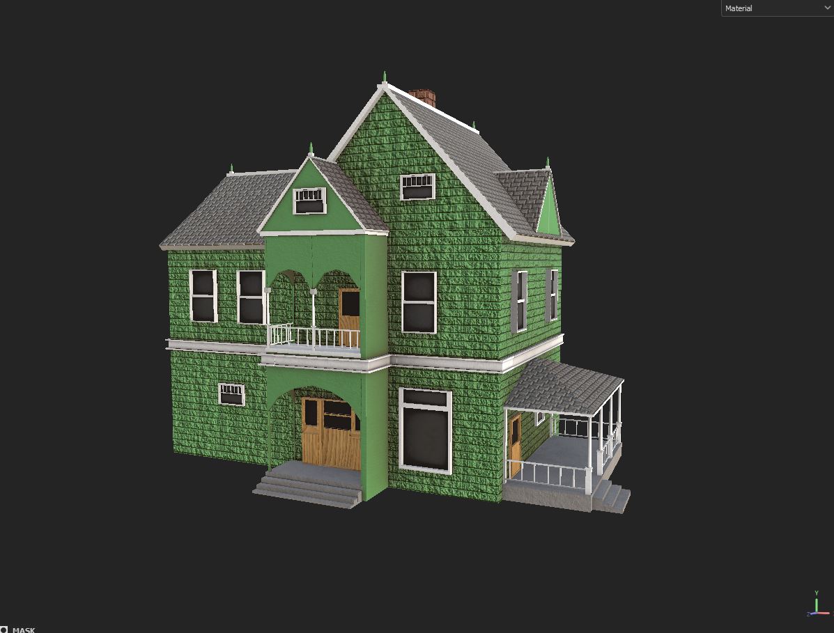
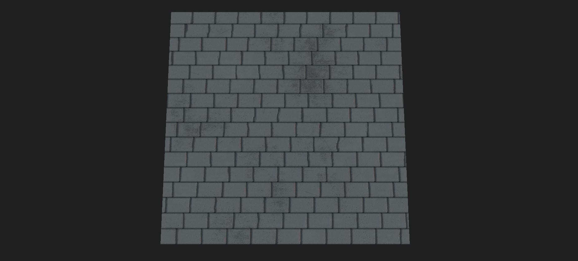
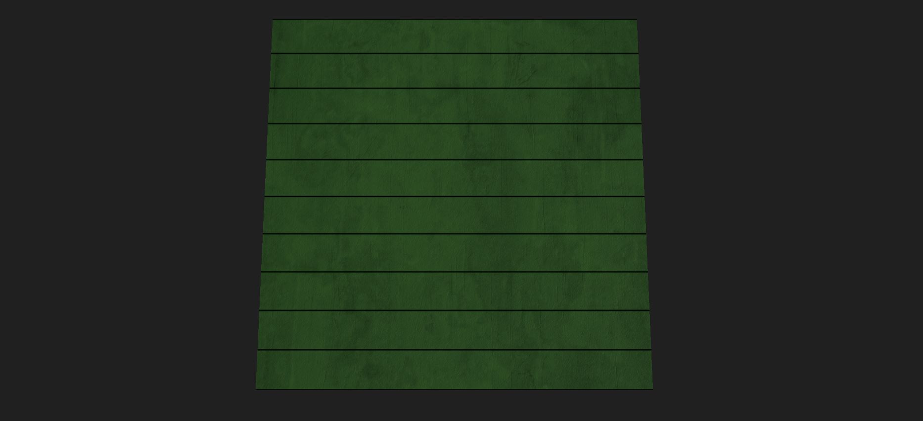
For this sprint, I textured the house I finished last sprint, and moved to creating textures for the terrain in the levels. I also modeled a couple of small models and got one of our UV sets ready for texturing. The house texture was what I started on first, and I based the overall color scheme on some of my favorite reference that I used to model the house, a light green base color with white highlights. I felt like that color scheme really enhances the historic feeling that the house already has. When I was trying to find textures in Painter that fit the reference I was using, I didn’t really find anything I liked, so I decided to just make my own textures in Designer. I’ve been working with Designer a lot this semester, so I knew I could just make something that was what I wanted quickly. I specifically wanted a siding texture and a roof texture. I didn’t have to spend much time making a very simple version of those two that do what I want them to. They don’t need to be super detailed, because this is more of a background model, so I just needed the textures to read well from a moderate or far distance, which I think it does. I also reused the roof texture on the chimney, just changing the base color on that texture.
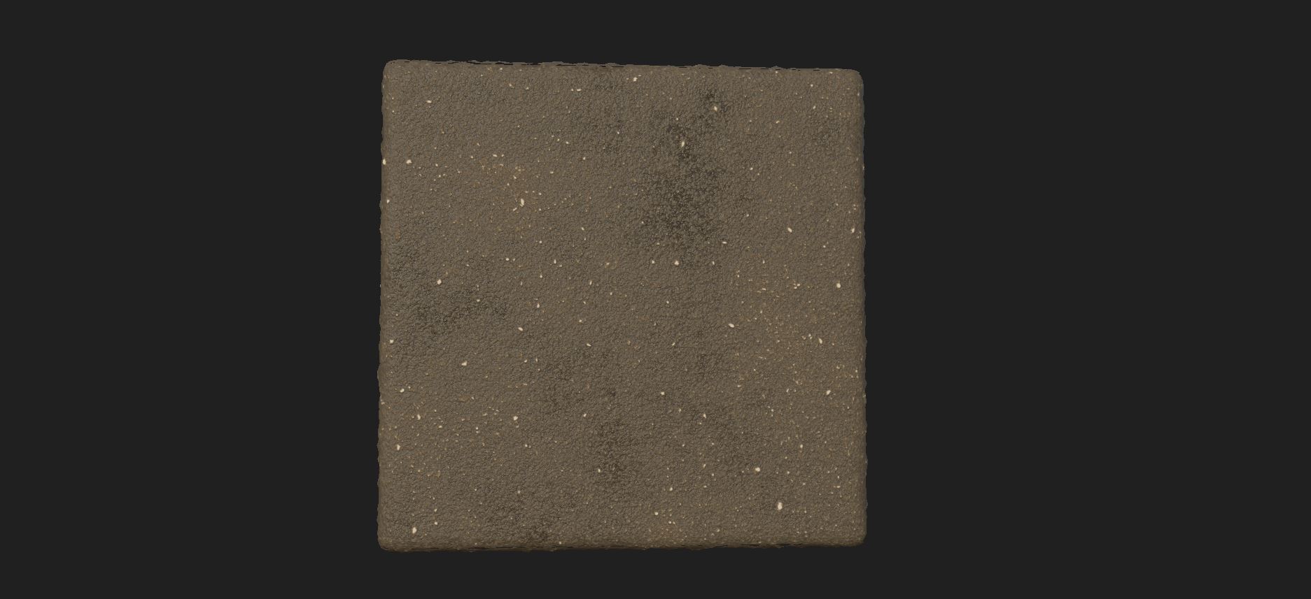
The next few things that I worked on were textures for our in-game terrain. We wanted at least three, a basic dirt, a grass texture, and a dead grass texture. I wanted a very basic look for all of the textures, nothing too complicated, since I was planning on using the terrain painting tool in Unity to paint the textures on. I started with the dirt texture, since I figured that might be the one, I would use the most out of the three, so I wanted to figure out what the overall look would be and try to match the next two textures as best as I could. I landed on something very simple that I liked.
The second texture I worked on was the basic grass texture. Designer has a few fur noise maps that with a little size modification look a lot like grass, especially from a distance.

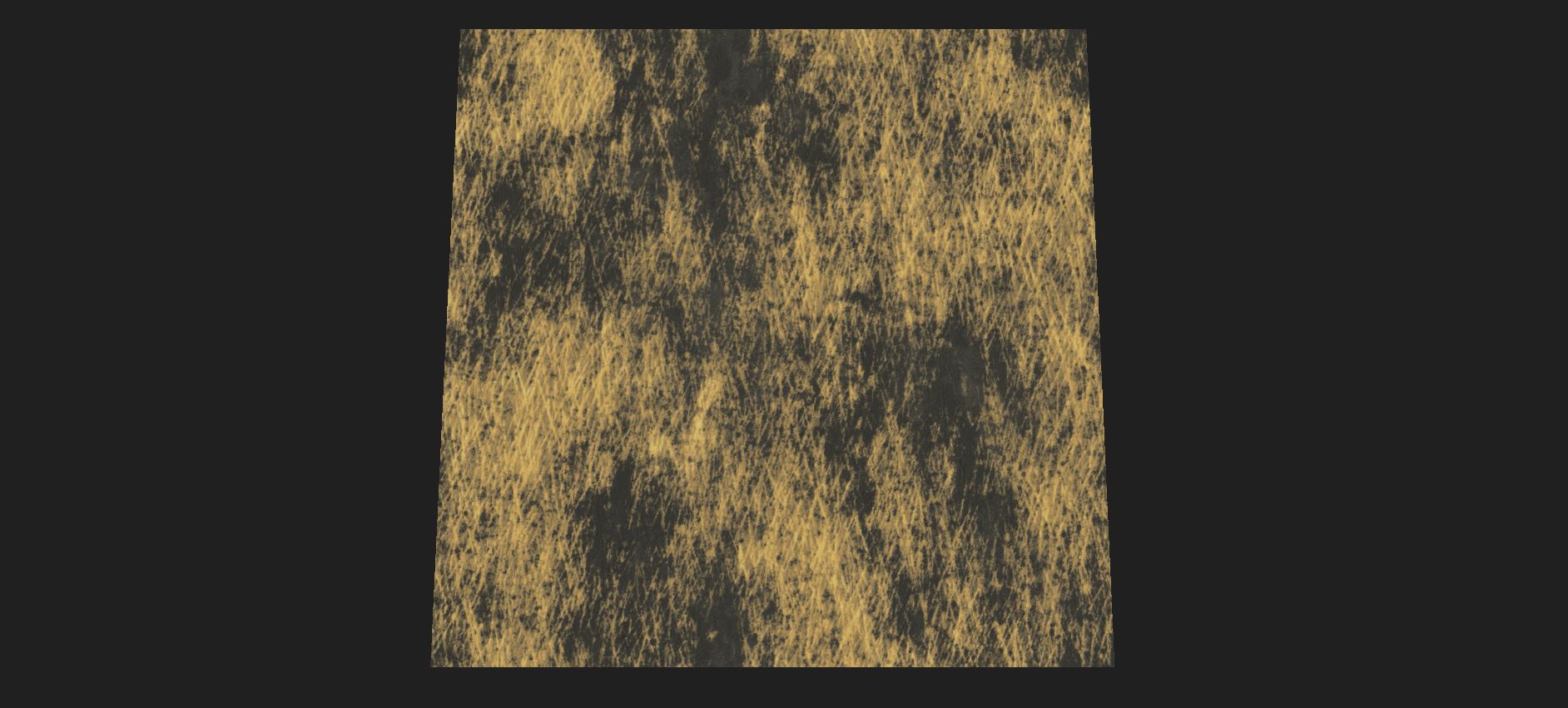
Then I started on the last texture, the dead grass. At first, I thought that it would be just the same grass texture with a different color. But my producer had a great idea for it, which was a base of dirt with some grass scattered over the top, which is a much better idea because it’s more interesting and dynamic. It wasn’t difficult to change, I just blended the grass I had with something that looked a lot like the dirt texture I already had.
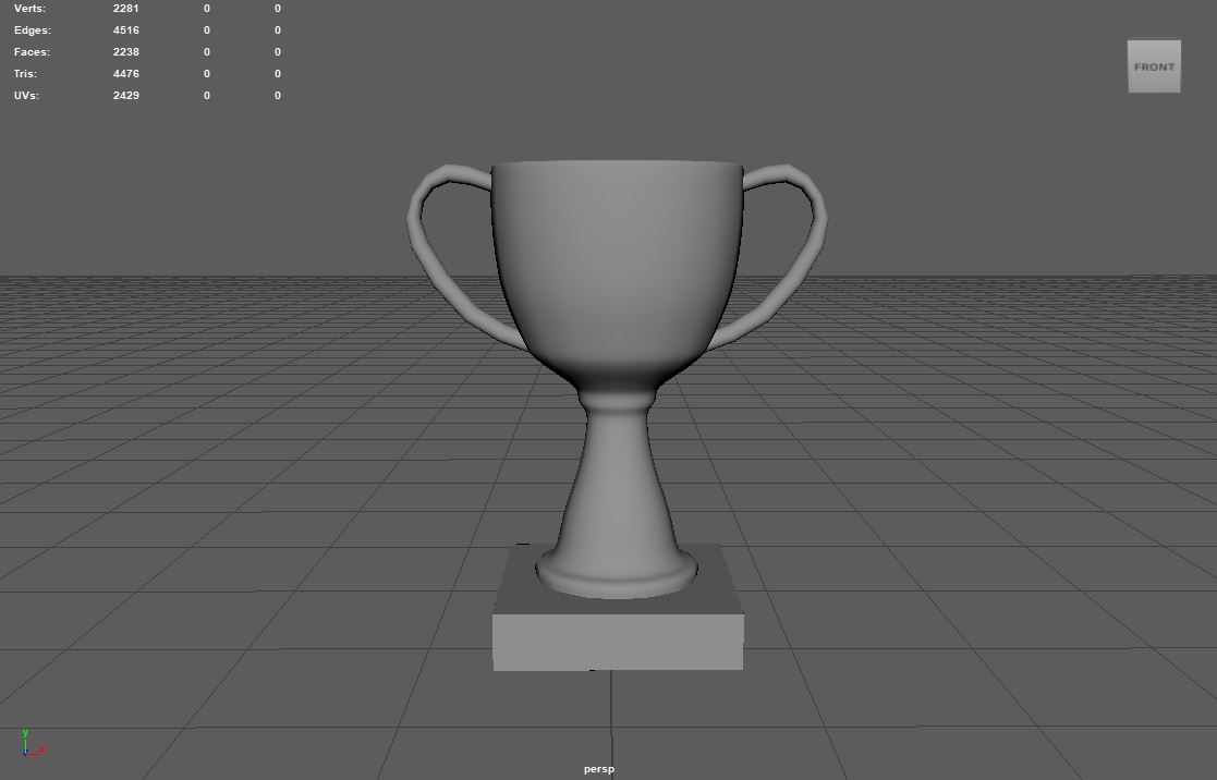
Then I started on a couple of models for our last level, a trophy and a banner. We decided that we would have an endless stage at the end of the game, so the trophy and banner are special props for that last stage. I just modeled a very basic trophy, with the handles on the side and a block base. The banner is a cube between two poles, that's it. I made it so that the player can move under it.

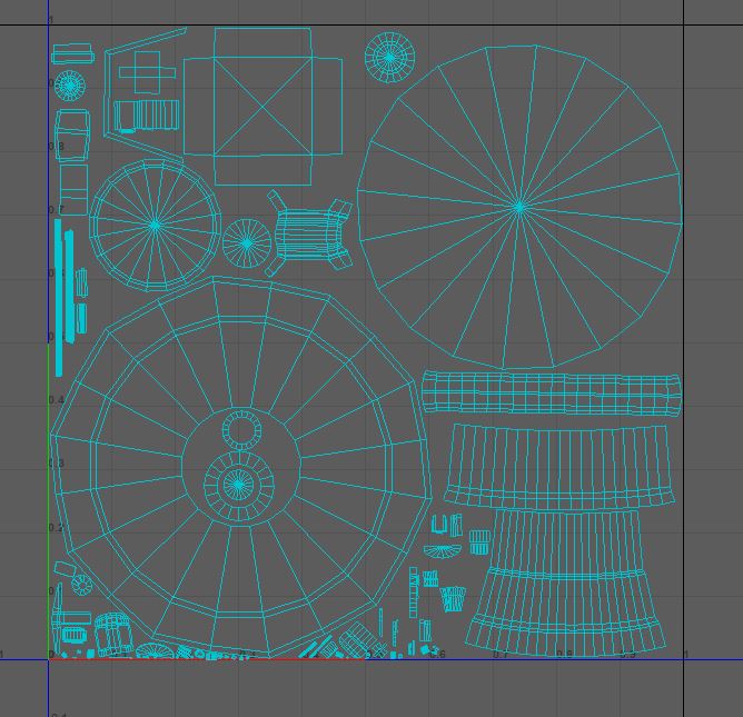
The last thing that I did was get one of our UV sets laid out, specifically UV set 6. Normally I don’t discuss making UV sets, since it’s very boring and usually just involves making everything fit in the zero to one space, and making sure the textile density is close to the same. The only reason I’m mentioning this is because this set had a model from each modeler on the team, so I had to work with models I wasn’t familiar with, which was more notable than normal.
Get Clay Striker
Clay Striker
| Status | Released |
| Author | CAGD |
| Genre | Shooter |
| Tags | 3D, First-Person, FPS, Short, Singleplayer, Unity |
More posts
- Design Blog 6Nov 19, 2023
- Production Blog 6Nov 16, 2023
- Production Blog 5Nov 04, 2023
- Design Blog 4Oct 23, 2023
- Production Blog 4Oct 23, 2023
- Design Blog 3Oct 09, 2023
- Production Blog 3Oct 08, 2023
- Design Blog 2Oct 07, 2023
- Production Blog 2Sep 24, 2023
Leave a comment
Log in with itch.io to leave a comment.