Design Blog 4
For this sprint, I finished a big center piece model, managed to hold a decently sized playtest, and wrote a good amount of dialogue for our tutorial character. The very first thing that I did was finishing the house model that I was still working on at the end of the last sprint. I only had a few details that I wanted to add, primarily some trim around the middle of the house, kind of separating the first and second floor visually. I felt like it needed something more, and I thought it might not be a bad idea to have something that separates the first and second floor, partly for me, so that I could accurately place windows where they should go. I think it also adds to the more historic look that I wanted. After studying the reference more, I felt like the first floor needed a larger window, so I made a larger window specifically for the front of the house, where I would imagine there’s a living room, or at least something like a living room. A detail about the windows I didn’t mention in the last post is that I made them all modular, so that I could duplicate and place them once they were UVed. The windows are the only thing that I made that way, since it would not only save some UV space, but also save me some time UVing.
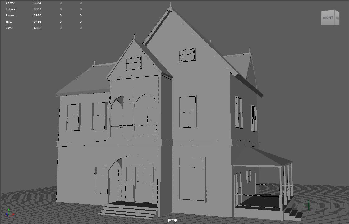
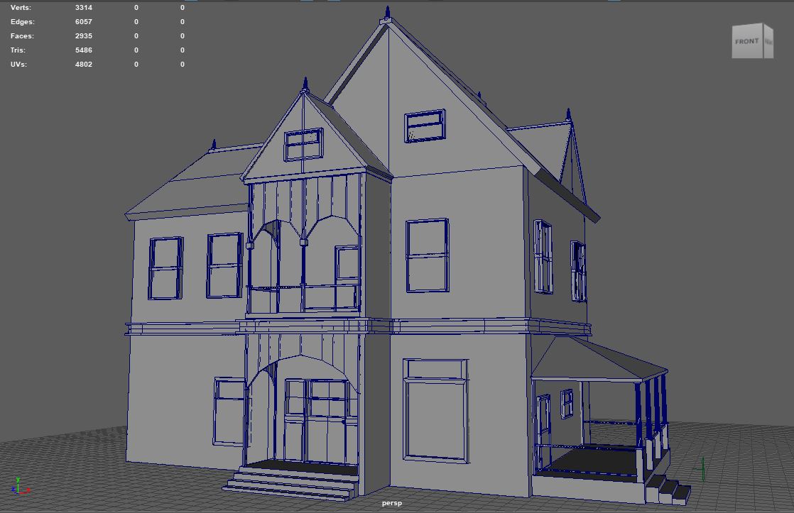
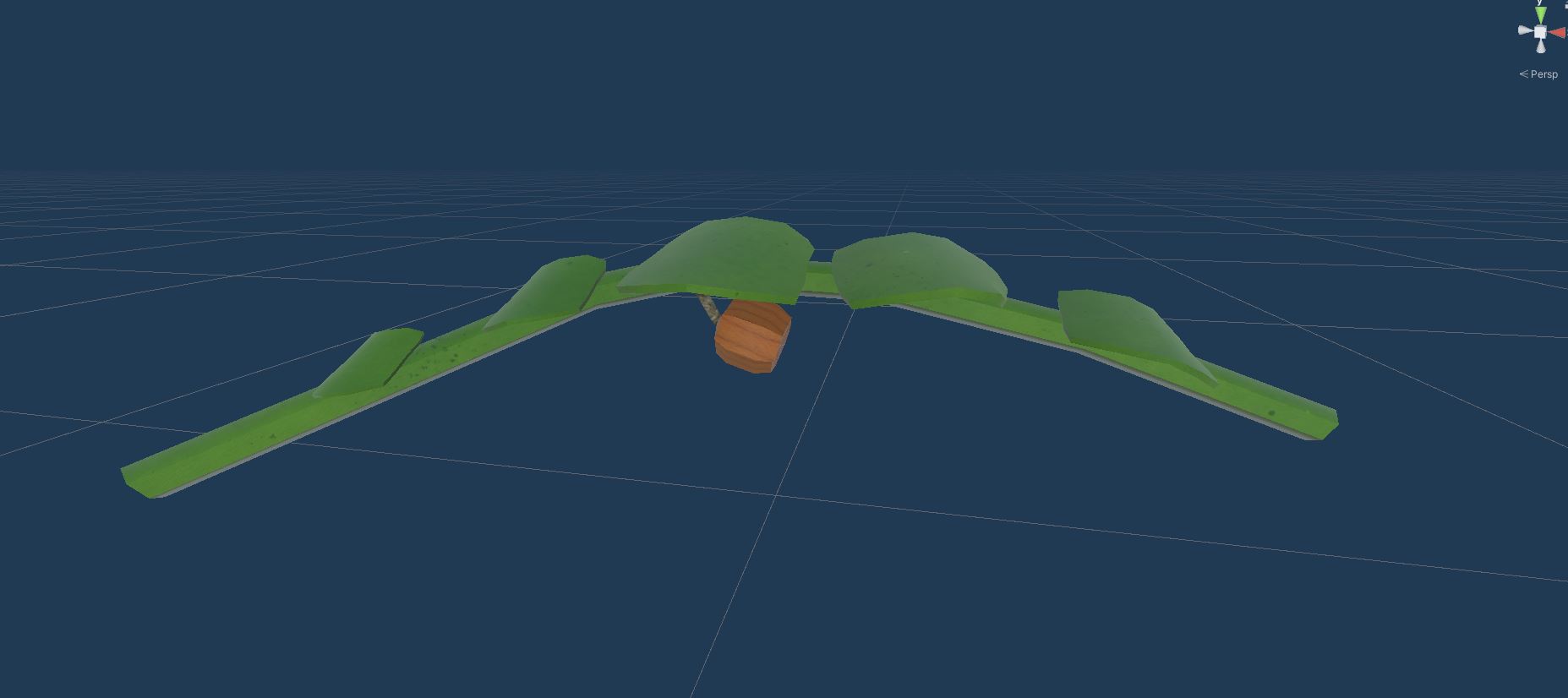
I only did one other thing relating to asset production this sprint, texturing the pumpkin sapling model I made last sprint, and adding it to Unity. I added it to the same UV set as the shotgun and clay target I modeled and textured a few sprints back.
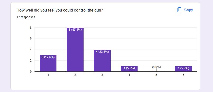
So, for the playtest we had this sprint, my producer and I managed to get a good amount of people to play the build we had at the time. We got plenty of good feedback, the most glaring issue was still the mouse sensitivity, we didn’t have time to adjust it from the last playtest, so we knew it would probably be the biggest issue going into this playtest, and we weren’t wrong. That obviously still needs to be adjusted.
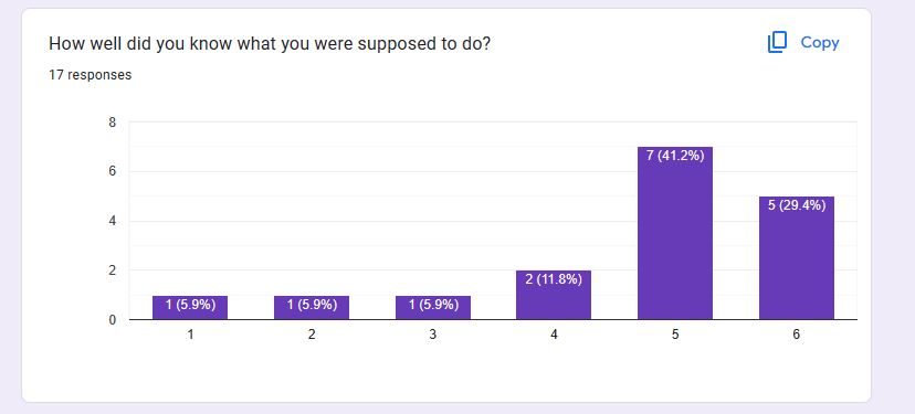
We also found that it took some players more time than others to figure out what the point of the game was, and what they were supposed to shoot. It wasn’t immediately obvious that they had to shoot the targets. The controls also needed to be explained to the players as well. Some kind of tutorial or at least added context is definitely needed, we always planned on having that, but we didn’t realize just how necessary it was.
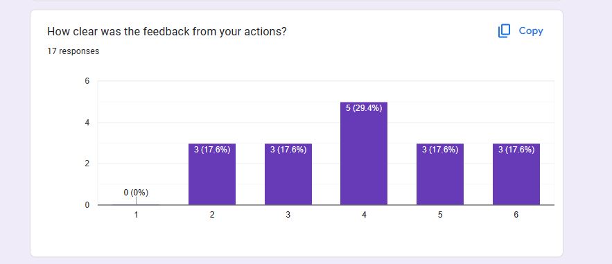
Another thing we found out during this playtest was that the rate that the targets spawn was far too high. Sometimes there would be four targets on screen at once, which makes the game feel far too chaotic. It also doesn’t give the player enough time to hit each target. We want the player to feasibly be able to hit every target thrown. So, the spawn rates need to be adjusted to make the game more manageable.
The other major thing I did this sprint was write the dialogue for Pat, our tutorial character. Pat will be introducing the player to the game, telling them the controls and objectives at the start of the game, and providing commentary throughout the experience. His comments will mostly be about how well the player is doing at the time, to give them some idea how well they are doing. It’s hard to keep track of how many targets you hit while you are playing, so Pat is there to help give the player an idea of how well they are doing. He will also comment at the end of a level based on the players final score, a positive comment means the player at least passed an unlocked the next level, while a more negative comment means they have to retry the level.
Get Clay Striker
Clay Striker
| Status | Released |
| Author | CAGD |
| Genre | Shooter |
| Tags | 3D, First-Person, FPS, Short, Singleplayer, Unity |
More posts
- Design Blog 6Nov 19, 2023
- Production Blog 6Nov 16, 2023
- Design Blog 5Nov 06, 2023
- Production Blog 5Nov 04, 2023
- Production Blog 4Oct 23, 2023
- Design Blog 3Oct 09, 2023
- Production Blog 3Oct 08, 2023
- Design Blog 2Oct 07, 2023
- Production Blog 2Sep 24, 2023
Leave a comment
Log in with itch.io to leave a comment.