Design Blog 2 - Card Garden
Good morrow friends,
Sprint 2 for us represents one of the most significant milestones in all of game development. We created our first playable build. As a team, it is a great moment to be able to see all of the hard work we put into our game interacting inside of our core loop autonomously. Our prototype focused on the core elements of our gameplay loop and contained all of the basic features one would expect from a card game and a tower defense game. Our most excellent producer, Alex Figueroa, has written a production blog post here detailing all of the efforts made by our team to make that prototype.
Once, in my first ever game design class, I asked "What tools does a game designer use?" I knew that a programmer used libraries, APIs and patterns, and that artists use Photoshop, Maya, and a number of design principles. Is a designer's toolkit just the engine and the documentation? While solving problems, design and otherwise, in this project I have affirmed that there is a lot more to the designer's toolkit than that. Often, I find myself asking, "What tools do I have to solve this?" when approaching a problem. Sometimes that is answered by consulting with my producer to assign more manhours to the appropriate team member. Most of the time, however, it is solved with the knowledge of the people I am working with and my own knowledge of their disciplines. Sprint 2 for me can be defined by this answer to the question.
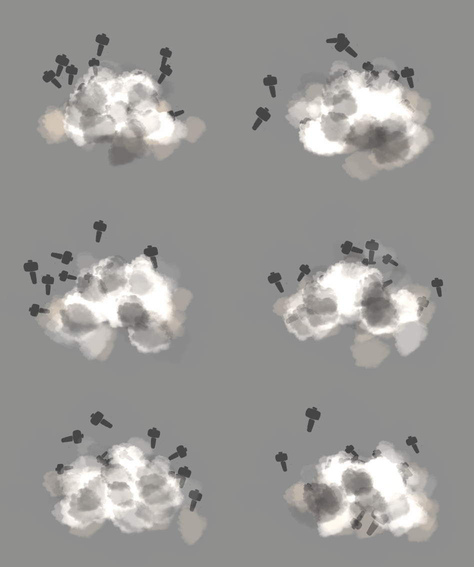
Sprint 2 has tested me on this in ways that I haven't been tested before. Part of that comes from the nature of having such a large group depend on me and part of that comes from the industry style pressure that the class is intended to simulate. Time is critical and everything has to be moving forward at all times. Sprint 1 was my opportunity for any and all pre-production, but even then we had to start everyone on their work at the same time. One of the first questions we ran into was asking what the level designers are meant to do without any tools in our game for them. We started them with paper prototyping, blockouts, and annotated maps, but their enthusiasm for the project left them with more time on their hands. That is when we discovered that Marc Billones, one of our fantastic level designers, had a hidden talent for particle systems. We asked him to do a couple simple ones and he came back with some incredible results.
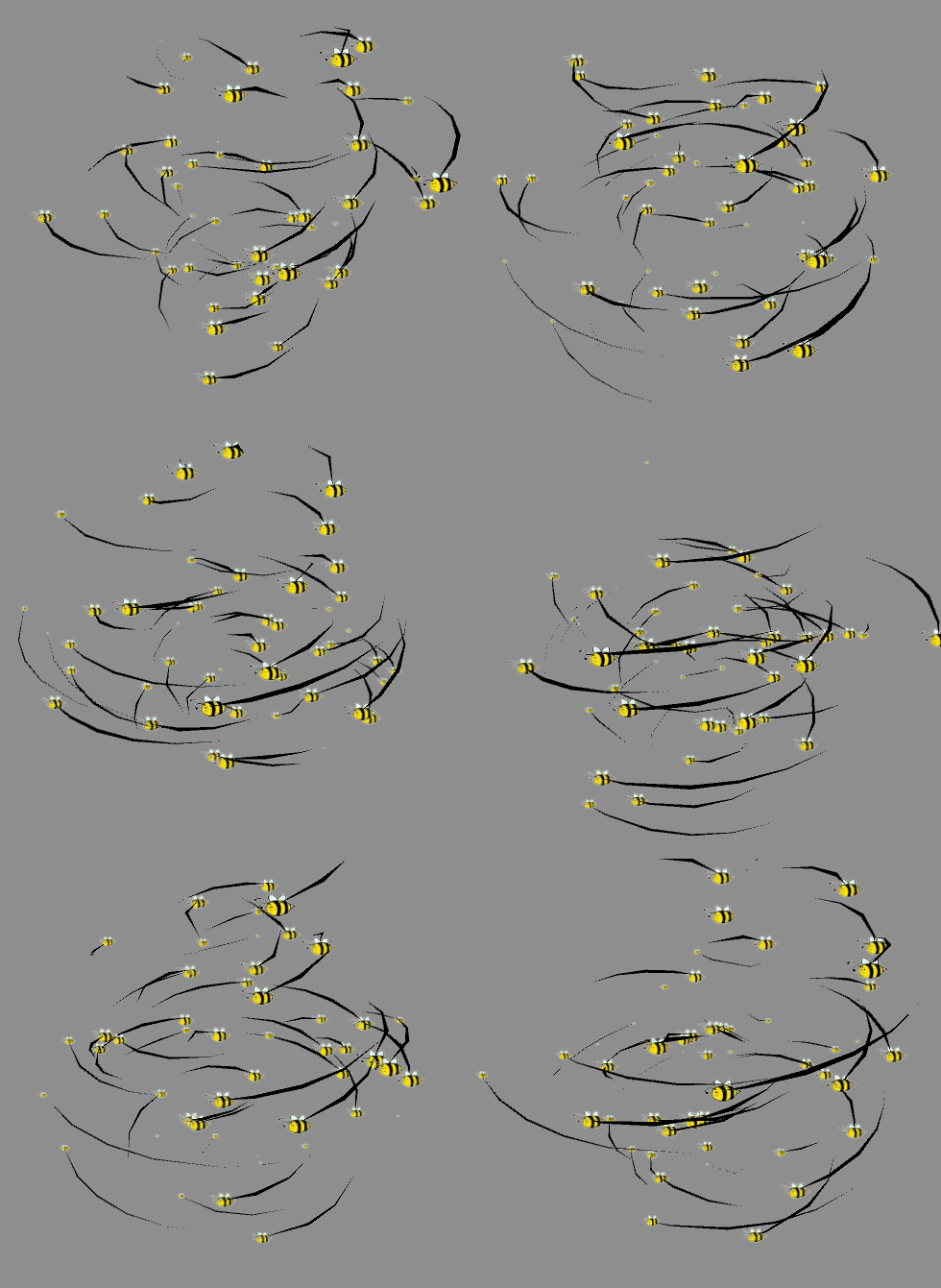
We could not be happier with how they turned out and this proved to be an invaluable use of his talents. Thanks to this brief dip into seeing our potential for polish, we became able and willing to add a number of mechanical components that could best utilize these graphical elements. You can expect a strong bee theme to the player's cards in level 2 of our game. However, knowing your group is more than just asking them to do something extra.
Sometimes knowing your group means knowing their strengths. For our programming, we divided each of the three programmers into categories they can best be suited for. Sky is responsible for our card system, Jacob for our tile system, and Alex for our AI. Midway through the sprint, all three programmers suggested that we swap away from a tile-based back end for our gameplay & AI and to make the game a bit more organic in movements and hit detection. I was originally opposed to this since it deviated from the original vision of the game and the documentation. However, I trusted my programmers enough to be willing to paper prototype it myself and to talk to our producer about it. Ultimately the decision came down to me and I chose to value the amount of time it would save by letting the programmers work on a familiar system using Unity's NavMesh instead of grid-based gameplay. Doing so also gives the player more responsive enemies which is always a big priority.
Sometimes the role of game designer also requires knowing more about the other disciplines in your group. I am fortunate enough to be working with a team that has so far met or exceeded my expectations with work, but there is a lot more peace of mind when I am able to check the code for modularity myself. The same can be said for models whose procedural textures need adjustments and leading the conversation of objective-based level design. Everything I have learned so far about game development has come into play and it makes me feel much better about the direction we are taking this game.
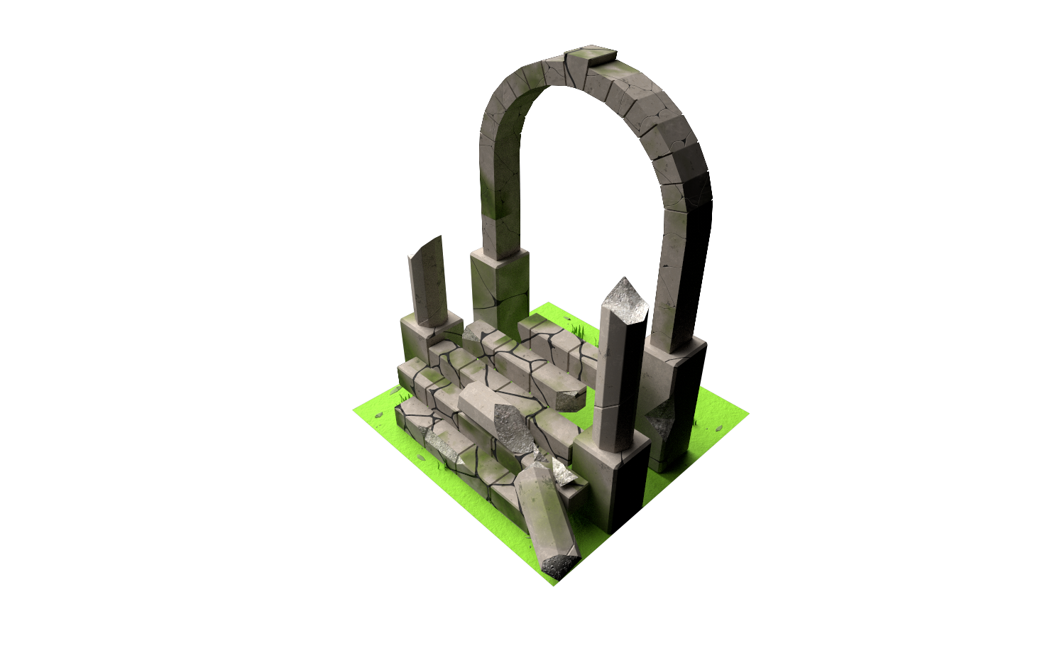
Perhaps my biggest hurdle so far has been my lack of vision for art style in this game. When I pitched the idea, it was a fresh new idea made on that day and was only guided by the words, "low poly" as a sort of catch-all that could be expanded on further. When I picture the gameplay, my mind goes to numerical calculations, system interactions, and representations of the game state using numbers. I had helped the modelers by creating a guiding document for them regarding technical specifications, but was hoping to let them be as artistically creative as possible. While this resulted in some fantastic work, it also required some work to need several revisions and not for the fault of the modelers themselves. The archway above went through more than a week of constant revisions to get right and I am eternally grateful to Cameron Schiff, the 3D artist, for putting up with it.
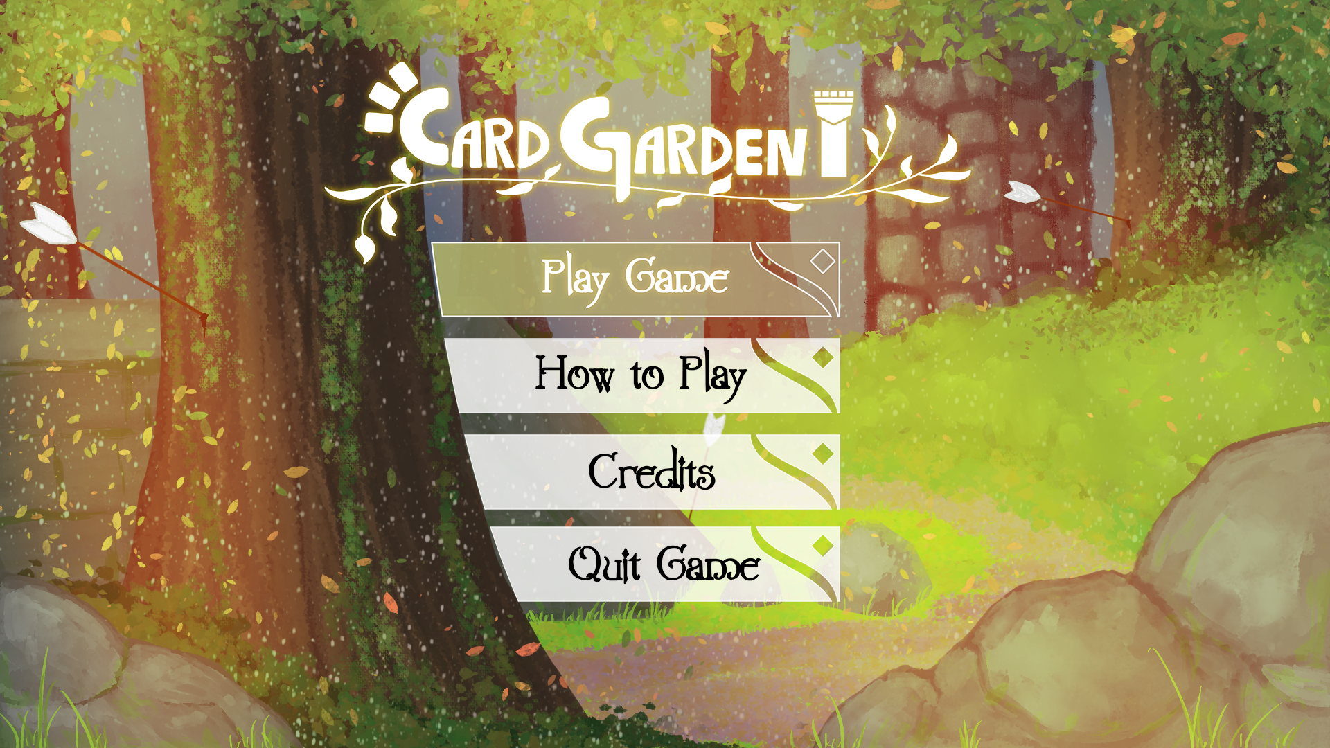
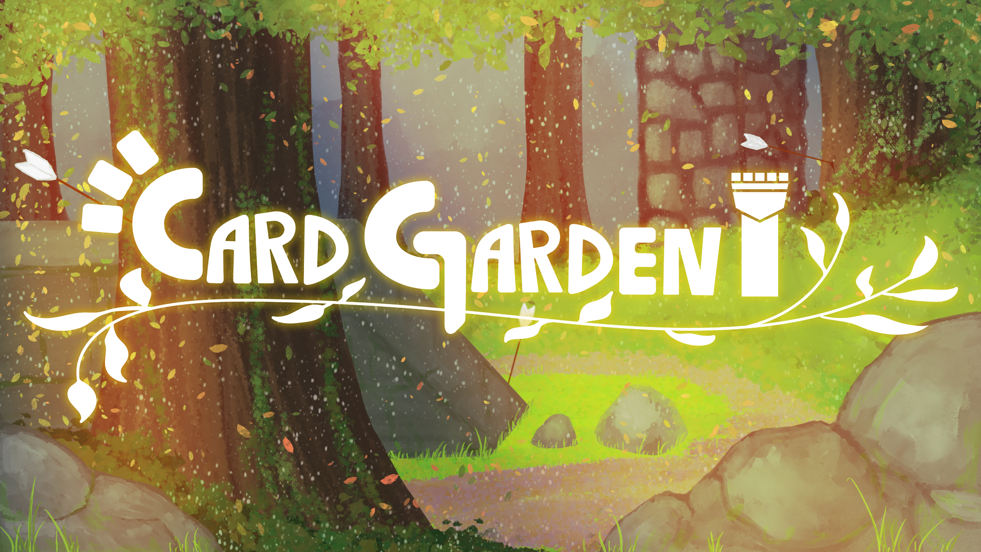
The same hurdle was encountered in our 2D artistry. We knew that we wanted something card related and something garden related, but that was it. It took a lot of discussion and reference finding before we settled on art style. Uniting that art style with our existing work made the task all the more frustrating. Had I spent as much time focusing on this in pre-production as I did with the gameplay systems, I believe we would have a more unique aesthetic. Once again, I am fortunate enough to have been saved by the absolutely excellent work of Atley Sakamoto who created this title screen for us.
The main thing I can say with certainty throughout this process in answering what tools a game designer uses is that it uses all of them. As a lead, there is no room for me to only be a designer-programmer. I have to be involved and dedicated to each of the components of my game and to make sure that it comes out the way I am envisioning it. At the same time, it is also my responsibility to be willing to change that game for the better, both against my original vision and guided by the principles created by the original vision.
Fortunately, there is one tool which I have yet to mention which makes the shaping of this game immensely easier. Playtesting. Playtesting is the best tool at my disposal for answering questions is the reason we prioritized tasks in the order we did. Our approach to developing this game has been to build a base featuring all of the core elements of the game and to build on it from there with a content pipeline that includes expanded systems, new cards, new buildings, and new enemies. This sprint we have completed our first step with all of the base elements endemic to our genres. Moving forward, I am most excited to be able to jump into the expanded systems and experiment with numerical interactions that allow the player to derive feeling directly from gameplay. It is a section that will require a lot of number tuning and is often a topic avoided by student projects for that reason, but is also one that I aspire to do professionally.
We are exceedingly happy with the feedback we got from our first playtest. Most of it, the good and the bad, reaffirmed the direction we intend to take with our most basic cards. We also had a very wide range of feedback from our playtesters in certain sections which gave us more insight onto which parts of the game they were most able to connect with. Individual cards received feedback nearly identically to where we would rate them ourselves, which tells us that our own estimates were accurate. The only card with conflicting feedback was one of situational use and it looks like the people who needed it rated it highly and those who did not need it did not rate it highly. The depth of feedback we received on lane length, towers, minions, gold, and enemies all felt great to read as we had created elements with a lenticular design. That is to say that they were all easy to grasp by the players but offered a lot of depth in decision making for mastery. We are very happy to take the game further in this direction and to act on the future features list we have from this feedback.
Sprint 2 and the playtest really made me focus on what it means to be a game designer and what tools were at my disposal when solving any problem. Now that we have a playable build, it is up to us to make sure that we improve on it by adding as much lenticular depth as possible. I am always fond of complex systems, but I believe this game is at its best when approachable and with opportunity to show mastery. Next time I hope to be able to share more about the systems of Card Garden and more about how we used them to achieve this goal.
Au revoir,
Arjun Gambhir
Game Designer
Files
Get Card Garden
Card Garden
Tower Defense Card Game
More posts
- Design Postmortem - Card GardenDec 17, 2020
- Production Postmortem - Card GardenDec 14, 2020
- Design Blog 6 - Card GardenDec 03, 2020
- Production Blog 6 - Card GardenDec 03, 2020
- Design Blog 5 - Card GardenNov 11, 2020
- Production Blog 5 - Card GardenNov 11, 2020
- Production Blog 4 - Card GardenOct 27, 2020
- Design Blog 4 - Card GardenOct 27, 2020
- Design Blog 3 - Card GardenOct 13, 2020
- Production Blog 3 - Card GardenOct 13, 2020
Leave a comment
Log in with itch.io to leave a comment.