Design Blog 5 - Card Garden
Good twilight friends,
As we transition to the end of our project for the semester, I find myself in new territory in game development. I have made plenty of student games, game jams, and hobby projects in the past, but never before have I set time for polish and tuning. It was never a big priority in those smaller games and I have learned since then that it should have been. Using the generous feedback we received from our instructors and from our playtesters, we spent the majority of Sprint 5 focusing in on the user experience. New feature development is mostly deprioritized and all resources are currently dedicated to addressing any concerns we might have had. As always, for a detailed breakdown of all of the work we completed this sprint, our producer, Alex, has a very informative producer blog here. You can also playtest our new build which is attached to this post.
A first consideration when entering this stage of development is to look at the project's scope and compare it to what was completed and what remains to be completed still. As the designer for Card Garden, it is easy for me to feel like I have completed very little of what I wanted in this semester. I still have grand dreams for a deck builder, micro levels, card customization, build synergies, card filtering, signposts, recursion mechanics, enemy types, class fantasy, unique properties, eclipse & solstice meters, custom game modes, and so much more. There is so much left that I want to do that there simply was not time for. Card Garden is a game that could be scoped to AAA standards and beyond and still not be 'done.' However, I am not at all upset by the amount of work we have or the progress we have made. The wisdom of my producer has kept my scope goals in check throughout this semester and I am quite happy with the total amount of content we are able to create using the designer tools we created. The systems approach resulted in a game with lots of possibilities and everything built has been a mostly efficient process so far.
The second consideration when entering this stage of development is to look at what should be cut. The designer adage to kill your darlings exists for a reason. Looking through an objective lens, the feedback we continued to receive told us to shift our focus to clarity. I am fond of complexity to a fault and players simply are not. Complex systems are only as good as they are intuitive to the players. For this reason, we had to take a step back and look at the total amount of resources to make our elemental upgrade and multiclass system finished and intuitive to the player. While both core concepts of that system are intuitive in other games of lower complexity than ours and it was very doable, it was also not an effective use of our resources. The programmers built the framework of it, but they never got the content of it working as intended and the visuals to make it work are deep in our list of priorities. Notably, cutting the feature barely changed the play experience, proving it was cuttable in the first place. I do wish we had explored the idea earlier as it could have added a lot of depth to the game for our target audience's desire of approachable mastery decisions. However, the system was still several iterations away from where it needed to be and was too focused on making something completely new rather than being an iteration on something else. Our time was better spent elsewhere.
The main consideration for us when entering this stage of development is one I should have considered a long time earlier. User experience. UX design is an often underrated component of design that can make or break a game. Despite all of our user stories being written "As a player, I would like..." it is still quite easy to forget about the player's needs. While much of UX work involves a lot of putting in finalized UI assets, it most definitely is not just UI work. We use the GUI to convey information that cannot be conveyed through gameplay feedback alone. In our case, this includes interactable elements such as the card system and our pause menu and also game information such as our game timer or the wave number. Our tutorials, also added this sprint, have the sole function of teaching the player how to interact with and react to the game's mechanics. Along with the UI, we have put a lot of emphasis on feedback through audio and particle effects. Every tick of gold income from an Obeya or a slain Adventurer yields a gold coin particle effect. Every tower and minion attack has their own sound. These do more than immerse the player. They add to the cause and effect registry in that player's brain and helps them associate the sound of a 'thunk' with the falling of an enemy health bar. Teaching the player how to play is one of the most important parts of their First Time User Experience. In a sense, it is selling the game just as much as the promotional artwork does.
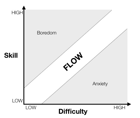
Finally, we have also adjusted our encounter difficulty to follow a metaphor of a beating pulse from a heartbeat. The level of each enemy increases and decreases regularly so as to provide moments of challenge followed by moments of relief in a loop that gets progressively more difficult. This was done to alleviate the feedback we received from our players that being ahead removed the challenge entirely and being behind made a comeback very difficult to achieve. Rather than adjust our levels or cards, both of which are more permanent fixtures with multiple consequences, we have decided to adjust our spawning behavior and the pacing of the enemies.

The goal here is to keep the player in a state of flow using incremental increases rather than straight linear progression. Our high skilled players were reporting some boredom and our low skilled players were reporting difficulty. It is our hope to normalize the difficulty curve using this 'pulse' approach by bringing more information to the lower skilled players and more feedback for all players to enjoy. With that, we know we have a lot of playtesting that needs to be done in order to make sure that the changes we made are the right ones. Now more than ever, our playtest feedback is helping us make informed decisions and for that we are always grateful. As a designer, this is where I feel most challenged and have personally turned to external resources the most to see how to solve problems. I can only hope that I am making good decisions, regardless of the outcome, but I know that I have a lot to learn still. In any case, I am forever grateful for the opportunity.
Tchau,
Arjun Gambhir
Game Designer
Files
Get Card Garden
Card Garden
Tower Defense Card Game
More posts
- Design Postmortem - Card GardenDec 17, 2020
- Production Postmortem - Card GardenDec 14, 2020
- Design Blog 6 - Card GardenDec 03, 2020
- Production Blog 6 - Card GardenDec 03, 2020
- Production Blog 5 - Card GardenNov 11, 2020
- Production Blog 4 - Card GardenOct 27, 2020
- Design Blog 4 - Card GardenOct 27, 2020
- Design Blog 3 - Card GardenOct 13, 2020
- Production Blog 3 - Card GardenOct 13, 2020

Leave a comment
Log in with itch.io to leave a comment.