Production Blog 6 - Card Garden
Howdy everyone, and welcome to the last update I'll be giving you on our team's progress on this project! I say this with bittersweet excitement, for I am incredibly proud of my team and the game we've made all thanks to their hard work that they've put in these past four months. I won't get into the sappiness now, though; I'll save that for the post-mortem! For right now, let's jump into some sprint statistics!
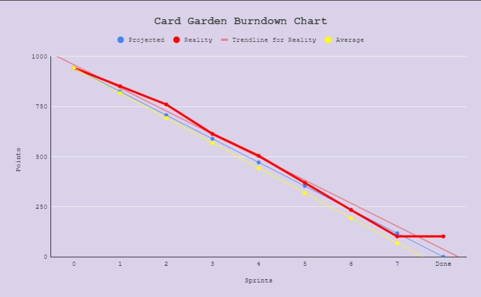
We've changed up the chart to reflect a little better what our data is really saying so we can more accurately see where we'll fall according to our velocity. We've remained pretty consistent throughout the entire semester, so I'm confident that we'll be able to pull off everything we've got in this last sprint quite nicely.
The data on the burndown chart is actually very important to me, both personally and as a producer. From the very beginning I was adamant about planning out the semester in a way that would result in no crunch towards the end. It's very important to me that my team is rested and healthy, because I know they've been putting a lot of hard work into this project, in addition to several other things as well in their lives. What with personal life and the state of the world at present, I did not want anyone to be put under any more stress than necessary. I like to think that this is something we're coming to see, but only time will tell for sure! I am hopeful that things will work out for us to have a smooth last sprint.
Anyway-- without further ado, let's jump into the awesome work the team did in this sprint!
Programming
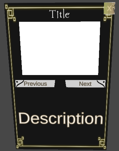
The Curly Bracket Crew was once again hard at work on both behind the scenes and visuals for the player to see in the game. This sprint saw a lot of refinement on systems we've been working on for a bit, as well as a few new things that are underway and expected to be completed quite soon! One of the things in question that got a nice overhaul was the tutorial pop-ups system. This is tied into the UI of the game (which also got a nice clean-up) and shows the player a series of info-popups that show them a little bit everything, all the basics that they need to know to play the game. All of that information is also in the new How-To-Play pages, which were both created and implemented in this sprint as well! They are able to disable/click away these pop-ups whenever they want as well. Players also now have the ability to right-click on any object in the game (Player and Enemy Units) and see that object's stats in a little pop-up as well! We also have made significant progress on the Save and Load system, which is soon to be nicely wrapped up! We've been testing along the way to make sure that it doesn't interfere with any of the other systems we've been working on throughout the semester. Last, but certainly not least, we've been starting the process of implementation; this refers to things like particle effects and assets that are being finished, such as some Spell particle effects and Level 3 assets.
Below are examples of the visual improvements and additions we've made:

Level Design
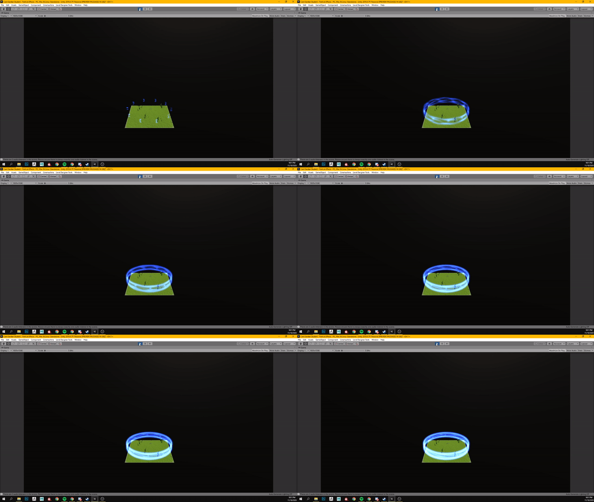
We now have a completed level one and level two in our game! Our level designers have been very busy bees this sprint. Thanks to Justin, Level two is now no longer floating in empty Unity void space, and has been fitted with some lights to add a more magical look and feel for the players. Level 3 has been underway and in the works of refinement in terms of Encounter balance. Marc has been a hero working diligently on his level, and we're excited to have it in the final build. He will be working on overall beautification next sprint with finalizations. We've also had our other Level Designer Ryan completely finalize his level and work on other VFX things, like an indicator for the buildable tiles.
Here are examples of the visuals they've done:

3D Modeling
Our modelers have been just as busy creating important models that will soon be implemented into the game! Cameron has been hard at work on those Level 3 tiles, all of which are coming out beautifully as you can see below this paragraph. We really appreciate his dedication to getting them done as quickly as he can (without sacrificing quality) so that they can be in the hands of our level designers. He completed quite a lot of them this sprint, and we can't wait for players to be able to see them in action! Jeremy has been working hard on the last few buildings as well; this sprint he created the Level 3 Lair, which also looks amazing and very in-theme with the look and feel of Wasteland that we're going for with this level. He also created an alligator prop for Level 2, and added an animation to it to bring it to life! Seeing as we're wrapping things up pretty soon, his work for crucial assets has come to an end, so we now have him working on polish assets that can be added in by level designers for pure decorative purposes. Last, but definitely not least, Joseph has created our Winter Minion, which looks absolutely amazing! We chose to let loose with a but of creative freedom with this player unit because we decided not to send it off for rigging; we're going to be animating it in Unity ourselves. I created a concept for Joseph to take inspiration from and he took it away! He also added his own animation to the snowflake at its core, to add his own little touch to it. He is in the same boat as Jeremy and will now be doing pure polish assets. We are extremely happy with the models and the touches that our modelers are putting on them; they've done amazing jobs this semester and I can't wait to see them finish it off strong!
Here are some examples of their work:


2D Art
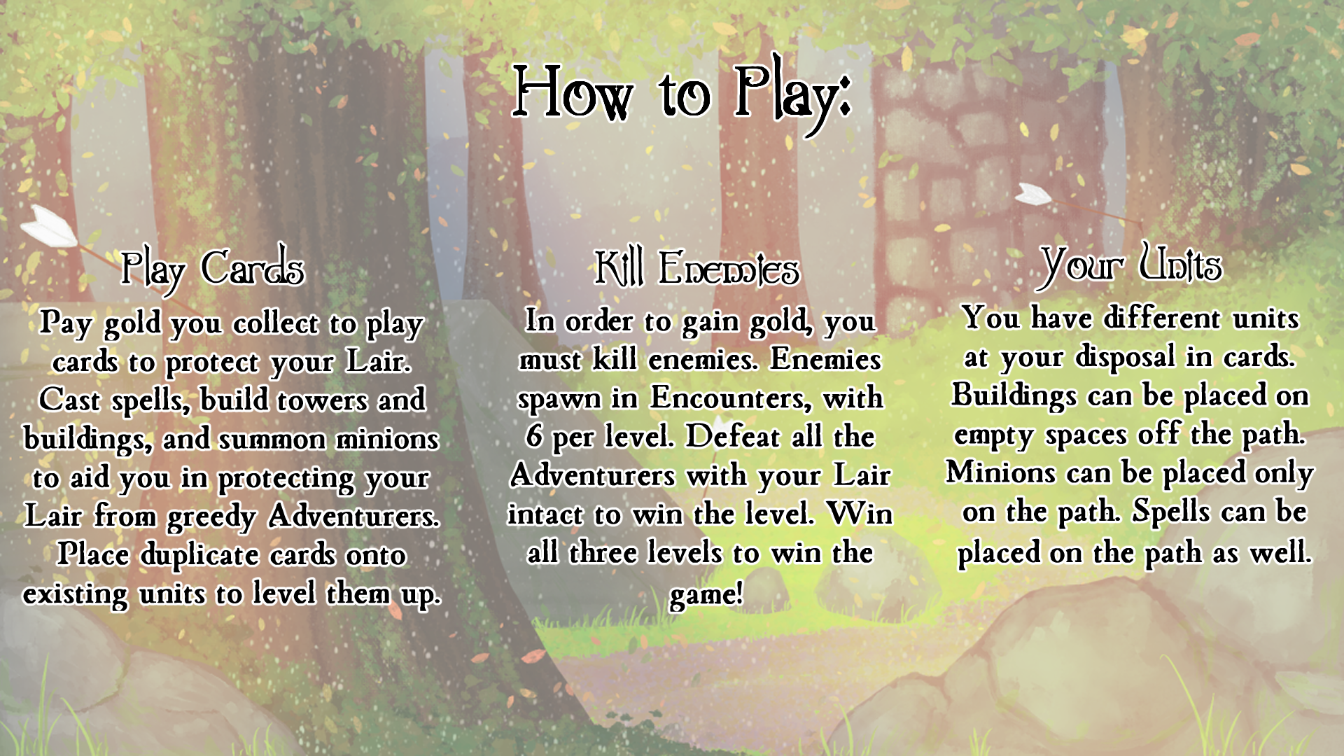
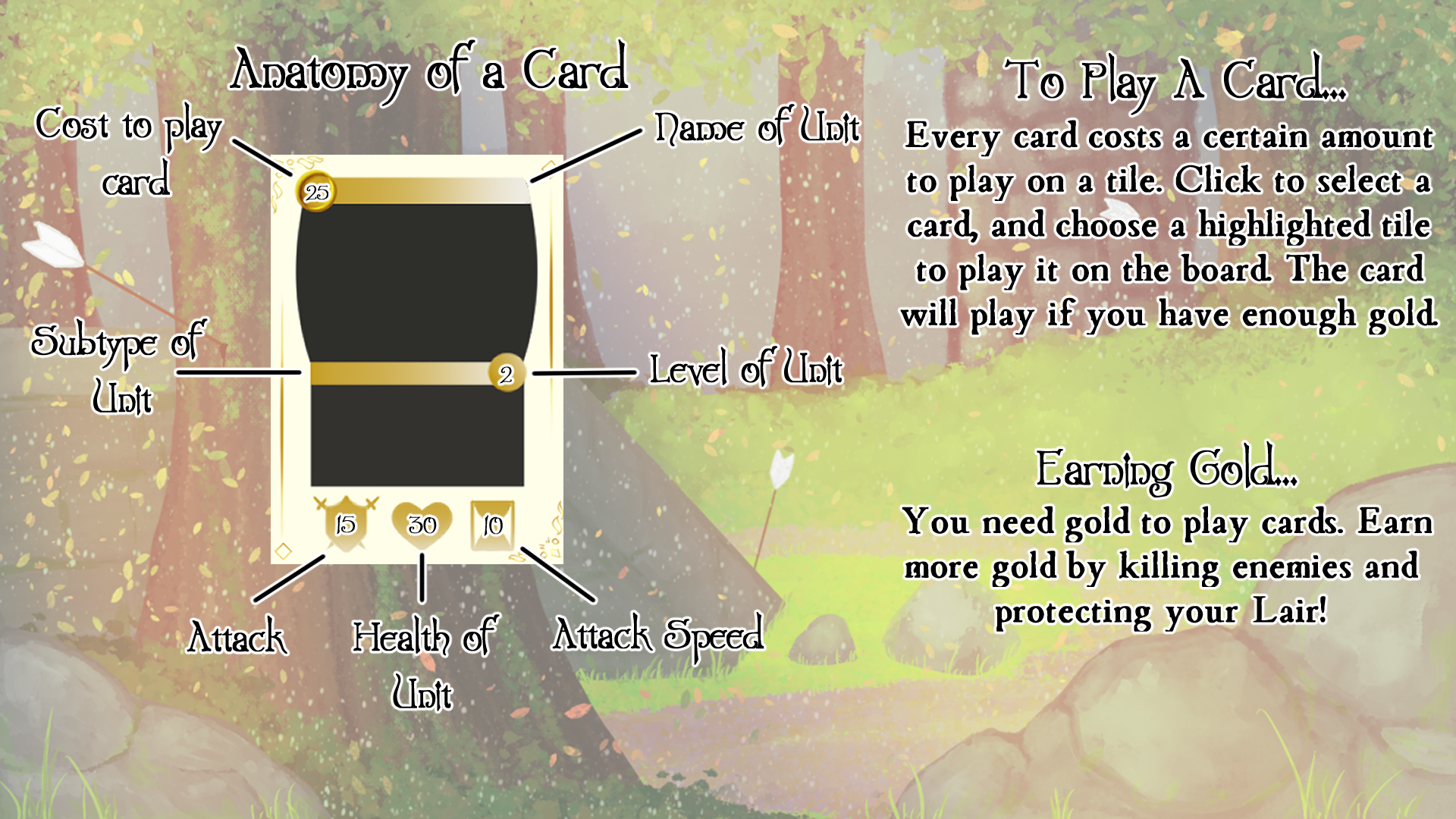
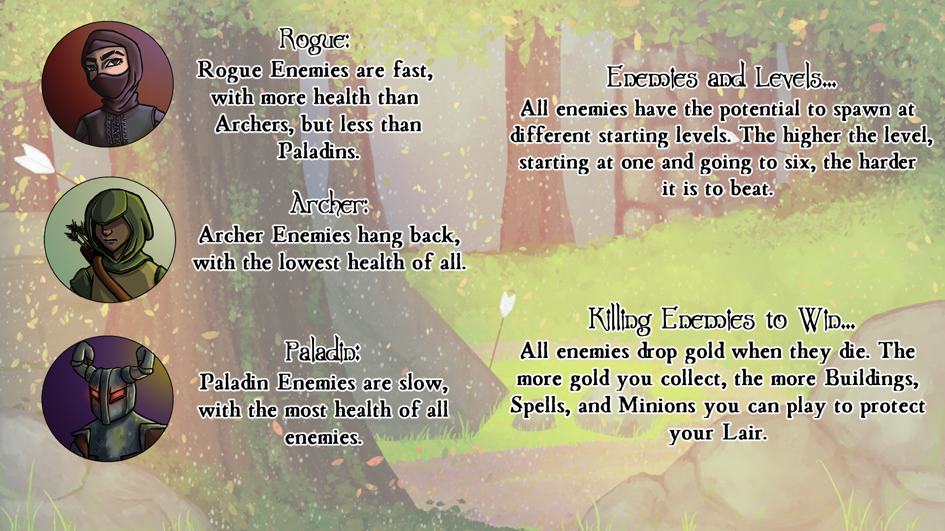
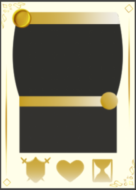
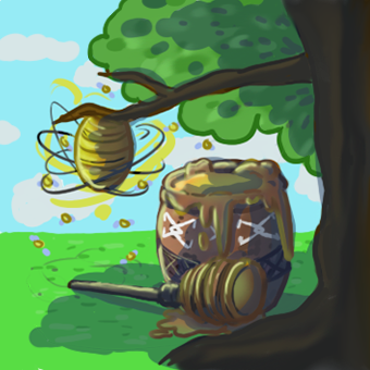
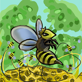
2D art in this sprint came from both our team and the 2D Art Team. From our team came the How-To-Play screens, which gave players the rundown of how to play the game as concisely as possible. There will be an iteration of it next sprint to make it even more concise. We also created the newest Card Template for our cards. We'd already had one made earlier in the semester, but the way we wanted to display the information and the information we wanted to display itself has changed drastically, to the point where we needed a whole new set-up. From the 2D Art team, we received two new portraits from Gabrielle! A lovely portrait for the Queen Bee Minion, and another for the Honey Pot building.
Here are the art works below:
Animation
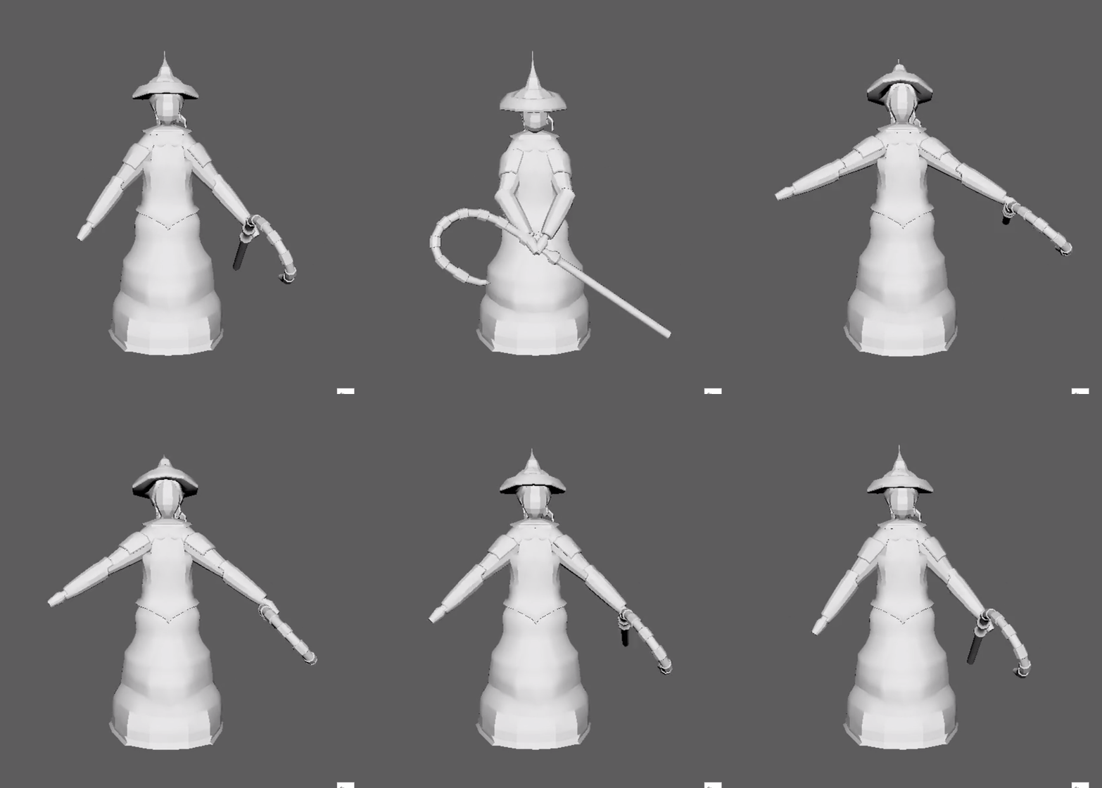
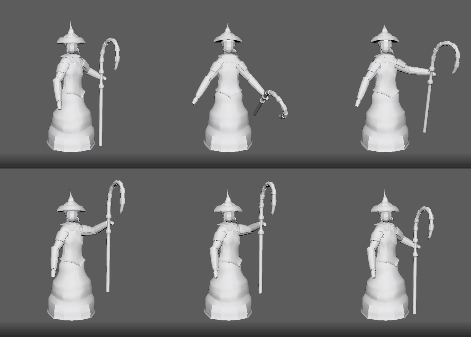
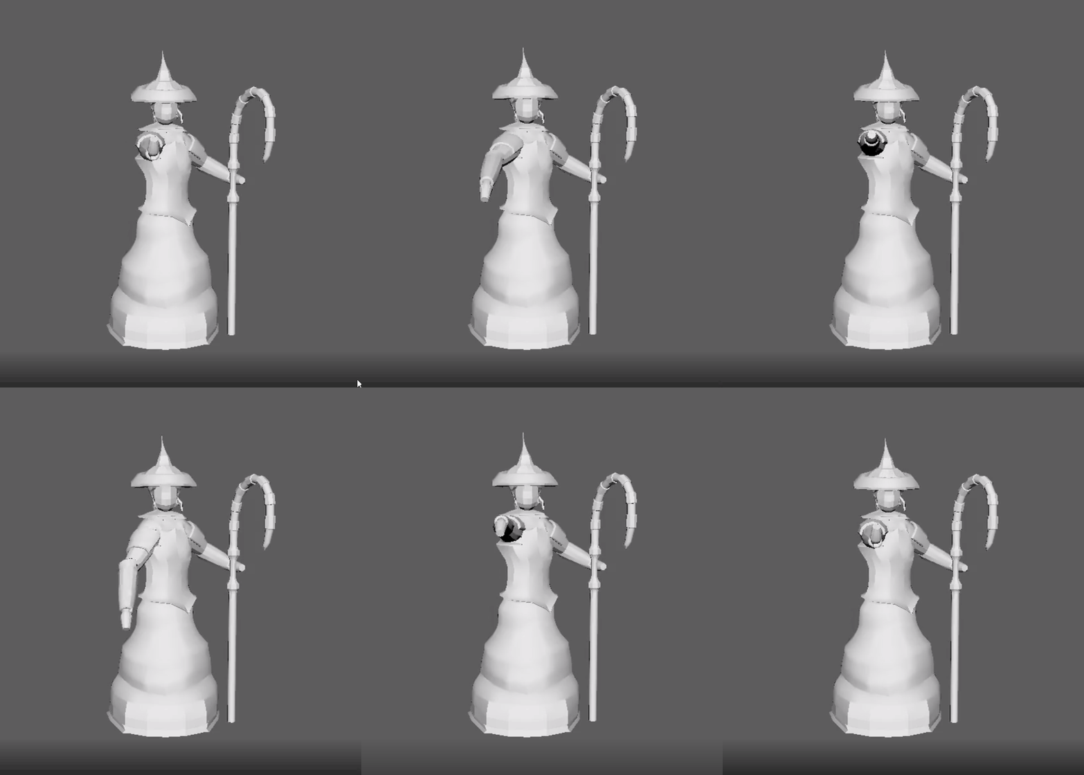
This sprint saw an animation from Tim from the Art Team! He created a few animations for our Gardener Minion and is currently working on the Rogue Enemy. He gave us an idle animation, a Spawn animation, and a Staff/Attack animation. They all followed the direction we sent to him and achieved the vibe we were hoping for! We are excited to see how he takes on the direction we've given him for the other units in the game!
Here are the animations below:
We're approaching launch day very soon! I hope you've enjoyed following the growth of our project, and seeing all of the incredible work everyone on this team has put into making this game. They've all helped bring this vision to life, and it wouldn't have been possible without their dedication and hard work. From Team Card Garden to you, thank you for sticking with us on this journey! We hope to see you on December 8th for the launch of our game!
Stay safe and take care!
Files
Get Card Garden
Card Garden
Tower Defense Card Game
More posts
- Design Postmortem - Card GardenDec 17, 2020
- Production Postmortem - Card GardenDec 14, 2020
- Design Blog 6 - Card GardenDec 03, 2020
- Design Blog 5 - Card GardenNov 11, 2020
- Production Blog 5 - Card GardenNov 11, 2020
- Production Blog 4 - Card GardenOct 27, 2020
- Design Blog 4 - Card GardenOct 27, 2020
- Design Blog 3 - Card GardenOct 13, 2020
- Production Blog 3 - Card GardenOct 13, 2020
Leave a comment
Log in with itch.io to leave a comment.