Designing Glass Castle #4
Hello, and welcome back to the design blog for Glass Castle. Once again, I am the game's designer, Brie Parr, here to share with you the updates for this sprint.
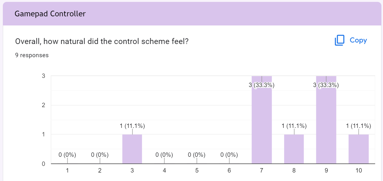
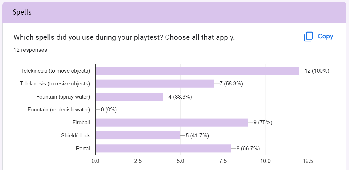

Playtesting continues to be a valuable source of feedback for Glass Castle. This time around players noted that the character's movement was still a bit slidey and the controls still feel slightly unnatural, so that will be the number one focus for our programmers for going forward. Style wise, players have been enjoying the art style and actually getting to see models and UI elements implemented with gameplay. One of the other major wants for players is having a section of the menu that not only tells them what buttons do what, but a step by step guide for how to cast a spell. Telekinesis is specifically the most complex spell, but also the most important for players to know how to use in order to progress in the game. Therefore, I plan to implement the spellbook menu and some tutorial dialogue into the game as soon as possible.
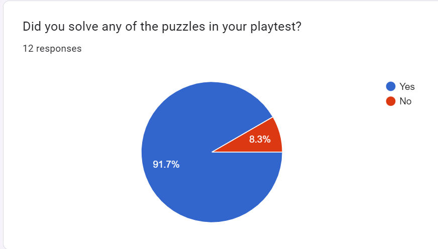
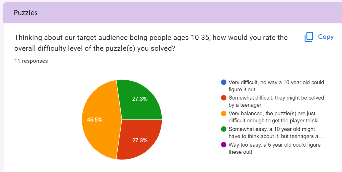
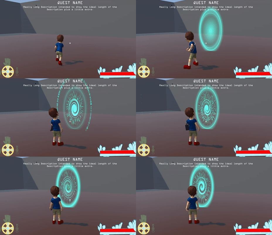
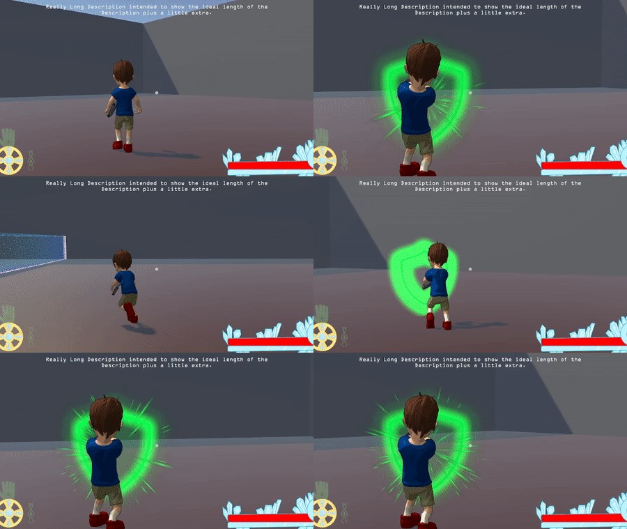
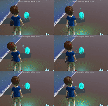
Let's move on to programming and VFX. As mentioned several times before, the spells are the most important aspect of this game, therefore, they need to not only feel good, but look and sound good as well. This sprint, Christian took up the task to create lots of immersive visual effects for each spell. Some of my favorites include the portal spell and the shield spell. I gave him a very vague description of each and he created effects that I could have never dreamed of! These visual effects are so important because they help the player believe that they have magic. On the other side of programming, Colin has been working to get enemy scripts created so that enemies can damage the player, be damaged by the player, have a patrol area, and be able to detect if the player is in their patrol area. One of the most important aspects of this enemy programming is the health bar that is displayed above the enemy that communicates to the player that they are doing damage and how much health is left before the enemy is defeated. Colin was easily able to create this health bar, which even changes colors from green to yellow to red as the enemy's health is depleted.
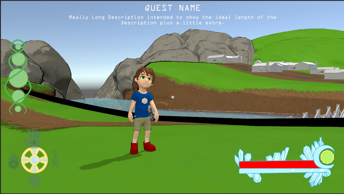
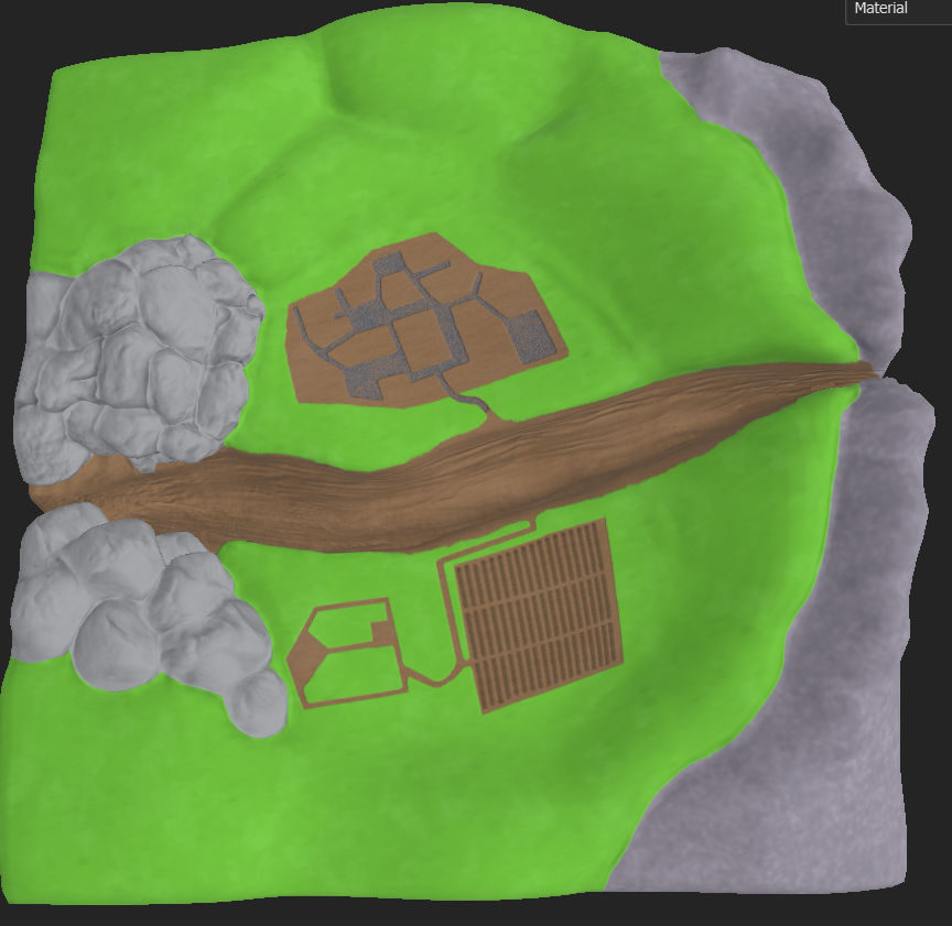
Next, let's talk about level design. The most major accomplishment in level design actually spills over to 3D art; and that is implementing the finalized sculpted terrain for World 1. We discovered early this sprint that using the terrain editor in Unity would not be an option since we would not be able to apply our toon shader to it, which is integral to the game's design. Therefore, I was tasked with finding a way to take a basic terrain layout from Unity and into Maya and Zbrush to transform it into a model instead. This proved to be more difficult than anticipated. There are several paid options for converting terrain into mesh, but our goal is to spend no money on this production if at all possible. I discovered a solution, but it is taking the long way around. What I had to do was export the terrain as a raw file, open it in Photoshop, export it as a .jpg height map, create a high poly plane in Maya,and apply a texture deformer with said height map. This got me a base model with tons of geo, but it stil wasn't enough for the amount of detail I wanted, so I took it into zBrush and sculpted it to my liking (and I admit I spent a fair amount of time retraining myself how to use zBrush). Finally, I retopped, UVed, and textured it, baking the high poly onto the low poly. I am extremely happy with the result and I will do this same process for the remaining terrains.
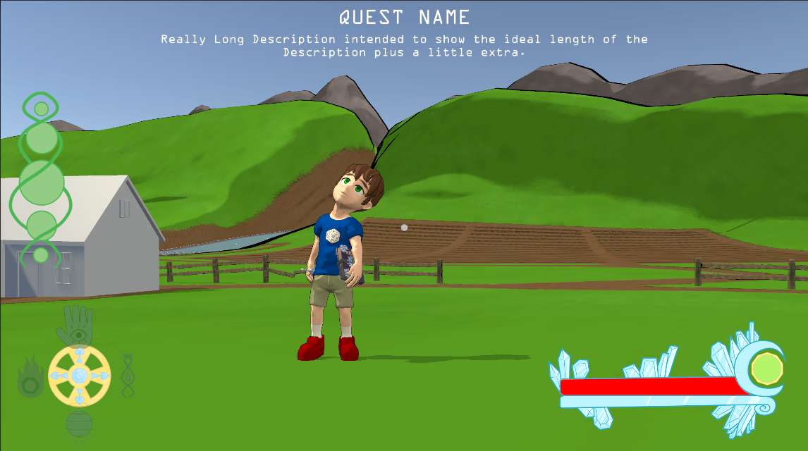
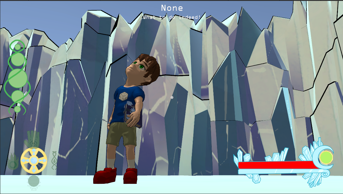
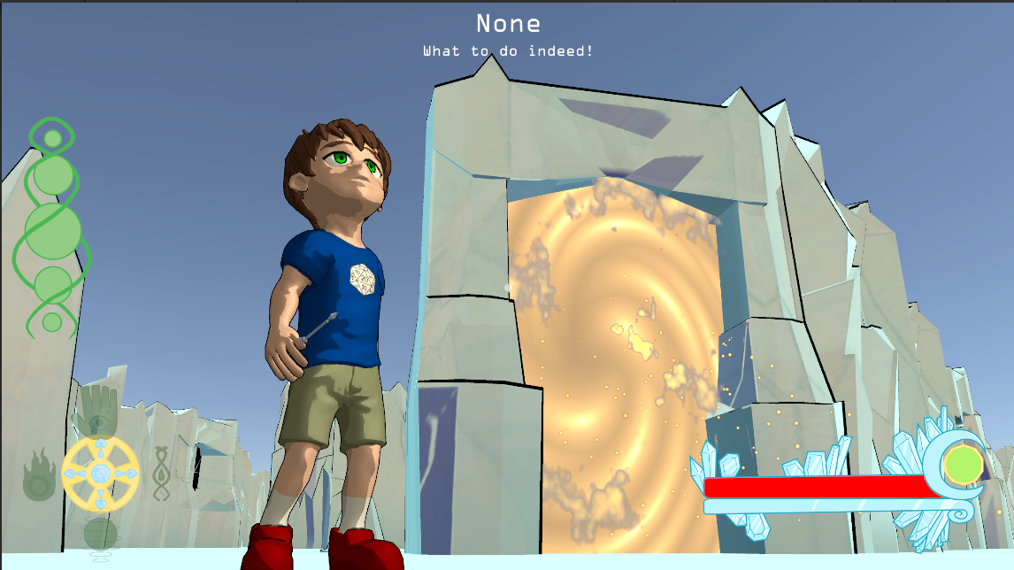
But I wasn't the only one doing level design, my dedicated level designers also contributed (obviously). Davis was able to get a built out iteration of the Castle implemented into the playtest so that players get a small taste of the game's magical portal aspect. Despite it being relatively small, I actually did get lost the first time I explored the Castle. This is both awesome, and... not awesome. I want players to be able to explore and feel like they are in new areas of the Castle, but I also want them to have landmarks to ground them so they don't get completely lost. I a great solution actually came from Christian when he created a visual effect that is specific to the portals in the Castle. Eventually, each of these portals will have a slightly different design that correlates to the World that they lead to. For example, the arid alien village is represented by an orange-brown color and sand-like particles. Speaking of World 2, Chris spent the sprint not only creating the base terrain for the well puzzle, but also got to finish the ambient sound design that will play in the background of the level. As I've said before, music is one of the most powerful things that makes players believe they are in different worlds.
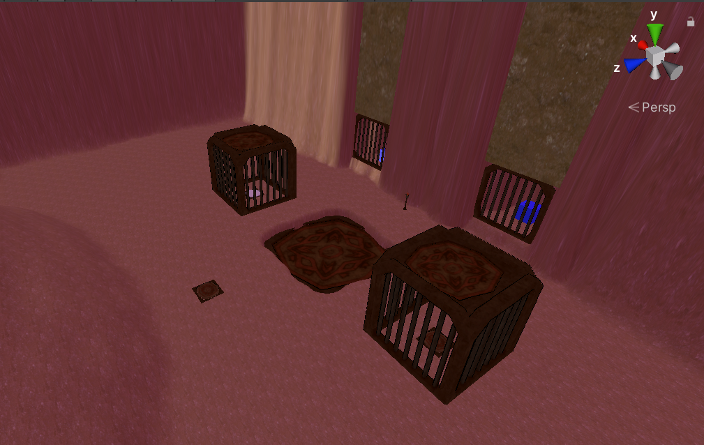
Last but not least, we have some amazing artists that continue to make my vision become reality, and they deserve to be recognized individually (and in no particular order). First up, we have our 2D artist, Mel. This sprint, they've created stylized menu buttons to further immerse the player into the game.
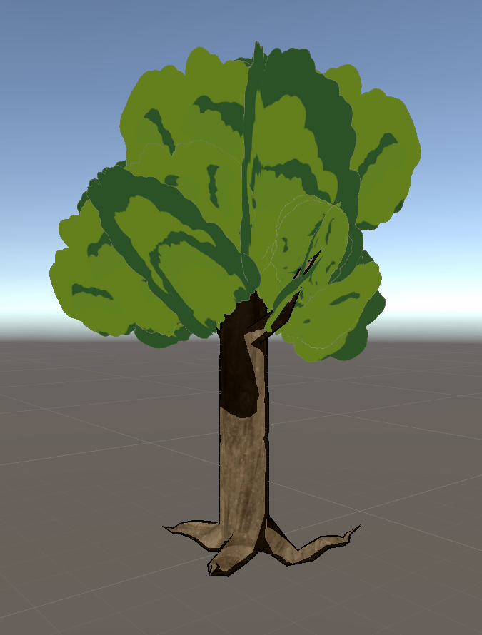
Next, we have one of our 3D modelers, Cyrus, who created several props this go around, but I am most excited for the trees! (Small side note, I wanted to avoid having my modelers make trees due to a past project of mine requiring me to make WAY too many realistic trees, and thus, traumatizing me). I talked to Cyrus ahead of time and asked him if he'd be comfortable making a few variations of low poly, stylized trees. He agreed to it, and with some advice for how to go about it, he absolutely blew me away!
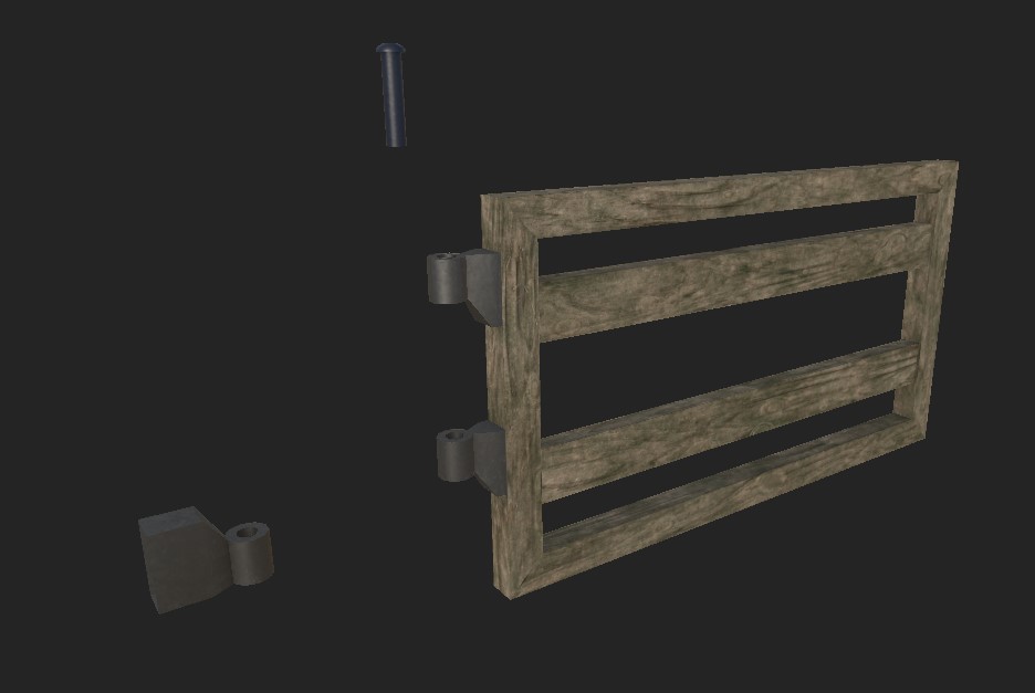
After that, we have William, who continued to create some very practical modular buildings, as well as some other small props, such as the gate that goes along with the fence in World 1. William does an awesome job with modular buildings in particular, he is able to make enough pieces that they can be combined in many unique ways while still being low poly.

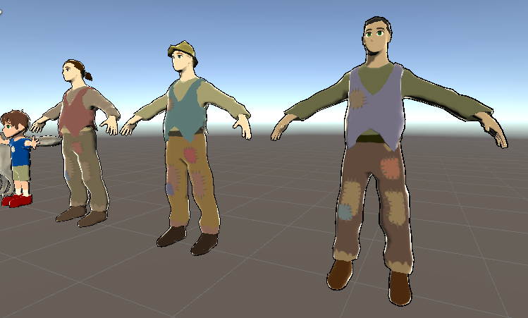
Finally, we have Liam, the talented character modeler. This sprint, Liam was able to create an NPC for World 1 with varying accessories that can be swapped out in Unity for variation. He also provided several textures for each piece for further variation, I asked him to include this variation for several reasons. The biggest reason is so that players don't think they are seeing the same person over and over again, which breaks the illusion of immersion. But I also opted for prop varyation because I thought it would give Liam a lot less work than having to model nine different NPCs individually.
I am optimistic for the upcoming few sprints left in the semester. I will be focusing greatly on implementation of assets and quests, as well as finishing the storyline for the game, which is what the original inspiration came from. See you all next time!
Get Glass Castle
Glass Castle
A game about letting out your inner child by learning magic, solving puzzles, and saving the Universe!
| Status | Released |
| Author | CAGD |
| Genre | Adventure |
| Tags | Aliens, Boss battle, Colorful, Family Friendly, Open World, portals, Space, Surreal, Third Person, Time Travel |
| Languages | English |
| Accessibility | Subtitles, Interactive tutorial |
More posts
- Design PostmortemDec 16, 2022
- Production PostmortemDec 08, 2022
- Designing Glass Castle #5Nov 10, 2022
- Production Blog 5Nov 10, 2022
- Production Blog 4Oct 27, 2022
- Production Blog 3Oct 13, 2022
- Designing Glass Castle #3Oct 10, 2022
- Production Blog 2Sep 29, 2022
- Designing Glass Castle #2Sep 27, 2022

Leave a comment
Log in with itch.io to leave a comment.