Designing Glass Castle #3
Hello and welcome to the 3rd design blog for Glass Castle! I am the game's lead designer, Brie Parr, here to share with you our progress for this Sprint. Let's jump right into it by talking about the playtest build that we were able to complete.

For this playtest we were able to get 11 playtesters, which is 3 more than last time. Though this is an improvement, I do plan on working to get even more playtesters in the future by reaching out to high schools, community colleges, and youth groups in my area beforehand to set up playtest sessions. That being said, the playtest data that I did receive was still very valuable. There are still plenty of bugs that need to be addressed, such as the player losing their Telekinesis cubes because they fell through the floor, or that the character animations would freeze every now and then, etc. These are examples of bugs with simple fixes such as not allowing the cubes to turn off colliders anymore and changing around the animation graph in Unity. However, many players said that the movement controls feel a little off, which will take a bit more time to solidify. Theme-wise, there was a lot of feedback in which players expressed that it was difficult to tell what they were doing because of flat textures or model scaling issues. I will be working to get more actual models into the next build, and even just putting basic grid textures on primitives or anything else that otherwise has no texture to avoid this confusion in future playtests.
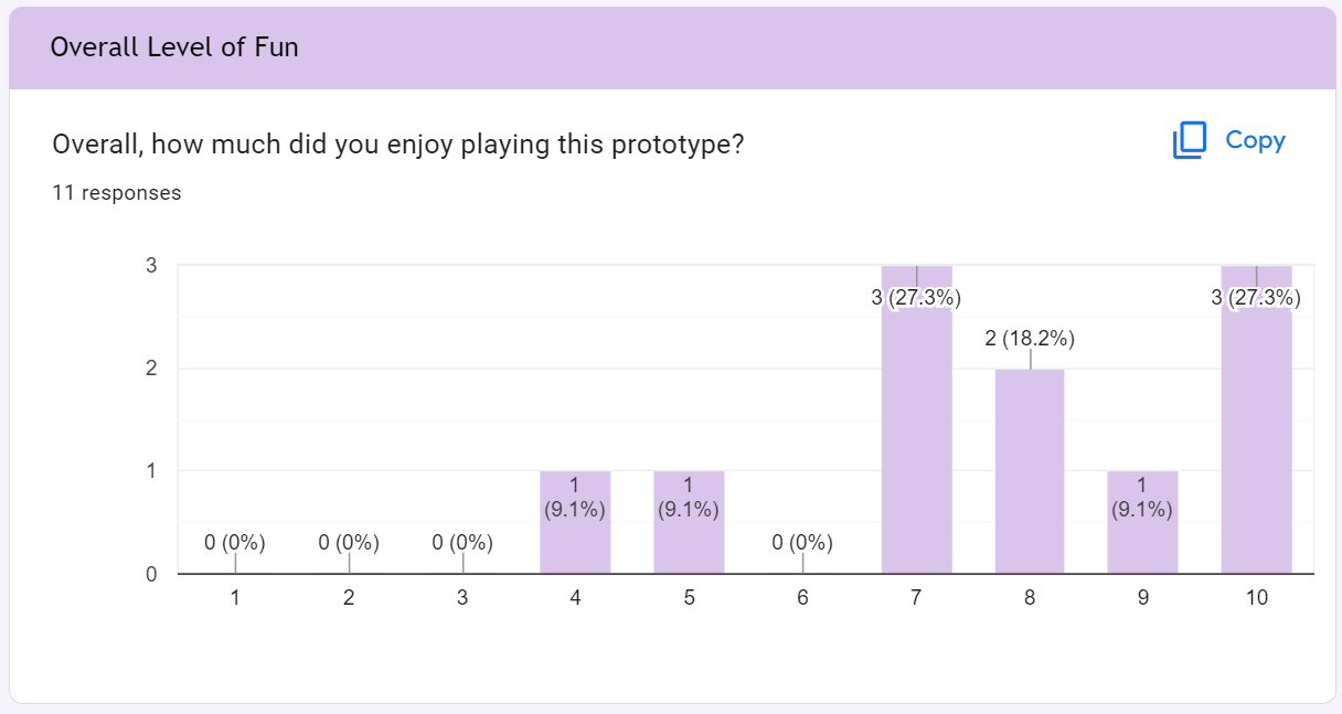
Despite the flaws, many players enjoyed playing this early prototype. And many of them were able to solve at least one puzzle even though there was no in game tutorial. It feels really good to see someone figure out what to do with limited prompting. The readability of the level design is something I really want to emphasize and get right going forward.
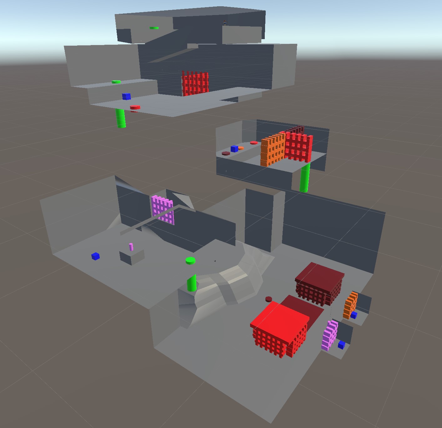
Speaking of level design, let's start off talking about our team's progress in this category. First of all, a lot of time and effort was put into the playtest level this Sprint. That being said, I wish I had been better at checking this design before the build came out. Up until I playtested our build, I had only seen screenshots of the level blockout, and therefore I didn't know what the scale was like for the player. It turned out that a lot of the placeholder models are way too big and they hinder the player's ability to see in some areas. Fortunately, I was tasked with modeling the actual assets that will be found in this puzzle area, so going forward the level designers will have a point of reference for the scaling of the level. Also, as a side note: I now am more familiar with GitHub, so I will be able to actually check levels before the build comes out so I can make more design decisions based on what I see.
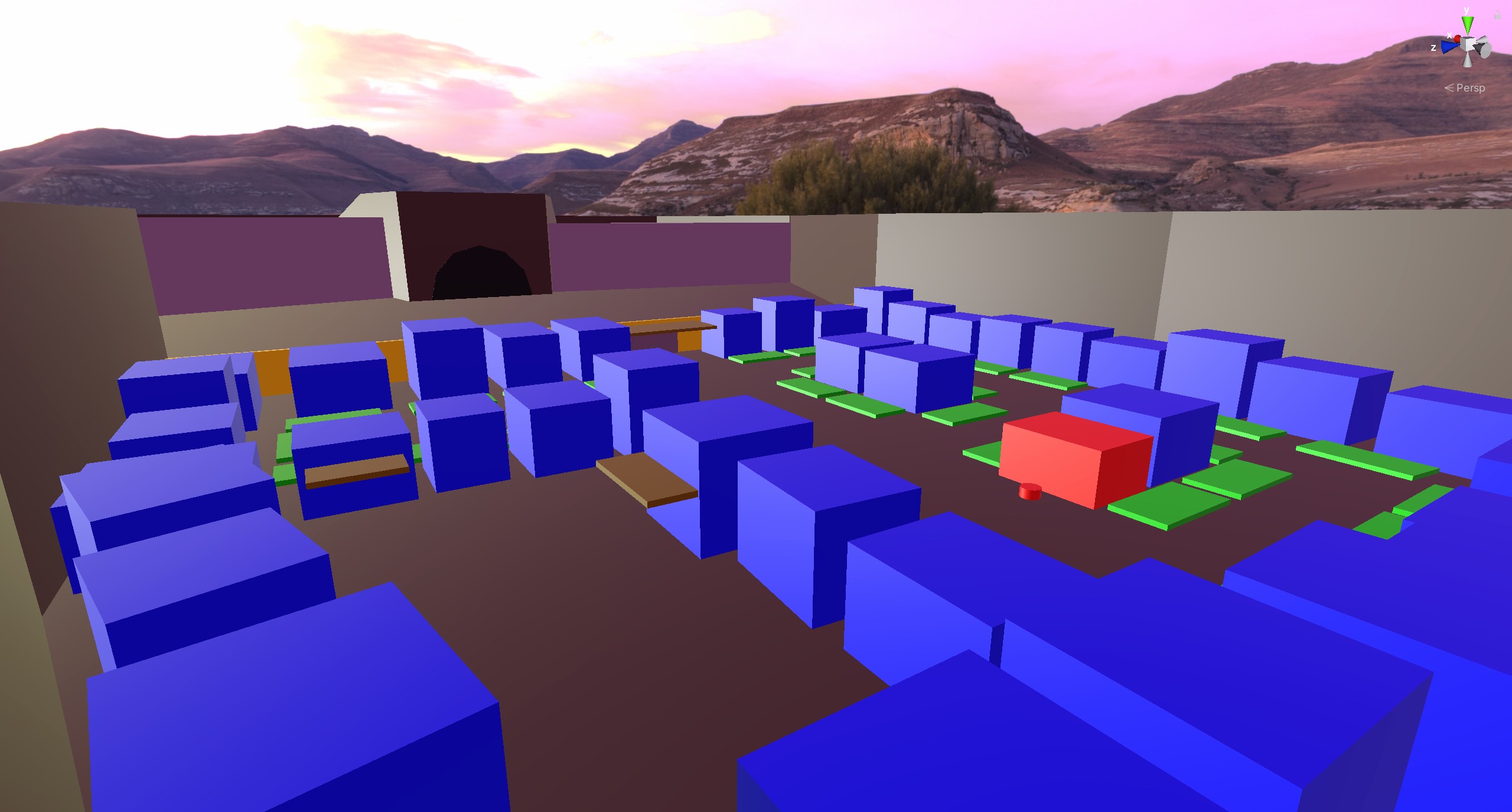
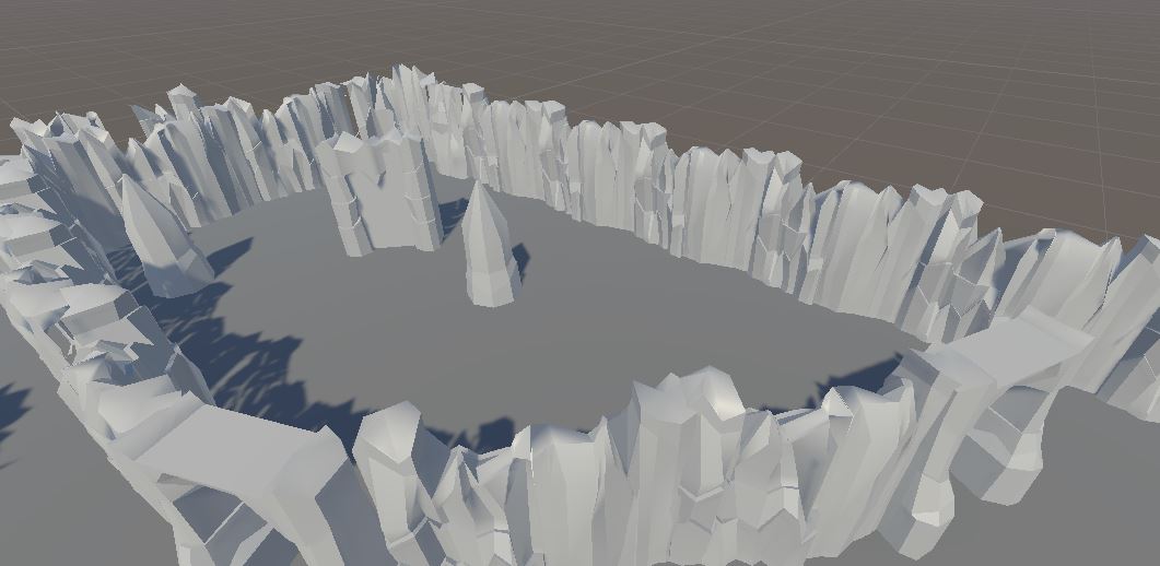
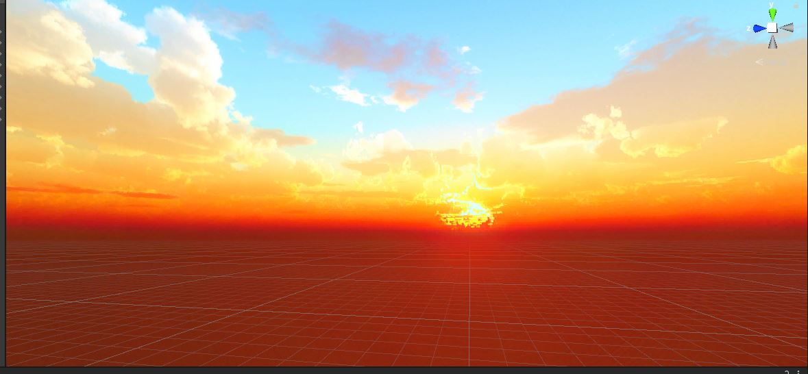
In other areas of level design, we have begun doing more blockouts of levels and even started importing actual assets. Some of my favorite assets are the skymaps that were found/created by the level designers. I specifically wanted the sky in World 2 to be a pinkish color because it is on an alien planet. Chris was able to edit a normal HDR skymap in Photoshop so that it had a pink hue to it, and it turned out looking exactly how I imagined. As for World 1, I originally envisioned it being a normal blue sky, but when I saw the beautiful orange sunset sky that Davis found, it immediately made me feel warm yet kinda conflicted since the top of the sky is still bright blue. This is exactly what I want World 1 to feel like, since World 1 takes place in the direct aftermath of a battle: there is relief because the fighting is over, but the mess and feelings of unease remain.
The final thing I want to highlight as far as level design goes is that we finally have a bit of ambient music. This particular score will play on a loop in the Castle hub area as well as on the title screen menu. It is probably the most important score in the whole game because it will be the first thing the player hears, so I wanted it to immediately pull them into the experience by making them feel childlike and curious. I also wanted it to sound like shining crystals, which is hard to describe in words, but I think that it actually succeeds in sounding that way. It also makes me feel like I'm in a video game (rather than just playing one), which is a plus. Ultimately, I can't wait to see how players respond to the music.
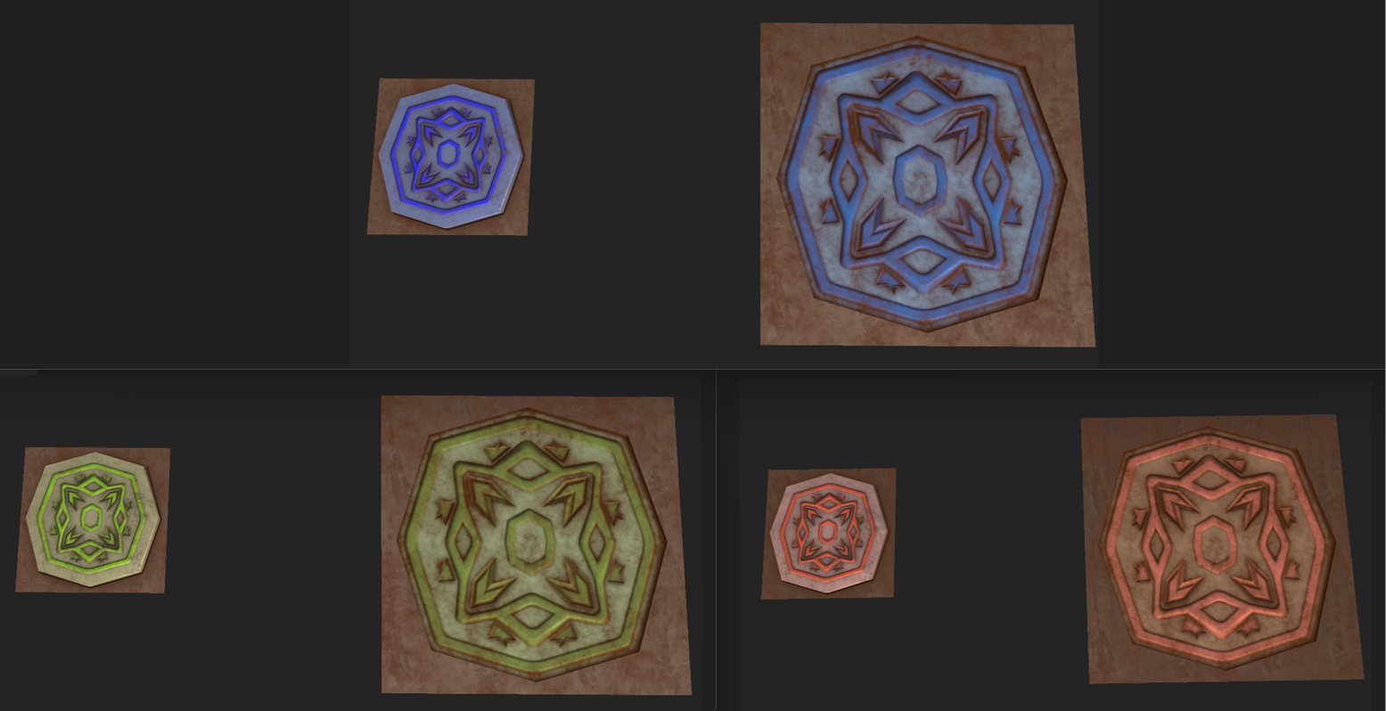
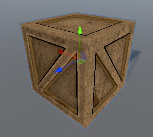
Let's move our discussion to the 3D art that was created this Sprint. As mentioned before, I was tasked with creating some of the props for the interior well puzzle, which was the scene in this recent playtest. I wanted to design props that looked like they belonged inside a giant underground irrigation system, so rust and dirt was a must. But I had to be careful, because Unity's toon shader can get noisy if there is too much color variation on textures. This balance was difficult to achieve at times, but I learned to think less about realism and more about how it would look if I were to draw it in Illustrator (my preferred 2D drawing program). This helped me visualize what it might look like in the shader. The other design consideration I had to make was how the player would correlate the props with each other, specifically the pressure pad (the button that the player needs to either stand on or place a block onto) and the vault door that is opened when the pad is activated. I decided that the textures on the two models needed to match up somehow. Given (again) that this is an alien planet, my idea was to come up with a crazy cool pattern that I could model, then bake the normals onto both the button and the door. I also color coded it so that each button corresponds to only the door with the same color on it.
I'm far from the only one that created cool models this Sprint though. Here's some of the awesome work from my team I'd like to highlight. Firstly, Cyrus created one of our non-traditional enemies: the Hydrazine rain cloud. This enemy is intended to look harmless so that the player doesn't immediately think it is an enemy, but it will become apparent when it starts to follow the player around and occasionally rain its danger fluid down onto them. This enemy should blend in with the environment of World 2, the arid alien planet, so it is a small cloud that has a pink hue to it, just like the sky does. That being said, I also don't want it to be invisible to the player either. However, the black outline doesn't look right to me, it makes it feel like it is a physical object, which in reality it is, but I want it to feel more like a light and fluffy cloud. This was solved by using a white rim light on it instead. I may also want to include a particle effect to make it even more cloudlike and fluid instead of a static model, but I think having a base model rather than making it completely out of particles is beneficial to the 2D style because there will always be a constant shape to see.

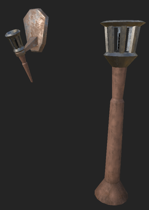
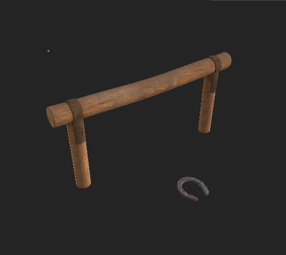
Next, here are a few of the props William has completed this Sprint. Though these are somewhat smaller props, they are very important to the feel of each world. For example, the horseshoe and hitching post are going to populate World 1, the ancient village so that it feels like the residents use horses as their primary form of transportation. I'd also like to point out the market booths that look hand-sculpted out of clay. These are going to be prominent in World 2 and need to look like they blend with the ground. This is important to make the player feel like the residents of this alien village worked hard to build this little town from nothing but their own surroundings.

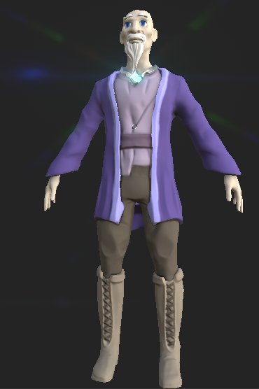
Finally, our character modeler Liam was able to finish our secondary main character, the old wizard Zachariah, as well as get a start on our Shepherd NPC. Zachariah was a challenge to design for both of us since he is an old man but still has to look like he belongs in the anime style I'm going for. Liam and I worked closely together to create that balance, and I believe we achieved it. This looks like a wise old man who is friendly enough to approach, which was exactly what I was going for. I can't have my younger audience being afraid of their mentor character, now can I?
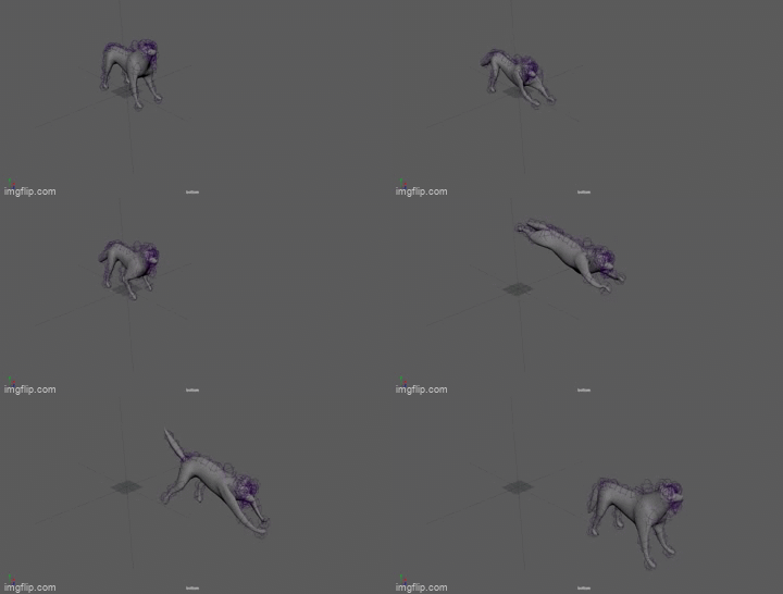
Let's now talk about animations. All of our biped animations come from mixamo, which has been very helpful. However, this doesn't mean that it is not work to be done. In fact, our programmer Colin has been wrestling with the animation graph in Unity in an attempt to make all the animations play and blend smoothly. Getting the player character to move realistically is especially important in making sure the player has a good experience. On the other hand, we have our actual animator, Mel, working on quadruped animations. This still proves challenging for them, however, they are quick to make improvements given specific feedback. They have completed the enemy run and idle animations, and are currently working on an enemy lunge attack animation. Since these animations are for enemies that can hurt the player, there are some important cues that need to be communicated to the player. For example, before the enemy actually lunges, there needs to be a pause so that the player has time to react.
Speaking of Mel, they have also done some more 2D artwork that has been very beneficial to our recent playtest: they have completed the spell icons for the D-pad selection cheat sheet on the UI. These tiny icons may not look like much, but they are so important because they communicate to the player which spell they have activated. This was missing entirely from the first playtest and it left all the playtesters confused. I was actually the one who designed the fireball icon, but after seeing Mel's icons, I want to go back and update my colors to match theirs because mine seem kind of dull in comparison. I also think I should add an outline to mine as well, which will help separate it from the background.
Last but not least, our programmers continue to kick butt! As I mentioned, Colin has been tackling animations, and he also set up the spell icons in the UI, but he ended up having another very important task this Sprint. He had to figure out and fix a major bug with GitHub that unfortunately paused some of the progress of the programmers and level designers for a good while there, but thankfully Colin was able to push through and whip it into shape. As for Christian, he was able to do a lot of set up for the playtest. This included programming pressure pads to respond to weight and open doors, making the fireball spell able to light torches, and making those lit torches trigger doors as well.

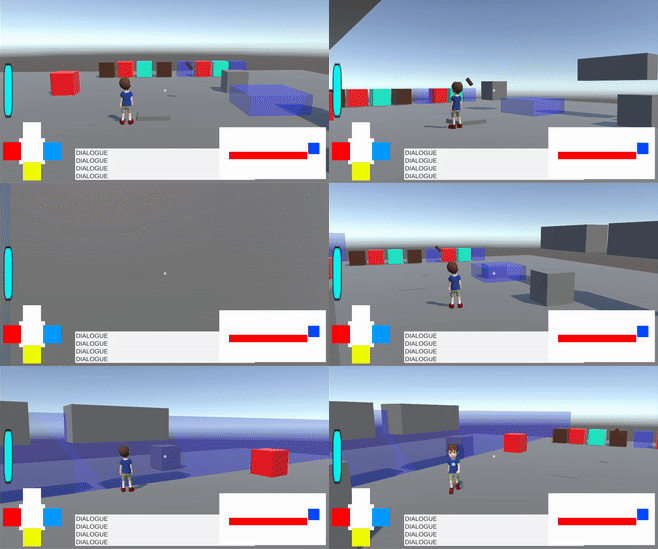
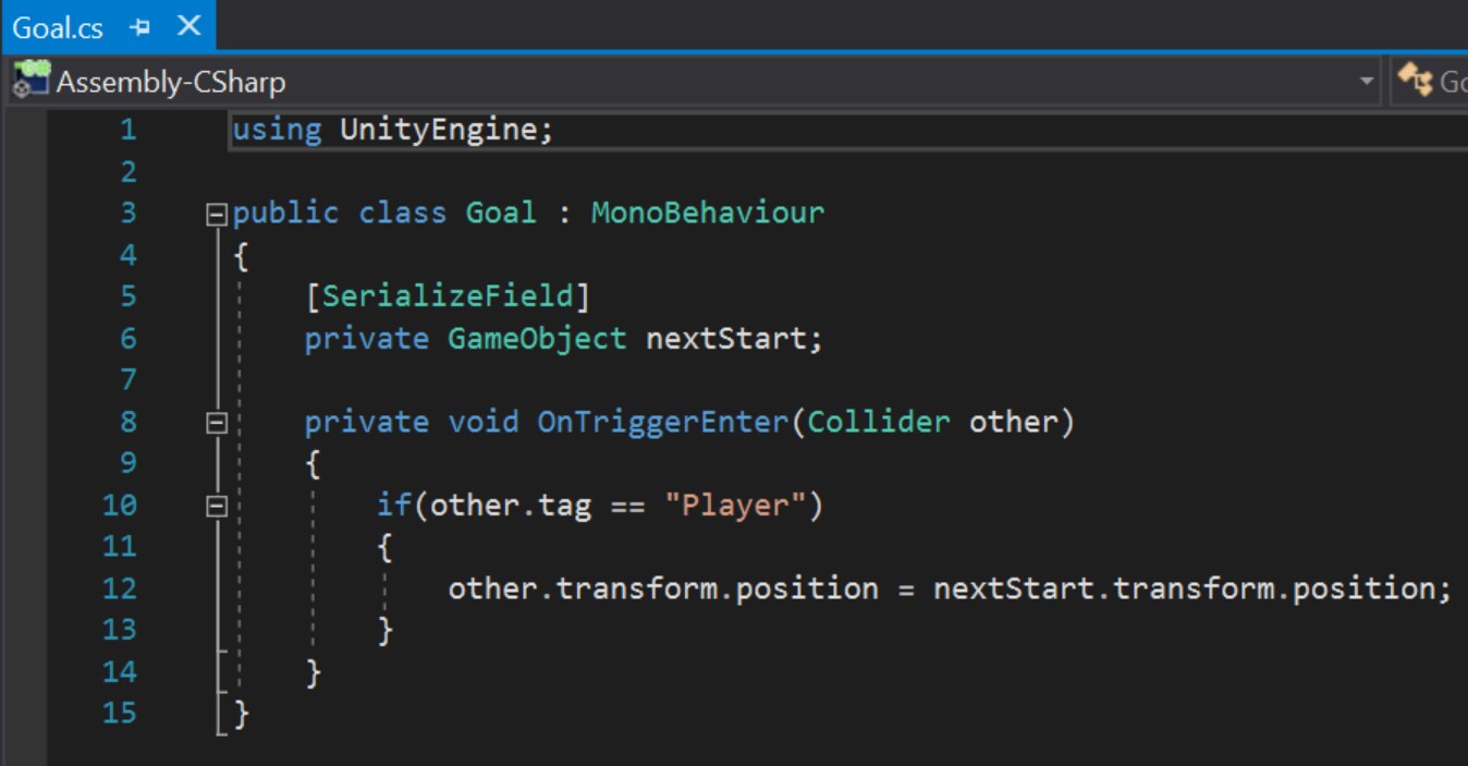
On that note, our level designer Chris, who built the playtest scene, actually needed to write a small script that would allow the player to move from one level to the next. This is because the "pipes" he was using were not actually hollow and there was no other way to get the player to the next level within his blockout. This method may actually end up being cleaned up and used in the final game. As we were discussing the length of the puzzle, I decided it would be best that the player's progress is saved after passing each room so that they don't have to restart the whole level over again if they die. They would only need to start over on the puzzle they were working on when they died, meaning all the blocks they moved would need to be reset. I asked the programmers what they thought the easiest way to go about that was and Colin mentioned that having each room be its own scene would be the easiest since reloading a scene will save the location of each Telekinesis block without the need for extra complicated scripts. I'm hoping the initial scene transition will be seamless since it can be done in the background while the player is watching the character fall through the pipe into the next room.
Designing Glass Castle continues to be an exciting challenge! See you all next time!
Get Glass Castle
Glass Castle
A game about letting out your inner child by learning magic, solving puzzles, and saving the Universe!
| Status | Released |
| Author | CAGD |
| Genre | Adventure |
| Tags | Aliens, Boss battle, Colorful, Family Friendly, Open World, portals, Space, Surreal, Third Person, Time Travel |
| Languages | English |
| Accessibility | Subtitles, Interactive tutorial |
More posts
- Design PostmortemDec 16, 2022
- Production PostmortemDec 08, 2022
- Designing Glass Castle #5Nov 10, 2022
- Production Blog 5Nov 10, 2022
- Designing Glass Castle #4Oct 27, 2022
- Production Blog 4Oct 27, 2022
- Production Blog 3Oct 13, 2022
- Production Blog 2Sep 29, 2022
- Designing Glass Castle #2Sep 27, 2022

Leave a comment
Log in with itch.io to leave a comment.