Design Blog 5
Hi, welcome again to my design blog. I'm Vivian Overbey, lead designer on Entoworks, a lightweight strategy/tactics game about steampunk mechanical bugs. for a bit more context you can check out my first design blog. You can check out the fourth production blog to see what got done by the rest of the team, this post focuses on the game's design and how it changes through development.
Sprint 5 has finished out, a lot of documents were created or updated to reflect changed made in the previous sprint. My main goal for this sprint was to document the new changes in more detail.
The largest undertaking was figuring out the math for the game's balance. Having only 3 units meant I needed to balance those 3 unit's stat blocks around each other. The 3 units are a bee, stag beetle, and dragonfly. Balancing around these 3 units in such a way as to make them each feel distinct, without there being a clear hierarchy, is tricky.

I created a spreadsheet using google sheets, and created custom functions using JavaScript for all possible damage interactions between units. I also added additional fields for static game variables like the critical hit damage multiplier. I additionally added overall average damage calculations factoring in chances to perform a critical or a pierce (or both) off to the right. The purpose of this sheet is to help level designers design encounters.
The spreadsheet mostly focuses on damage, and can't really explain more dynamic game balancing such as mobility and sight. a lot of that comes down to level design and will likely need to be iterated on a good amount by the level designers.
Some changes also had to be made to the level editor. Units needed to be determined by the level designer for both the player and the enemy now, instead of just the enemy. we also concretely know what units are in the game. Knowing this I adjusted the level editor to give the designers agency over both teams units.
Both the spreadsheet and the changes to the level editor should give the level designers the tools to, and information on how to design levels in Entoworks.

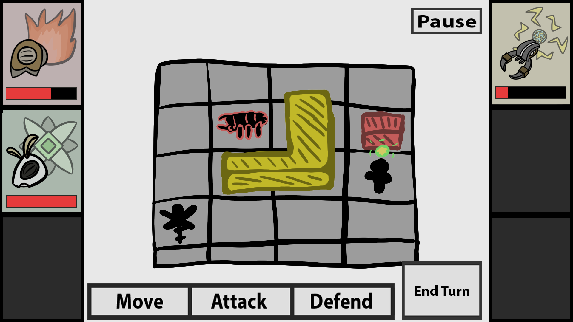
I created a new UI mockup for the game's combat. Some mechanics have been dropped or simplified sense I made the last one, so a new one needed to be made. The player's action menu and end turn button is displayed at the bottom, while units information are displayed at either side. the player's units are on the left, while the enemies are on the right. there is a pause button in the top right if a player needs to exit the game or change some settings. The gameplay takes place in the center of the screen.
Additionally I drastically shortened the GDD. a lot of mechanics were cut for scope so the GDD was combed through and updated. overall the GDD went from 22 pages to about 10. The upgrade loop was removed, which made up a lot of the cut content. Smaller changes also helped reduce this down, such as removing special attacks. The removal of resources from the upgrade loop simplified a lot of the design elsewhere as well.
Overall this sprint went really well. Key documentation was created and updated based of off the design changes from last sprint. The game's development is speeding up a lot into these last few sprints. A snag was hit with programming for awhile due to the nature of this type of game. they are hard to program. This last build has a lot more to it than the previous builds, and hopefully we can continue with this momentum.
Thanks for reading, there should be a build attached to this post you can check out if your interested.
Files
Get Entoworks
Entoworks
More posts
- Version 1.1.0, Entoworks Overclocked!Dec 15, 2023
- Production Postmortem - EntoworksDec 13, 2023
- Design Blog 6 and Postmortem, Games Done!Dec 07, 2023
- Production Blog 6Nov 16, 2023
- Production Blog 5Nov 04, 2023
- Production Blog 4Oct 26, 2023
- Design Blog 4Oct 26, 2023
- Design Blog 3Oct 12, 2023
- Production Blog 3Oct 11, 2023

Leave a comment
Log in with itch.io to leave a comment.