Designer Blog 3 - The Warfront From Intercepts
Howdy Everyone,
With Sprint 3 done, we have gotten to around the halfway point of this project (oh god, this semester is moving too fast). We got a lot of stuff done this sprint including more models for the war map, most of the war room functions programmed, and another prototype to test. If you want to know more about what our team has been up to, check out Natalie’s Blog.
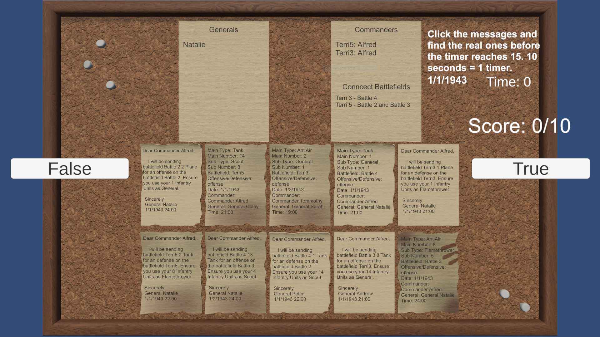
Sprint 3 had our first electronic playtest. As mentioned in the last blog post, a little miscommunication led to us rushing the prototype in the last sprint. This caused us to cut the war room portion out of the first prototype and focus on the messages. While not ideal, that is just something for the next playtest. However, we still have to test the more important feature: Messages. Messages are going to be what the player interacts with the most being the only source of information for the strategy portion of the game while also needing a lot of attention to determine if the message is fake or not. Because of this, I wanted to test our most basic way of fake messages with wrong information. Wrong information works a lot like how the game Papers, Please works where if there is a discrepancy between the message and the known information, the player can assume the message is false. So, our prototype is a little game where the player tries to guess if each generated message is true or false depending on the information given. When testing, I was looking for: if the player found this fun, if it could be fun with the rest of the mechanics, and what can we improve on.

The playtest was a little rough, but it still gave us valuable information. Overall, we had 10 playtesters (5 of which have played and enjoyed Papers, Please). While playtesting, it was clear that the prototype was rushed and was in pre-alpha. I think the most important thing I got out of this playtest was Readability. As mentioned earlier, messages are the thing that the player interacts with the most, so it is super important that the player can read them quickly and accurately. Something that a few playtesters brought up was underlining and highlighting the important information to guide the player's eyes. One of the playtesters thought it was hard to read because we used the test names for the territories. Finally, there were a few bugs too that caused some confusion like a small chance that a false message generated the right names.
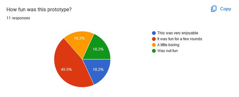
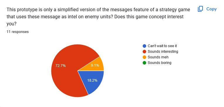
There were also a few smaller things that caused confusion. For example, I also had to explain the game to a couple of playtesters in order to test what I needed which means we needed more text to at least explain the game. Another example is that there was no UX feedback if the player selected a message. Overall, most found the game only a little enjoyable, or not at all due to how little there was. This was expected since it was rushed and only featured the messages, but a lot of the feedback from playtesters did have a lot of interest in future features when told. Despite not testing as much as we wanted, we still got a lot of valuable feedback from the playtest
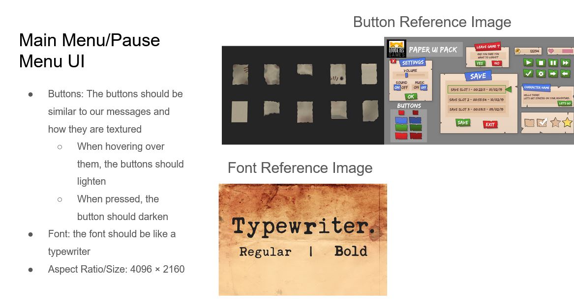
Besides playtesting, I made more documentation to help the devs. One of those was a UI style guide. This was something that I didn’t think about with my background as a programmer, but we want the UI to be consistent. Therefore, I just gave a simple guide to have the main menu and pause buttons similar to the messages the player interacts with. Some buttons are more simple and transparent since I didn’t feel like having a diegetic ui for everything like a pause button is necessary. (Future Justin from Sprint 4: still didn’t remember everything since I forgot that screens like the main menu need a background… yup still learning).
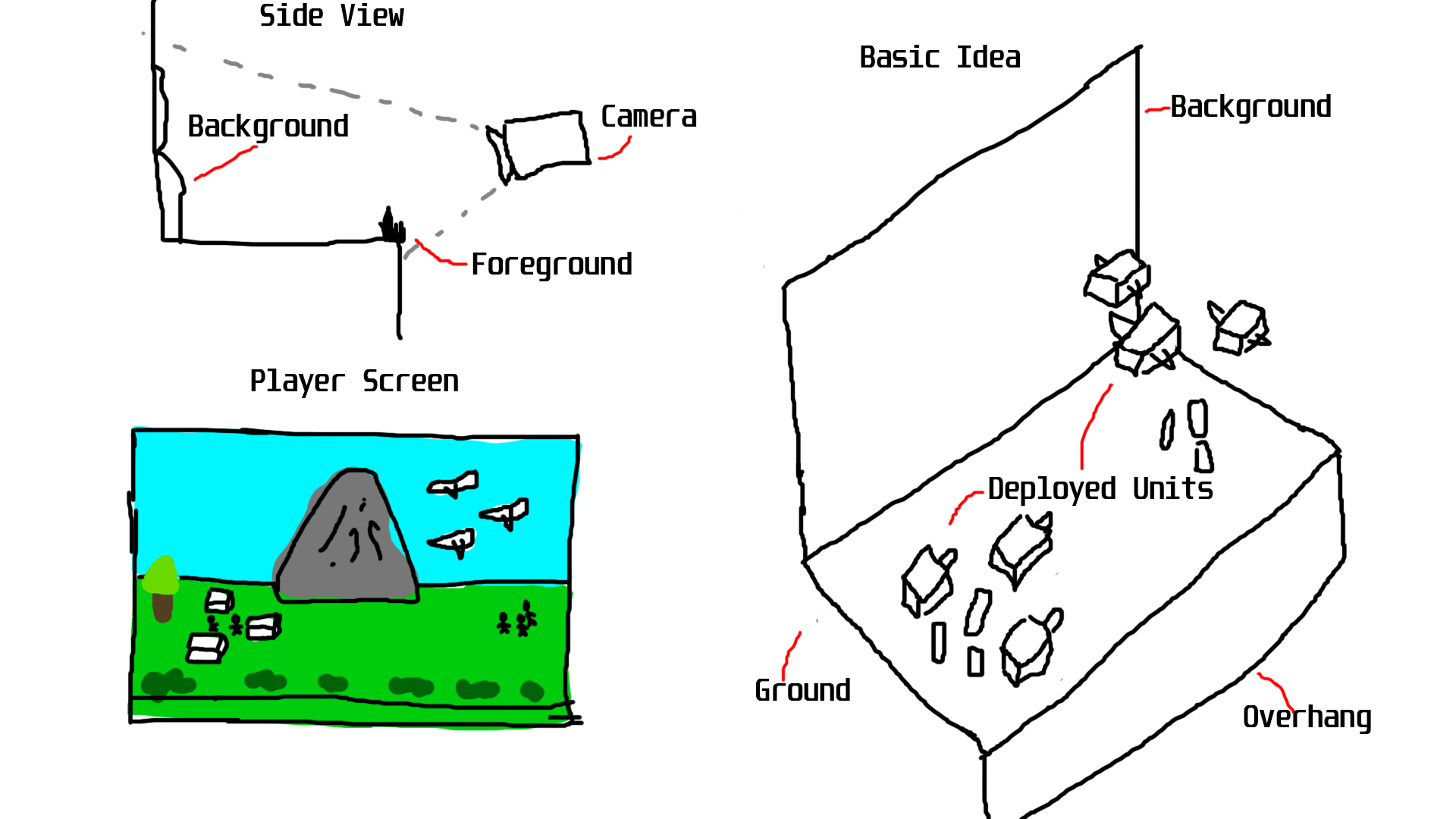
Another document I spent a lot of time working on was the battle backgrounds for the animations. In our game, after the player deploys their unit and time runs out, the game reveals the enemy on each battlefield and displays a quick “Advance Wars” style battle animation between the player’s and the enemy’s deployed units. These animations are going show the player how well they were able to sort throught the messages and deploy their units in a satisfying way. These are the animations that will make use of the wonderful tanks, planes, and anti-air models that the modelers have made. However, to make sure these animations aren’t just on a blank void, we need a background for these animations. A lot went into this doc since each of the different terrains was going to get its own background. I spent a lot of time researching and talking to our artist Jax about all the information needed for these backgrounds including reference images, sizes, and colors to make sure they are consistent but still give the artist a lot of freedom to make them look good. I’m really excited for the models to be made and to start work on these animations.
Overall I felt this sprint went pretty well. I personally felt that I could’ve done more work since I spent a lot of the sprint playtesting. It’s still nerve-wracking to me to ask random people to playtest the game, but it’s what I have to do. Looking forward to the next build, we are going to test the controls of the war room along with testing different messages that can be encrypted or hidden in invisible ink. Overall, I feel like we are in a really good place for this project, and excited for the next sprint.
Until Next Time,
Justin Lam
Game Designer
Get The Warfront From Intercepts
The Warfront From Intercepts
Hidden amongst the fake messages are the real plans of the enemy's attack.
| Status | In development |
| Author | CAGD |
| Genre | Strategy, Puzzle, Simulation |
| Tags | World War II |
More posts
- Designer Postmortem - The Warfront From InterceptsDec 12, 2024
- Production Blog 6 - PostmortemDec 12, 2024
- Designer Blog 6 - The Warfront From InterceptsNov 24, 2024
- Production Blog 5Nov 14, 2024
- Designer Blog 5 - The Warfront From InterceptsNov 12, 2024
- Production Blog 4Oct 31, 2024
- Designer Blog 4 - The Warfront From InterceptsOct 28, 2024
- Production Blog 3Oct 17, 2024
- Production Blog 2Oct 03, 2024
Leave a comment
Log in with itch.io to leave a comment.