Design Blog 3
Sprint three was playtest sprint! First public test, to be specific. This is a significant development that will inform all aspects of production. That said, the goal of this particular test was to improve the kinesthetics. We addressed feedback from the testers while also progressing the title’s UX / UI. Meanwhile, level design continues to be a tough nut to crack. All this and more on the third designer blog for Stumblebumps Unite!
But first off, the playtest report.
Audience: We had a total of 6 respondents. All players played their matches with four players. 100% of players used a controller. 50% of respondents have played Fall Guys, with 33% having played more than two hours of Fall Guys.
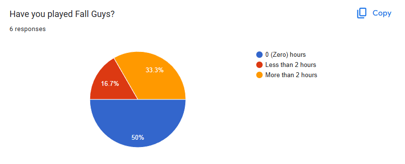
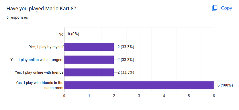
Takeaways: Future playtests need to reach a greater number of people. We should have playtesters use a keyboard, since it is an officially supported control scheme. Likewise we should playtest with varying numbers of players. Forms should ask if participants have played more games similar to Fall Guys, I.E. Stumble Guys.
Controls:
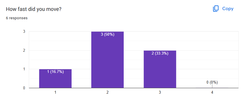
Majority of players felt the character was too slow. I will try revising this up slightly and test it in close collaboration with the level designers.
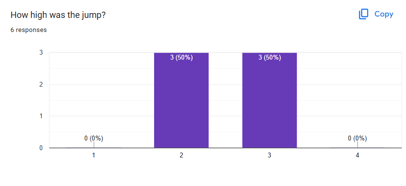
Players were evenly split on the jump being slightly to low or slightly to high. This tells me we hit a good height for the jump. Furthermore, based on my time watching people play, I am no longer planning on implementing variable jump height as I can’t see having a significant impact on how fun the game is.
Interestingly, players were evenly split between skewing “too far” and “not far enough.” However, two players fall on the extreme end of “too far” while none fall on the opposite extreme. I believe this split is a result of the speed gained from a dive feeling disproportional to how far they slide after landing. I observed many players sliding off of platforms after diving. Several comments also back up this conclusion. Players frequently asked for the ability to cancel the dive, which would align with the observation that the dive is necessary to make some jumps, but the slide is obstructive enough that players want to be able to cancel before sliding:
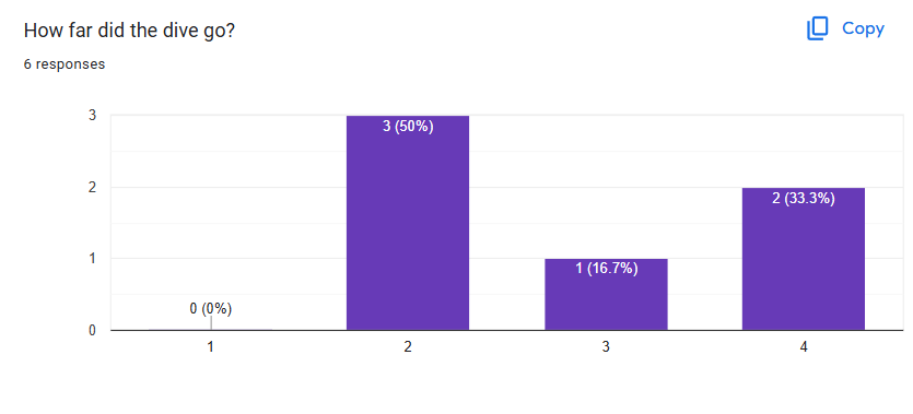
Select responses to "Any comments on the controls?"
“The player should be able to dive cancel”
“The dive should have more control in how far you can go vs how short it ends”
During the playtest I did not observe players frequently using the dive as a method of sabotage. It was extensively used as a platforming tool. Still, this means the dive is only fulfilling half its intended purpose. To address this, we will aim to give the players greater control over the dive and curate the levels to encourage PvP interactions.
Improved Kinesthetics
Before getting too far removed from the playtest, the coders and I made a joint effort to address kinesthetics issues. We separated ground, air friction values for walking and diving. So, dive velocity can be maintained in midair but drops dramatically on the ground; all without affecting walking movement. In another change, a moving platform will now impart its velocity on a character that jumps off it. This effectively makes it easier to line up jumps between moving platforms. Alongside this change, I introduced a moving platform manager which updates the position of every platform before the player. This keeps the behavior of moving platforms consistent at lower (~30fps) frame rates.
New Frontiers for UX / UI
Outside of kinesthetics feedback, UX took center stage this sprint. Starting with fully revised wireframes which empower programmers and artists to create near final user interfaces. First off, we shifted towards a more playful design. It features paper cut-ins (represented by the off white tone) and hand drawn buttons layered over game footage (represented by the grey tone). Additional wireframes were added for achievements, cosmetics, and the podium scene. We clarified the UX for continue and back commands with icons and standardized positions.
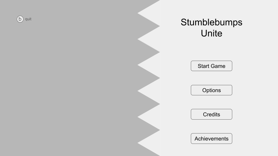
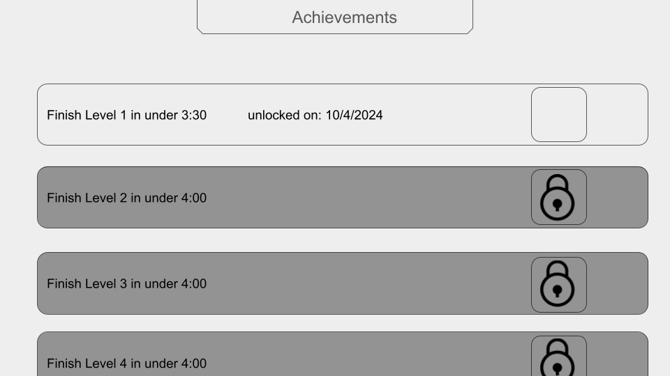
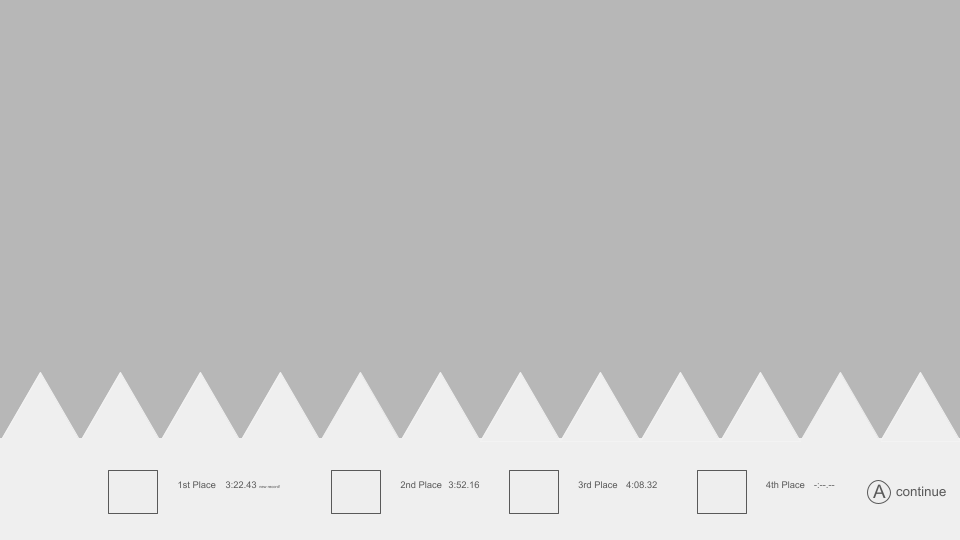
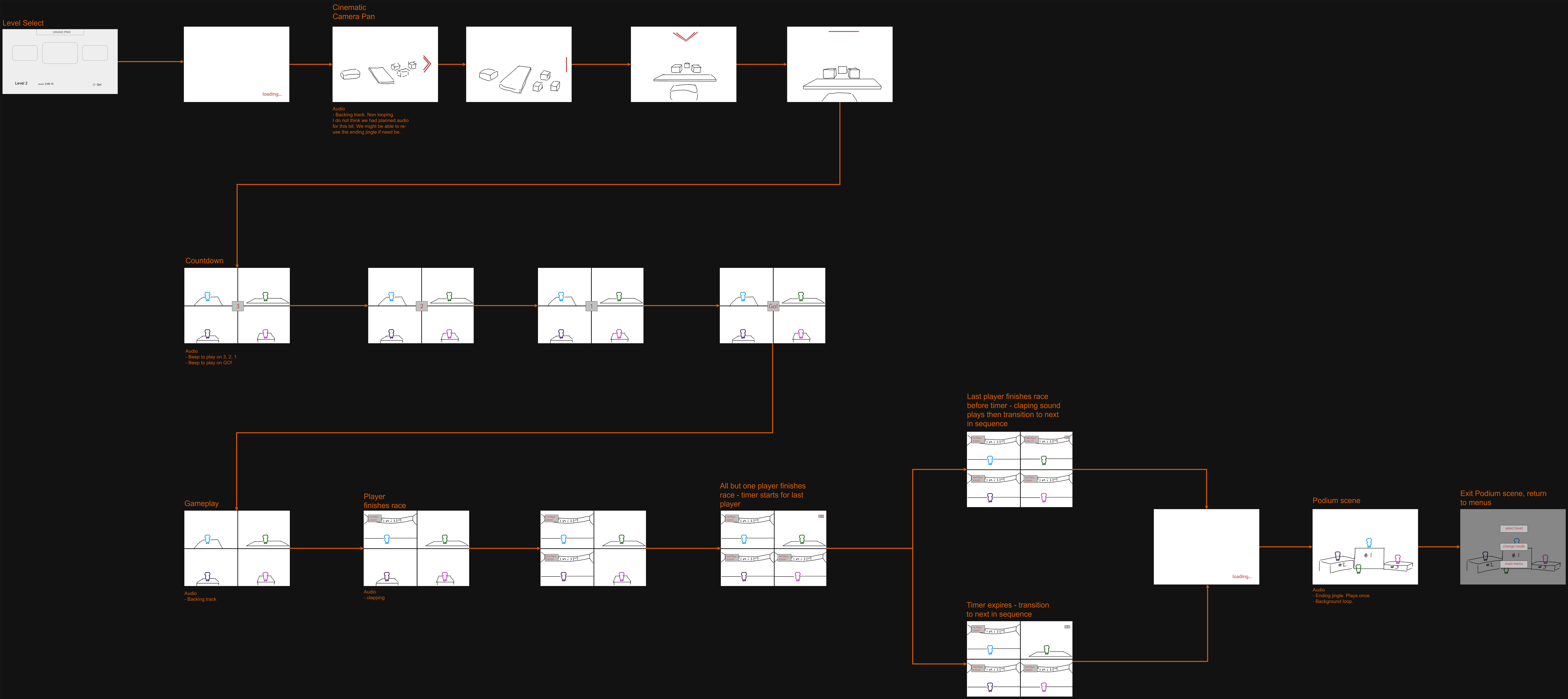
New wireframes facilitated a new UX flowchart. In fact, we further cemented the UX with two new flowcharts. First the menus flowchart was updated to include achievements, cosmetics, and the podium. But the Grand Prix storyboard is all new. It shows the flow of a grand prix match from level selection back to level selection.

Miscellaneous stuff!
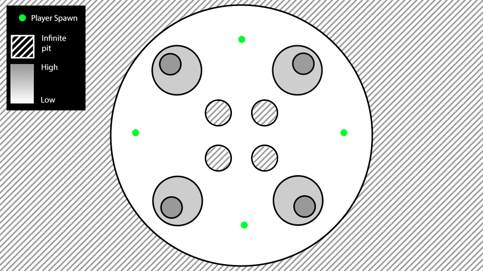
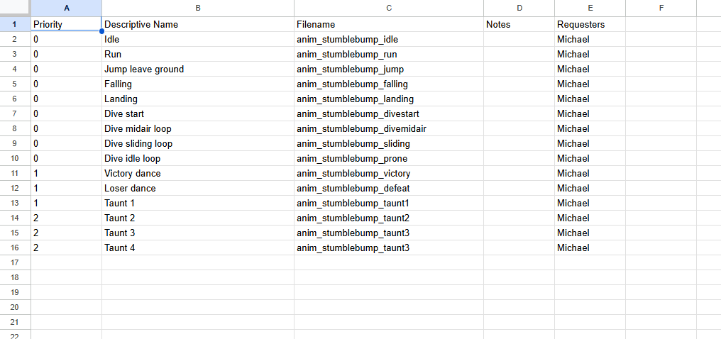
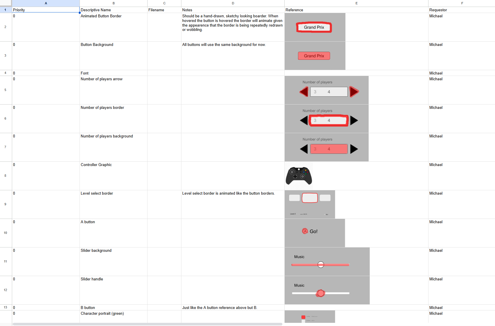
Here is a collection of images I missed out on putting elsewhere in the blog. The first is an example arena mode annotated map. I made this after I noticed level designers were proposing ideas more akin to minigames for the arena mode. I found out later people were not seeing it because I did not notify everyone in the GDD update channel on Discord. It got announced in the level design channel then quickly buried. I have since standardized my approach to announcing GDD updates, so everyone stays informed, not just the team members I believe are relevant. The next two images are of new animation and 2d art asset lists I added.
Level Design Adventures (continued)
Adoption of the modules workflow got off to mixed results. First, the good. One pagers provided more consistent work and promoted discussion among level designers. For the bad, the one pagers frequently lacked emotional descriptions of the levels. Level designers also seemed somewhat uncomfortable working with multiple scenes and prefabs. Overall we are still seeing gradual improvement to the levels, but moving forward we need to establish a stronger feedback loop.
In Conclusion
This sprint hit almost all the right notes. We had a successful playtest and addressed feedback from it all in the same sprint. We solidified our UX and UI layouts. Art is rolling along great. I am still struggling with how to best guide the level design team, but overall we are still moving in the right direction.
Get Stumblebumps Unite!
Stumblebumps Unite!
Run, jump, dive, and bump your way to the finish line and glory!
| Status | Released |
| Author | CAGD |
| Genre | Platformer |
| Tags | 3D Platformer, Casual, Character Customization, Controller, Local Co-Op, Multiplayer, party-game |
| Languages | English |
More posts
- ver. 1.0.3 patch notesJan 15, 2025
- Production PostmortemDec 21, 2024
- Design Blog - PostmortemDec 21, 2024
- Design Blog 6Dec 08, 2024
- Production Blog 6Dec 04, 2024
- Design Blog 5Nov 26, 2024
- Production Blog 5Nov 14, 2024
- Design Blog 4Nov 09, 2024
- Production Blog 4Oct 31, 2024
Leave a comment
Log in with itch.io to leave a comment.