Deadeye Gold: Production Blog 2
Hello everyone, once more this is Austin Moore with a production update on the development of Deadeye Desperado's second semester of work. We have completed our second sprint of work on the game now, and we have really gotten deep into progressing into what we intend on getting done this semester. So, let us get right into it.
Programming
First of note, the vaulting and climbing mechanics from before have been refined and implemented into the character controller. So while there are not specific points to vault over yet, you can vault over the explosive barrels in the blast level. But continuing onward, we have begun implementation of the planned bandoleer and upgrade menus, with class map diagrams and UI breakdowns for each.
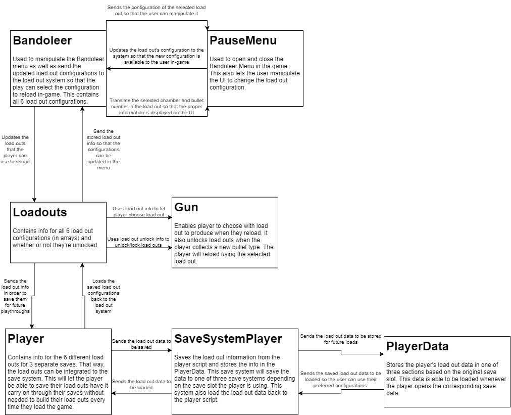
First, the bandoleer menu will function as a loadout system, where the player can set up certain bullet combinations to quickly load into their weapon instead of manually placing every bullet into the chambers. This will ideally speed up the players actions by allowing them to quickly refill their shots with a pattern of their choice to improve the flow of the game.

Next, the upgrade menu will allow the player to utilize resources they have collected in the level to improve their own abilities or their gun. Continuing on, we have prepared the code for the next two bullet types that are planned to be added, so that way once we get their effects ready we can slot them in without much issue. And our progress on a new save system continues, so now the game has persistent data that will be kept track of even after restarting it, and the blockers are remembered too. So if you quit in a puzzle, it will remember your progress. And lastly for programming, we got behavior trees for the existing enemies, so this way we can upgrade them to be more fun to fight.
Level Design
Our level designers have gotten quite a bit of important progress done this sprint, but first we will start with the end of what happened in the previous sprint. We got finished blockouts of the tutorial level, as well as the central hub area. These will, and in one case are, serving as a basis for a new strategy with our 3D modelers where they will be modeling specific geometry for the level itself, to make it feel more unique.
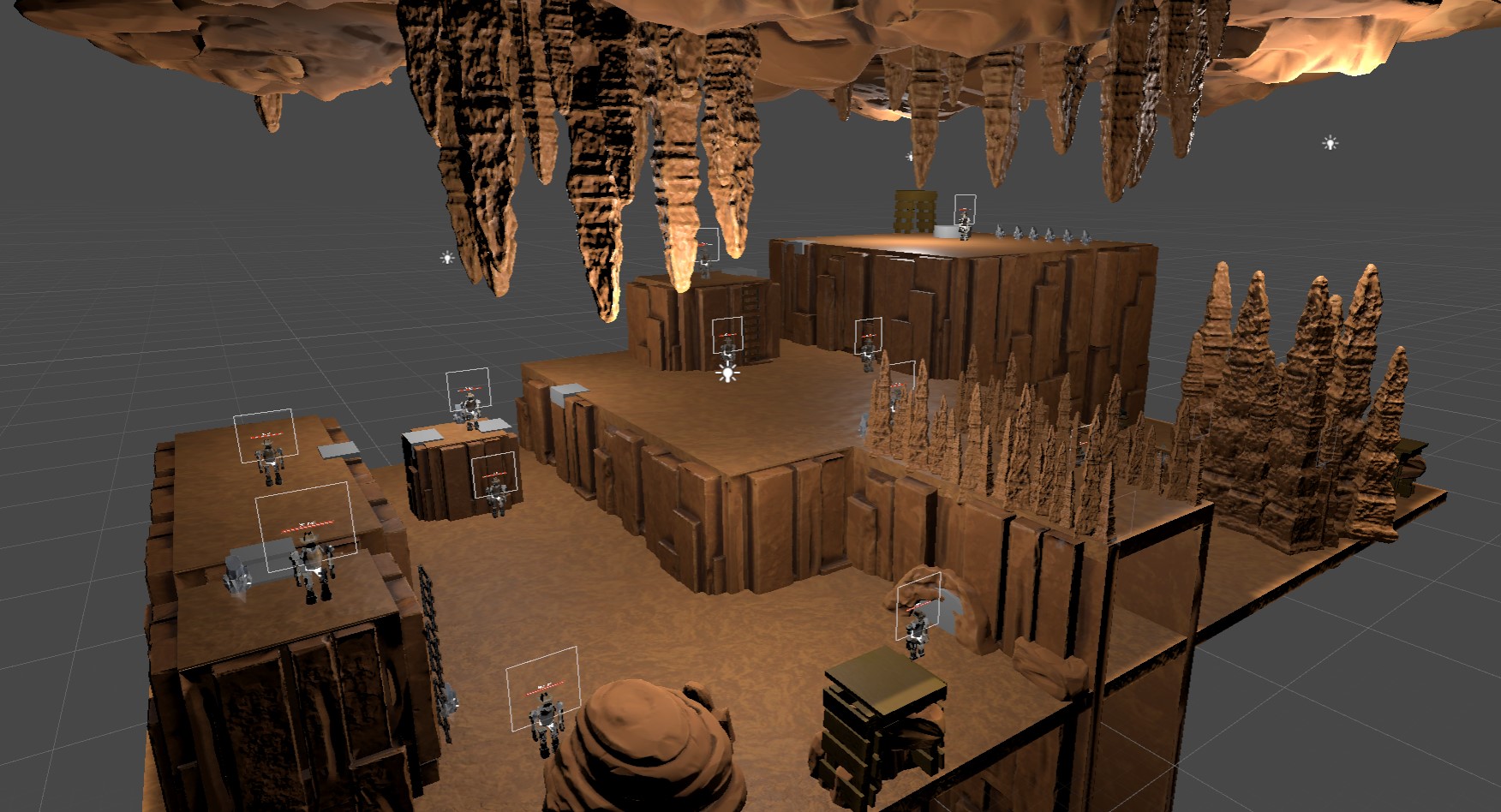
Beginning with the tutorial map, we have gotten the layout that was planned out before in 3D now, so we have the basis of what is intended for the level and to scale. We have separate sections for what each part of the tutorial will teach the player, which will be useful in teaching the player.
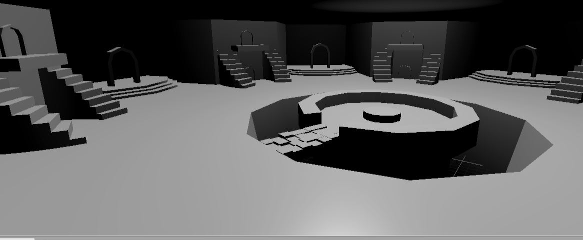
In addition, we have the blockout of the central hub ready too, with the main platform, the level entrances and the enemy spawners being the objects of note. And with these parts done, we have begun work on creating annotated maps of the next two levels we are redoing, the blast and freeze levels.

Our goals for these levels is to have several combat challenges on areas with interesting terrain, alongside side areas the player can attempt to get into to gain resources for upgrades. Here, we can see that there are 3 combat rooms with varying terrain levels alongside the other rooms that are split up from each other by a little challenge, some requiring a shot type that is not the one you get normally. And in addition to this overall map, we have smaller maps for the individual combat areas.
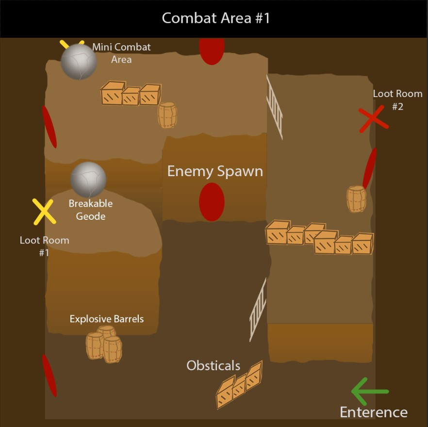
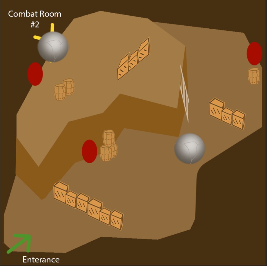
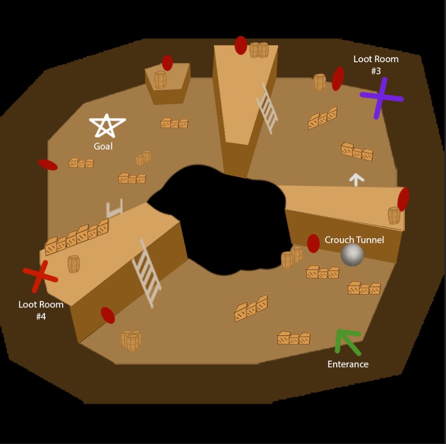
Here, we can get a better idea of what kind of terrain the player will have to overcome in order to clear each of these combat areas. And with the map done, we have moved on to blocking out this level. As for the frost level, we have reached the same point with that one too.
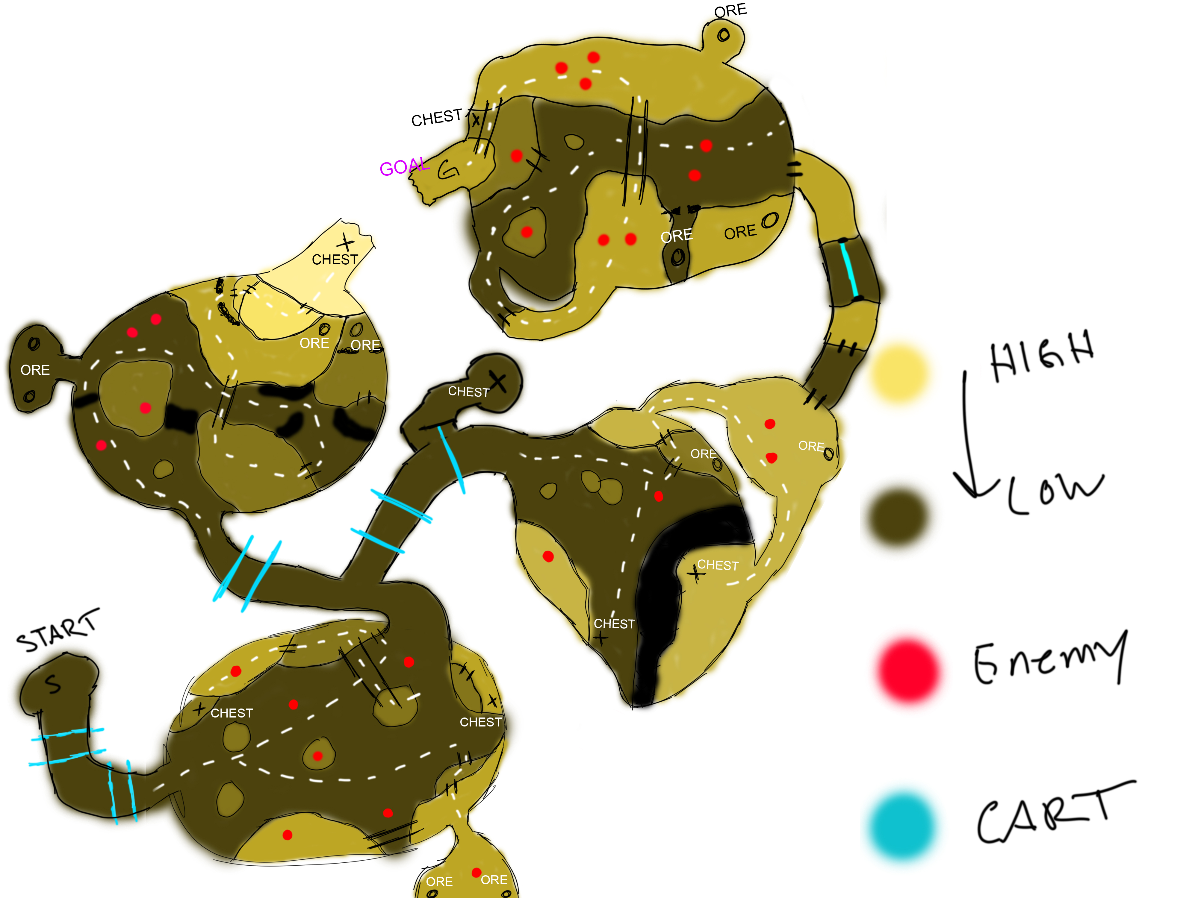
This image has the parts all on one map, so this is one image. Here, we can see the same thing as the previous map, where each combat area has variance in terrain, and hidden spots for collectibles and side paths alongside it. This map also currently has a blockout in progress, so that way we can proceed further along.
3D Modeling
Our 3D modelers have gotten a lot of work done this time, but we will start with the geometry of the tutorial level. As we saw before, there is a basic layout of what we want the level to be like, as well as where the objects are located. Using this information, one of our 3D modelers has turned that into assets that can be used to create the same layout with a more unique look.
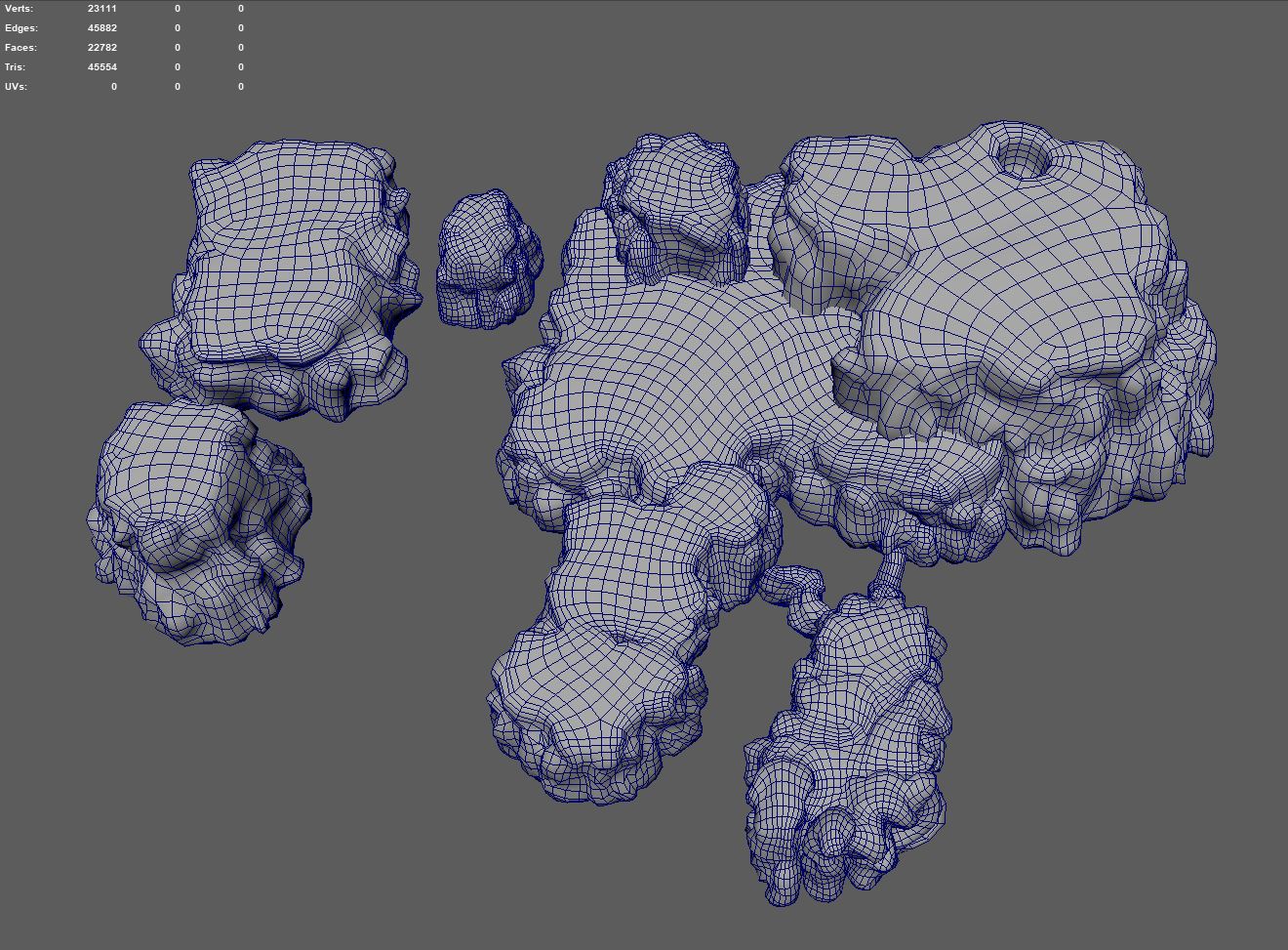
They are currently working on the smaller assets that will be placed on top of the geometry of the level itself, but they have captured the look of the level quite well. Continuing with modeling, our other 3D modeler has been working on assets for the player characters model, which we can see here.
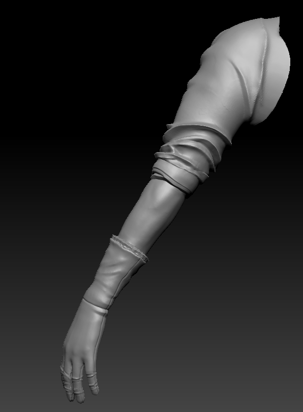
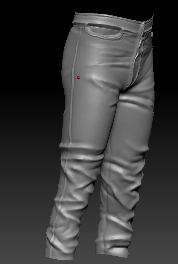
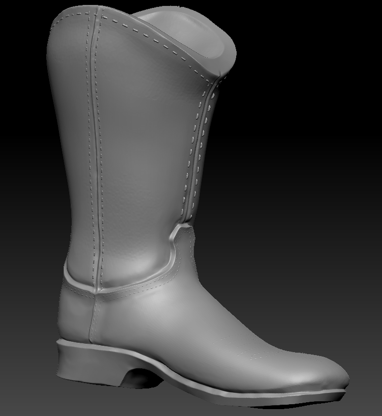
With the high poly models of these done, we will be able to proceed further and eventually get this character looking a lot nicer than before, where they were just gloves. And in addition to these models, we have gotten a lot of texture work done too, for all the models that were shown off before as well as some of the geometry for the level.
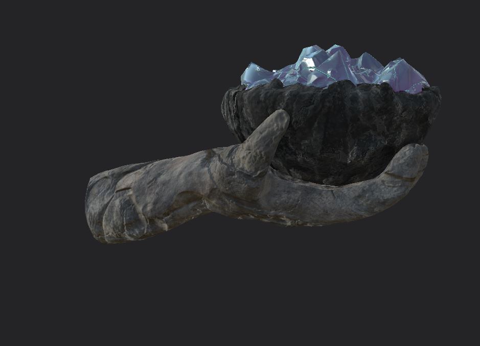
Beginning with the arm, we have made it look a lot more carved, and it looks very much like stone. A different type of stone than the almost sandstone like texture of the other rocks, which makes it stick out a bit more. As if it's man made. And the crystals on top will glow to illuminate the area.
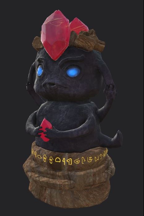
Next, the statue has been designed to be very eye catching, with jewels and eyes that glow, as well as the golden text. Considering the importance of the statue, this was vital to nail.
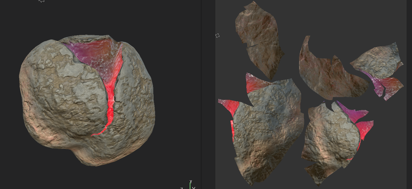

The big geodes we got set up so the crystally veins within glow and stick out in them, and in multiple color options too. This will help them stand out against the walls, and considering their usage as breakables with the right bullet this will make it clear immediately what their use is.
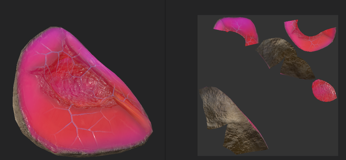
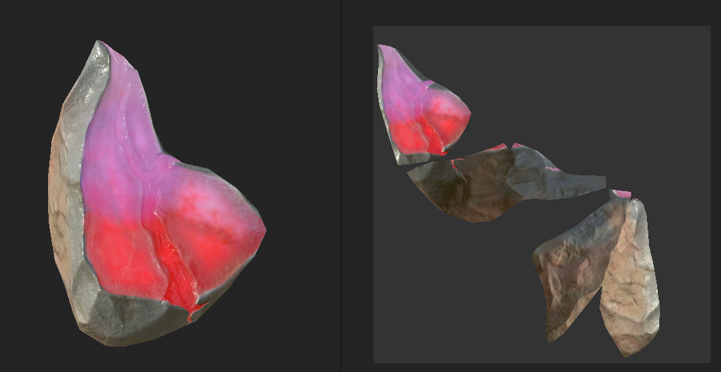
We also textured the geode rubble with the same colors as the big geodes, so that way it'll stick out when you break them.
2D Art
Our 2D artists this sprint worked primarily on concept art of a couple aspects of the game, as well as work on what will be the UI later on. To begin, we created some icons for what the upgrade materials will be
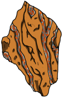
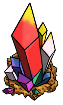
The ore was intended to be like metal in stone, compared to the crystals which are far more clearly gems. This is tied into how you find them, with the ore being pockets found in other stones while the crystals are found prepared already. In addition, the crystals are the colors of the various crystals and bullet types you'll find throughout the game.
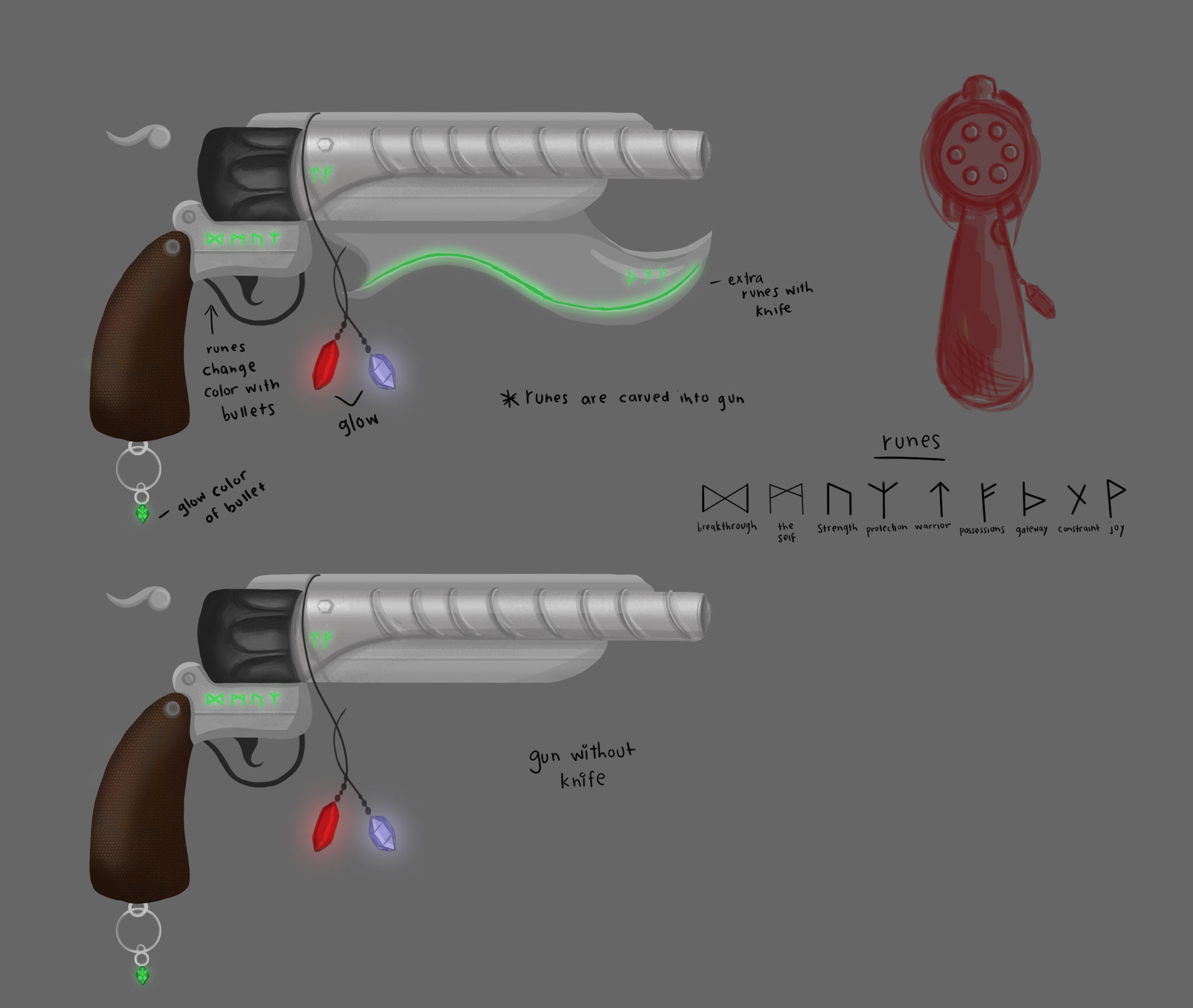
Next, the gun concept art from the previous sprint has been completed, and we feel like this one is a lot more powerful looking, as well as integrating more into the mechanics of the game with the runes that change color based on the bullet type loaded. And as before, the knife attached to it would be something added maybe later, but is not a priority currently.
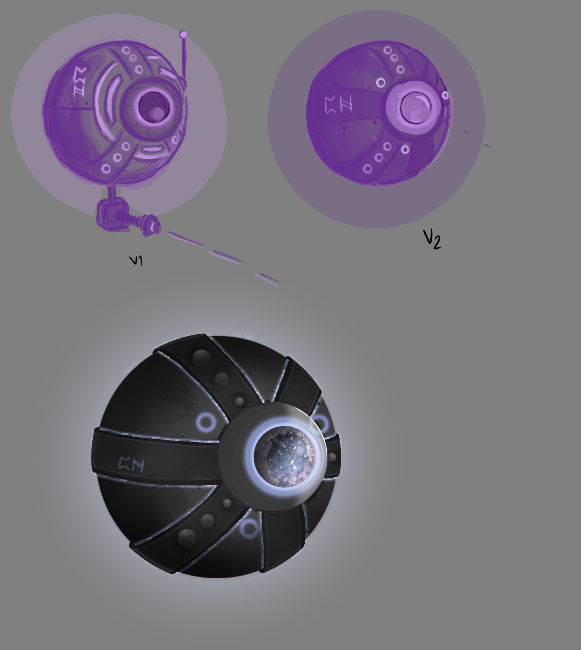
Next, the third enemy type is intended to be a sort of teleporting turret enemy. The eye on it will be pointed towards you and fire, and occasionally the lights on it will glow before it pops into a new location. The crystals and lights on the enemy will change color to show its weakness, and that will be how you deal with it. Overall we are very happy with how this enemy looks, and are excited to see how it will look in 3D later.
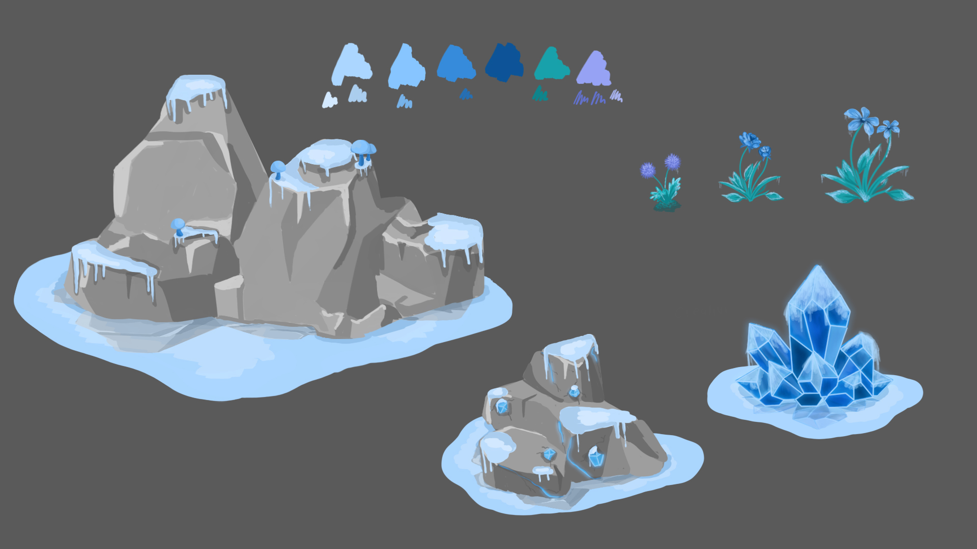
Our last concept art for this sprint is some potential decorative pieces for the freeze level, which will act as guidance for our 3D modelers once we get to populating the level a bit more. Next however, we have UI work.
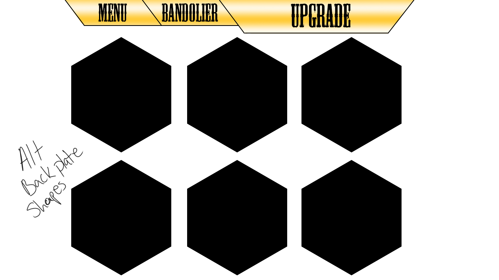
First, we have the basic layout of the upgrade menu, with each of these squares set to be one upgrade the player can choose to buy with resources acquired throughout the levels
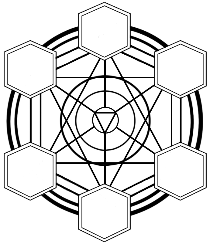
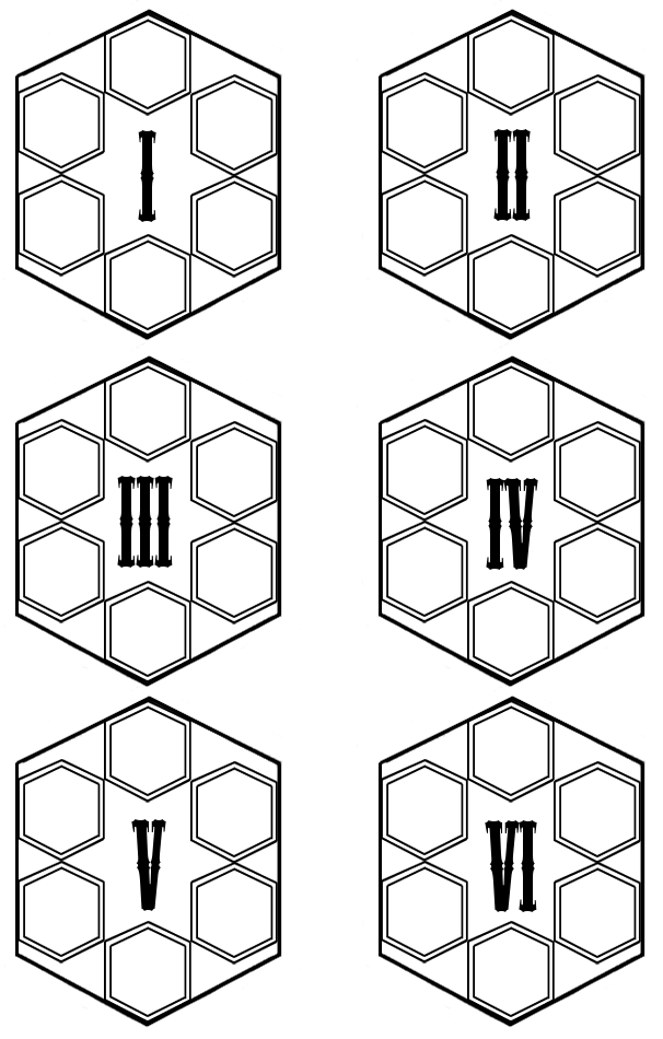
And lastly, while we do not have it set up in one image we do have the components of what will be the upgrade menu ready, with the first image being where you set up your loadout and the second being your saved ones. This will let you interactively customize your shots, to make sure you're all ready for whatever you may encounter.
Conclusion
I am quite happy with the amount of progress we made this sprint, and while the number of tasks done may be less than before we got a lot more major tasks done along the way. Should we keep up this momentum, I feel like we will be able to get this done without issue. Once again, thank you for reading this update on our development, and I hope you continue to follow the development of Deadeye Desperado.
Get Deadeye Desperado
Deadeye Desperado
A First Person Shooter where you control your cylinder and the bullets in it.
| Status | In development |
| Author | CAGD |
| Genre | Shooter |
| Tags | 3D, Experimental, First-Person, golem, Magic, Singleplayer, Unity, Western |
| Languages | English |
| Accessibility | Color-blind friendly |
More posts
- Deadeye Gold: Production PostmortemMay 07, 2020
- Deadeye Gold: Production Blog 6Apr 23, 2020
- Deadeye Gold: Designer Blog: 6Apr 23, 2020
- Deadeye Gold: Designer Blog: 5Apr 23, 2020
- Deadeye Desperado V1.6.3Apr 22, 2020
- Deadeye Gold: Production Blog 5Apr 09, 2020
- Deadeye Desperado V1.5.3Apr 08, 2020
- Deadeye Gold: Designer Blog: 4Mar 26, 2020
- Deadeye Gold: Designer Blog: 3Mar 26, 2020
- Deadeye Gold: Production Blog 4Mar 26, 2020
Leave a comment
Log in with itch.io to leave a comment.