Deadeye Gold: Production Blog 4
Hello everyone, back from spring break this is Austin Moore with another update on the development of Sensational. Now, for those looking at this in the future during the timeframe of this sprint is when coronavirus started to impact Chico. And due to that, we lost a significant amount of time. Spring break was not a time where we are required to work on the project, so with its extension and the start of online courses instead of in person ones this has lead to our pace slowing down significantly during this sprint. Though we can hopefully get back on track sooner rather than later, for now let us begin.
Programming
To begin we got some behind the scenes work done in the options menu, which we are overhauling. Some of the options included previously we decided should be removed while others should be tweaked. And to guide our efforts, we created a new class map of what we want it to do.
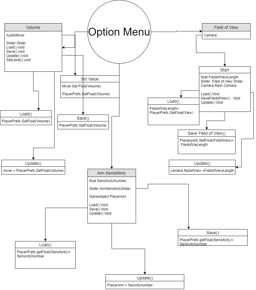
This shows what we intend on getting into the menu, and so far we have removed the color blind option and included a field of view slider. We are working on a more pattern based way to tell the elements apart, so you could use color and symbols.

We have also gotten the save system to include our newly implemented bandolier menu, which will allow our players to choose several loadouts to bring with them and quickly load into their pistol.
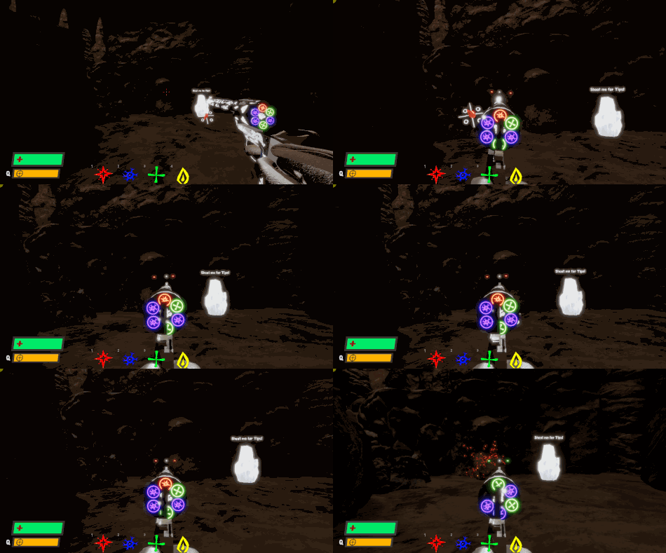
We also did some touch ups to the players animations while aiming down the sights, to make them better match the actions taking place.
Level Design
During this sprint, our level designers got a completed annotated map of what will be the shock level and a blockout of the new heal area layout.
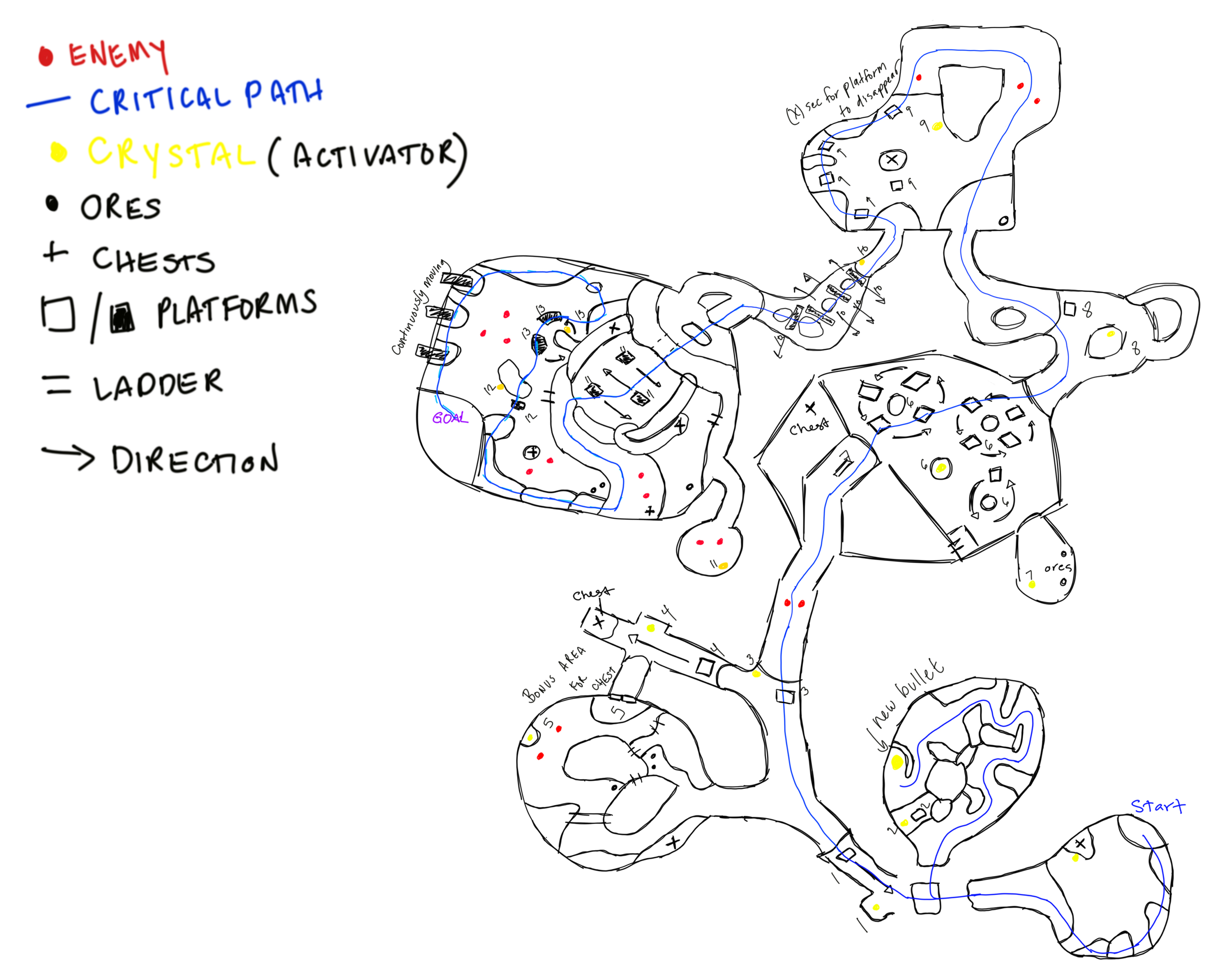
Starting with the shock level, this level will utilize the new bullets power to turn on and off devices that will control platforms and obstacles. This will provide a form of interactivity and creative use of what you will have learned in the puzzle room.
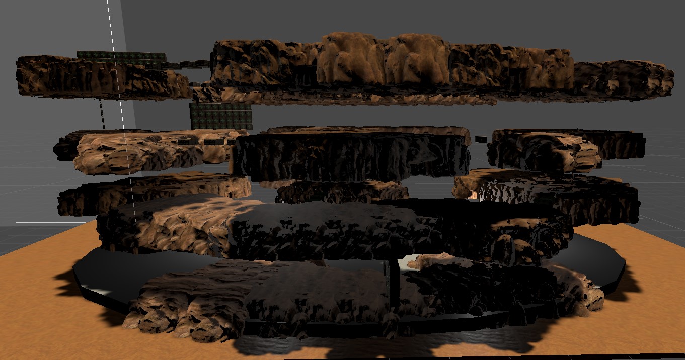
Next, we have the initial blockout of the heal level area. Here, we can see the multiple levels that make up the stage that the player will be climbing up. At the moment it's made of already existing assets, but we will be getting more to make it look better and more unique. Also to make it look like the platforms aren't just floating.
At the moment, our level designers are working on bringing this map into 3D as well as finishing up the heal level plans that were seen in the previous production blog.
3D Modeling
Our 3D modelers have been working on completing the pistol we saw in progress last time, as well as working on the models for the central chamber that will function as the hub world.
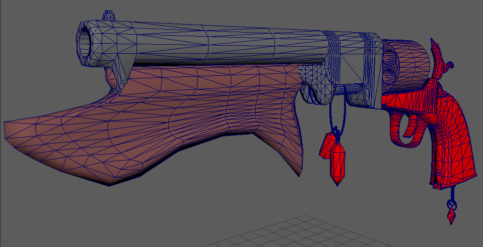
We had a bit more adjustments done to the model to make it look closer to the concept art and the vision for what it should look like. Compared to before, the pistol is larger, more powerful and intimidating. At the moment, the model is undergoing texturing and should be done soon after.
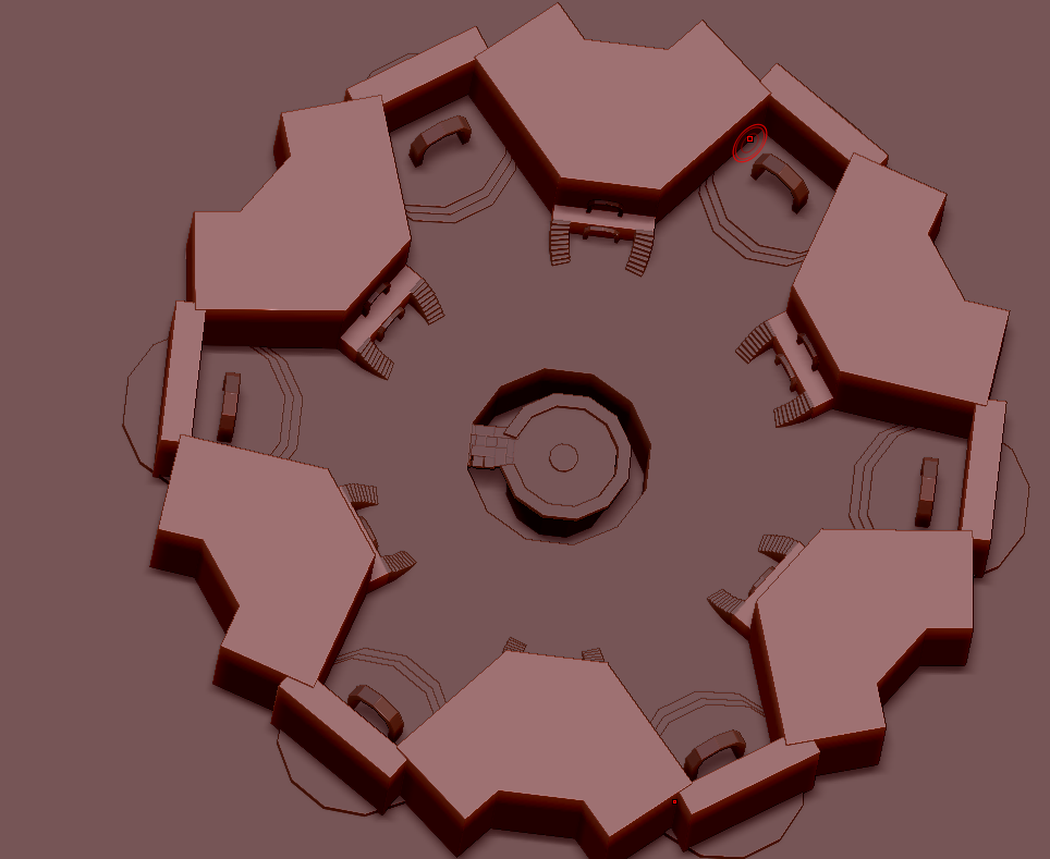
Next, we have been working on the central chamber, beginning with the blockout seen here. We have several parts, but have split it into the central platform and the objects tied with it and the outside area as the revolver floor.
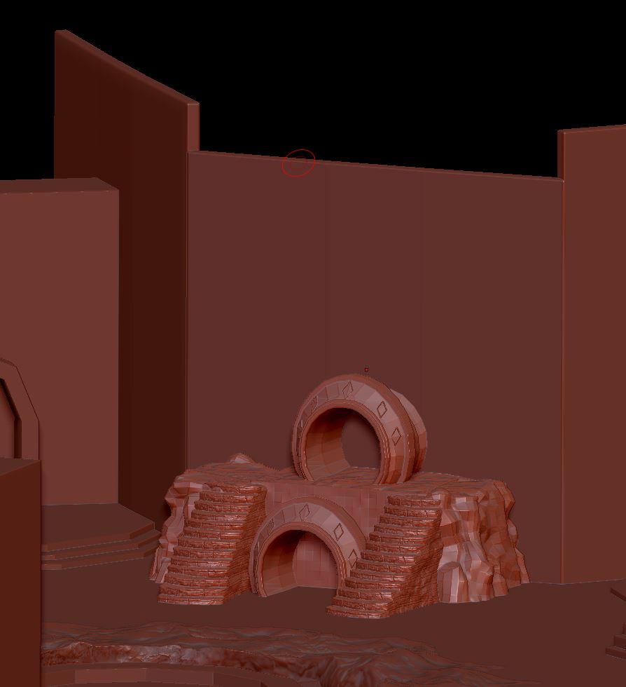

Here we can see the progress on some of the major objects that will be repeated, in this case the stairs, a portal and the upper level. This section will be where enemies spawn from between levels, since each time you return you will need to do a combat encounter. So far they are progressing well.
2D Art
Our 2D artists got progress done on several major tasks. The first of which is a new, universal button background. This will be used to unify the buttons we have in game, to ensure they all fit each other.
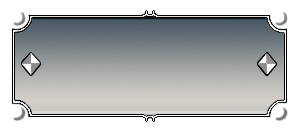
On the button, the diamonds as well as the little circles on the corners can have their color changed. This will let us provide some variety, while keeping the primary color palette of the game.
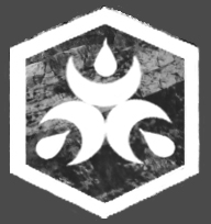
Next, we got a new design for what will be called the corrosive bullet and a backplate for all runes. We determined that the incendiary bullet was too close to the explosive one, so we changed it to be functionally similar yet visually distinct. And for each of the runes, we created a backplate that can be used with any of them. This will make them look more like an object, compared to having a hole.

We are also working on creating a new main menu, which we can see the in progress version here. At the moment, the main menu is rather simple with just a plain background. And here, we have a new background and what will be the silhouette of the main character. We can also see the buttons and their various colors, making it a combination of several components we've worked on. Next, we will be finalizing the design of the player on the screen so its no longer this silhouette that was put together to get an idea of what it will be, and touching up the background.

Here, we can see designs for objects that will be in the shock level. Since this level will be focused on machinery, we got concepts of several potential designs and objects that fit the more technologically focused area that it takes place in.
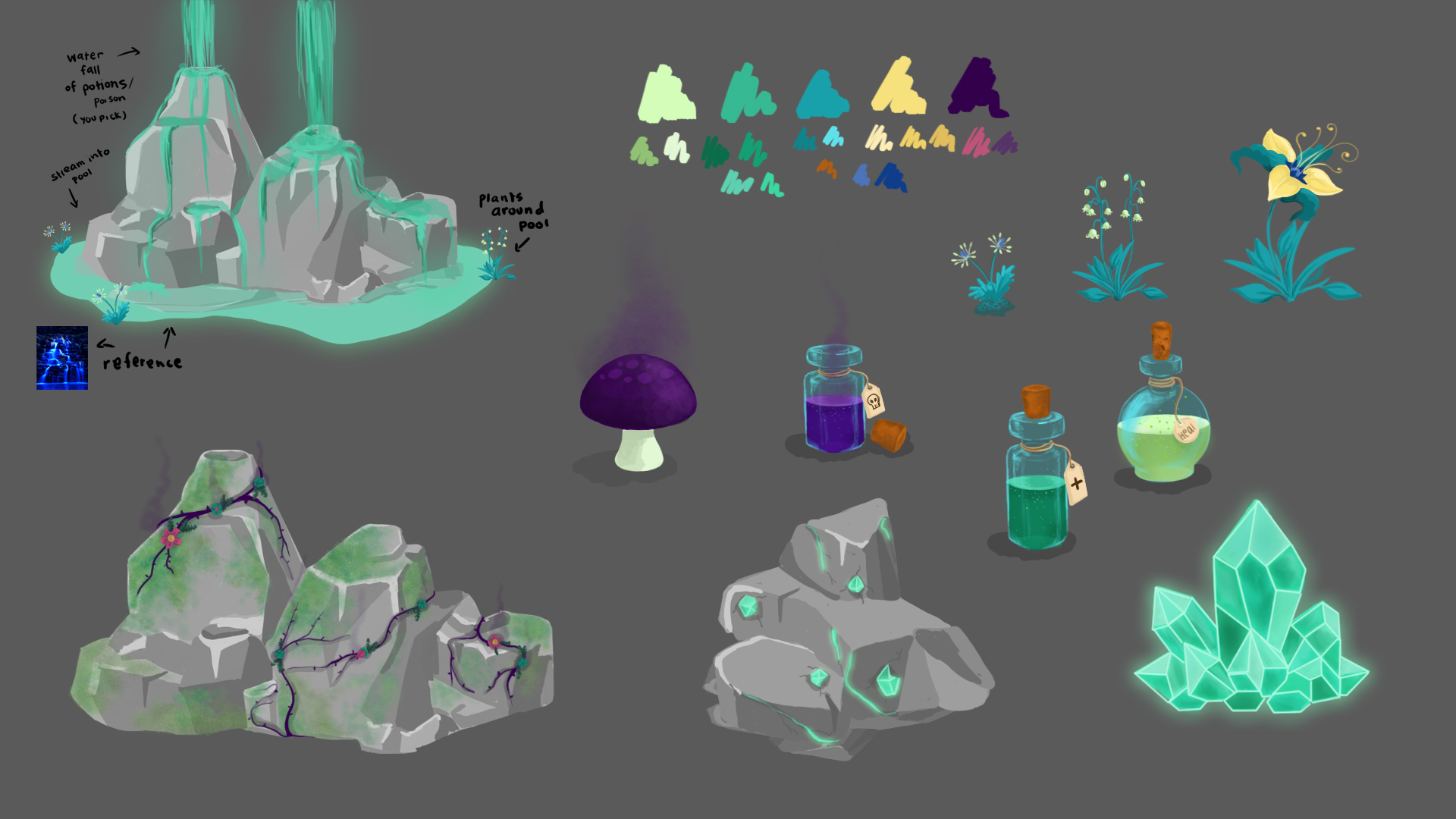
And lastly, we got designs for environmental objects for the heal area. For this area, we have lots of gas and poisons so that is what wound up being the primary inspiration for what's in the level.
Conclusion
The spring break being combined with the Covid situation has lead to us getting off schedule, so we will need to refocus our efforts on what really needs to be done. However, what tasks we did get done all have maintained good quality, so hopefully this will be simply a bump in the road we can recover from. Other then that, feel free to follow our progress on the game's development in this new situation, and we all hope you enjoy the product we release at the end of this.
Get Deadeye Desperado
Deadeye Desperado
A First Person Shooter where you control your cylinder and the bullets in it.
| Status | In development |
| Author | CAGD |
| Genre | Shooter |
| Tags | 3D, Experimental, First-Person, golem, Magic, Singleplayer, Unity, Western |
| Languages | English |
| Accessibility | Color-blind friendly |
More posts
- Deadeye Gold: Production PostmortemMay 07, 2020
- Deadeye Gold: Production Blog 6Apr 23, 2020
- Deadeye Gold: Designer Blog: 6Apr 23, 2020
- Deadeye Gold: Designer Blog: 5Apr 23, 2020
- Deadeye Desperado V1.6.3Apr 22, 2020
- Deadeye Gold: Production Blog 5Apr 09, 2020
- Deadeye Desperado V1.5.3Apr 08, 2020
- Deadeye Gold: Designer Blog: 4Mar 26, 2020
- Deadeye Gold: Designer Blog: 3Mar 26, 2020
Leave a comment
Log in with itch.io to leave a comment.