Designer Blog #3
Hello Everyone!
Welcome back to Perry’s Pies! In this blog, I will be discussing design choices made in Sprint 3 along with work that I have done during this sprint. As stated in previous blogs, my name is Abbey Mendoza and I am the Lead Designer for the horror action game, Perry’s Pies. Brad Farris is my producer. If you would like to have more information on the team and what cool and exciting things they are currently up to and created, head on over and check out his blog titled, “Producer Devlog 3”. As also stated in previous blogs, Perry’s Pie is a horror action game where the player plays as a young teen named Jesse who has to escape the bakery by using various items to outsmart Perry and find the keys he has hidden around the levels to escape.
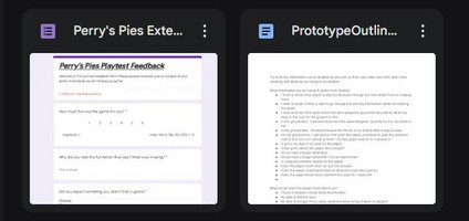
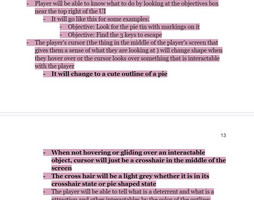
During this sprint, I worked mainly on adding very important/ priority information to the GDD along with making a Google Feedback form that is geared towards the various things we were playtesting in our most recent build at the time. When it comes to the feedback forms, I plan on making a new form each time so that it is specific for that build we are playtesting ( as a designer should, in my opinion). The forms will also be geared towards whether it is an external playtest or an internal playtest, as well. I chose to do it this way because I wanted to make sure that my team would get the most accurate feedback as possible for that specific build in an organized manner so that it helps streamline the process and helps us pinpoint what we need to improve on, change, and fix each time we test a build. I also made a section in the GDD so that way I could put links to each feedback forum done, along with their matching builds. I also added a section in the google drive and GDD where I could record my findings and other design changes I would like when playtesting the builds and other aspects of the game myself. I did this for not only the history documentation of Perry’s Pies, but so that I could also compare them to the feedback of the players and see what the player’s would want versus my own vision that I want and adjust accordingly to both if needed.
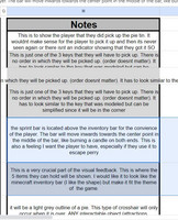
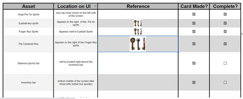
I also focused on making and adding a UI asset list for my 2D artist as well. This list isn’t just on the GDD though. In order to make it more accessible and faster to find for the team members who need it, I also placed it in its own folder in the team’s google drive. I used google spreadsheets and made columns for the UI sprite asset, its location on where it will be placed in the UI, when it will show up on the UI ( some UI sprite assets won’t show up until they are collected or triggered by the player), and its reference on what it should look like or be similar to. I also decided to add a notes column to the list, so that way I could give my team a detailed explanation of how it should look like in writing and also give them an explanation on why I think it should be designed and look this way so that way whoever looked at the asset could get a very clear picture of what I wanted for the design of them. When it came to making the UI list, I had to think of every possible UI piece that the player would see throughout the gameplay so this list didn’t just include sprites that the player would see once they picked up an item in the game or already given things such as the sprint bar/inventory. This list included assets such as the mouse and keyboard control schematic that would pop up right before the player officially started the game, the main menu buttons, and setting buttons, etc.
Since I had to add mouse and keyboard schematics to the asset list, I also decided that I would make a section in the GDD about how I would like to introduce the players to the game’s mechanics and controls. In this section, I explained how I would like the player to press play in the menu options and before they are able to do anything else in the game, a text box would show up with a picture of the mouse and keyboard controls. There would also be an arrow to the far right of the text box that would allow the player to click to a different schematic that would show what the player would be seeing on their screen during the game play. These things included stuff like showing where their inventory bar is, what their sprint bar is, where the key sprites would show up to let them know they have obtained a key and where/how their objective would be shown to them. In the top right corner of the textbox for the mouse/keyboard and gameplay screen, I decided to put an exit button, in case the player was replaying the game and already knew the controls OR they could click out of those helpful text boxes and learn the controls themselves if they chose to. In the section about the game mechanics and introducing the player to them, I added a section about Nemostar the Hint skeleton and the notes that he will have attached to him. This section is super important because these notes that he has will be not only hinting at where the keys could be possibly located in the cluttered level but also would be providing some backstory to the game and would also be reminding the player how to use certain items such as the deterrents and attractions if they chose not to read the control schematics.
I added a detailed section in the GDD about the feedback that the player would be receiving too. This section included the previous things mentioned earlier such as the UI sprites but also included other visual feedback the player would be receiving such as the player camera shaking and rumbling a bit to visually show the player that they are in Perry’s line of sight. Another visual that I added, as well, was having a constant particle system displaying dust floating around in the air. I chose this design of wanting dust in the air in order to help convey the feeling of an abandoned building and a sense of emptiness and stillness in the air. I wanted to make the player feel a little on edge from the start due to the stillness of the atmosphere and wanting the feeling of emptiness despite being in a cluttered abandoned bakery/building. I took inspiration on this from other horror games that do this same type of particle effect because I noticed, as a player, that it helped so much to give the air this “sense” of uneasiness about it.
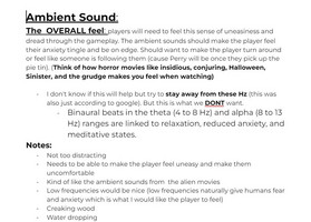
For the feedback the player will be receiving, I didn’t just focus on the visual parts, I also focused on the auditory parts. Audio is one of the biggest and most important aspects of games like mine because sound alone can set a human on edge especially if they are alone in a very creepy and unknown environment. When working on the audio, I started out by listing the obvious and important pieces first. This included sounds such as Perry saying “pies”, Perry’s patrol crawling sound, Perry’s chasing player sound, player footsteps when walking/sprinting, elevator dinging, and attraction and deterrent sounds. Since this was also a feedback section for what the player will be hearing, I also added audio effects for when the player is in Perry’s line of sight. When Perry sees the player, I didn’t want just a camera shaking. I wanted a sound that indicated that Perry saw the player and was chasing them because it would add to the intensity and could possibly provide another “jumpscare” that would get the player’s heart racing and give them that burst of adrenaline that a lot of horror game player types actually enjoy (whether they admit it or not). Continuing with the list, I added a section for the sound when the player is running away from Perry. I want some type of intense drumming sound when Perry is chasing the player because it, again, adds this sense of dread and is something that will amplify the feeling the player gets when they are being chased. In a way, when I thought about the feedback the player would be receiving with sound/audio, I really wanted it to play on the player’s natural instincts, thus is why I designed it to have audio for when Perry sees the player and then for when the player is running away from Perry.
In this upcoming sprint, I will be adding more information to the GDD and will be also making a couple of other asset lists for specific things that are needed such as a fleshed out Audio asset list document with many references, just like I did for the UI Asset list. I will also be continuing to playtest externally/internally myself and be providing those who need new google forms for their specific builds/what they are testing.
Get Perry's Pies
Perry's Pies
Whisk your life on a dare to get Perry's famous pie tin and prove to your friends you aren't a baby!
| Status | In development |
| Author | CAGD |
| Genre | Action, Role Playing |
| Tags | 3D, First-Person, Gore, Horror, No AI, Singleplayer, Thriller |
More posts
- Producer PostmortemDec 12, 2024
- Designer Post MortemDec 12, 2024
- Producer Devlog 5Nov 14, 2024
- Designer Blog #5Nov 14, 2024
- Producer Devlog 4Oct 31, 2024
- Designer Blog #4Oct 31, 2024
- Producer Devlog 3Oct 17, 2024
- Designer Blog 2Oct 03, 2024

Leave a comment
Log in with itch.io to leave a comment.