Design Blog 2 - 9/30/21
Hello everyone, and welcome back for our second design blog!
Being a lead designer has been an interesting task for this production period. While I have been a lead designer for previous projects they were always small team projects where I was pulling full team duty as a designer, producer, level designer, and programmer (with a bit of modeling on the side). But now I am able to focus much more heavily on the design of the game and ensure a quality experience with team members who are in their own specialized field every time. This has lead to me being able to take that bit of knowledge I have in these different fields and guide my team into a unified vision of the game. I am still able to dip my toes into the level design, into the programming, and into solving issues encountering with animation, but I find myself more able to focus on the needs of my team with the direction they require.
The biggest thing I have found is that I am learning so much more about the systems available for the production process than I expected to learn about in such a short time. New techniques in Maya for animations, new path finding systems, new Substance techniques, and a better understanding of the concept art creative process.
Sprint 2 for us was all about setting up the core functionality of our game. As a rogue-lite with clicker elements there were 3 obvious systems that we were going to need:
1) The clicker elements. What good is a clicker if you can't click anything to get a bunch of money? Because of its design direction as a castle diving dungeon crawler we opted into a gold mine as the theme for the clicker elements. The idea is giving the player a sense of them actually entering the mines, working for their money, then turning that money around to hire workers who will do that work for them. Of course, a worker is going to need tools; thus the minecart enters the scene. Purchasing miners and minecarts will give a set amount of income generation to the player while also increasing in price with each purchase. This is so that while the player can buy a theoretically infinite amount of upgrades for their mines, the return for the cost goes down over time each time the player purchases that specific upgrade.

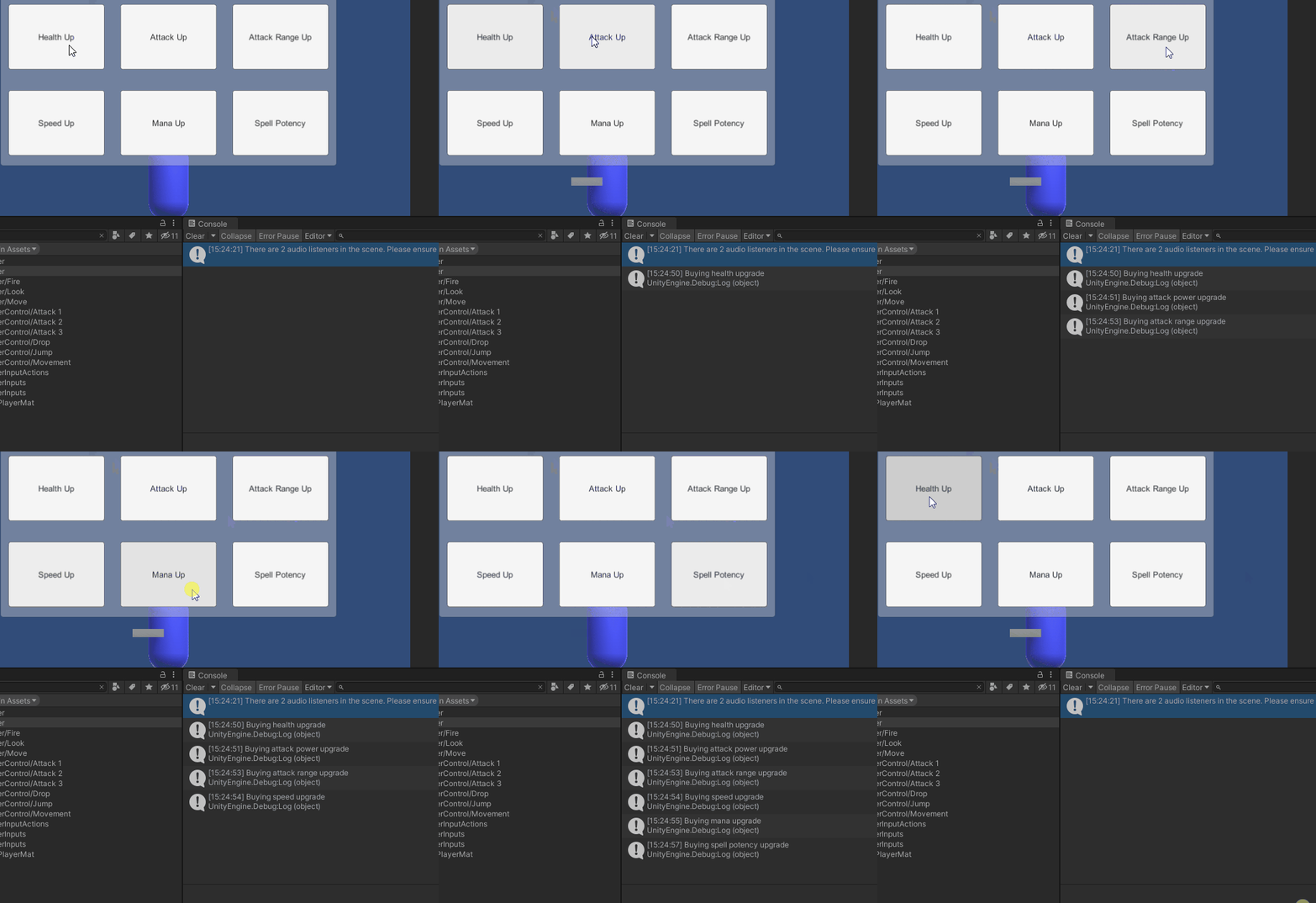
2) The shop elements. The player needs a place to spend all this gold that they are earning from their mines. This is where the shop comes in. The shop will allow the player to upgrade their stats to create a build of their own design from a list of attack damage, attack range, health, movement speed, mana, and spell potency. Whether a player wants to be a slow moving tank or a fast moving spell slinger, that choice should be theirs to make.

3) The dungeon crawler elements. The actual core of the gameplay loop and what a start we have. Starting with the rooms themselves we are having the rooms be a universal size to allow for an easier time slotting them together. This is ensuring that the procedural generation tool that we have created doesn't have to worry about fitting together differently sized rooms and allows for us to have a simpler map system.

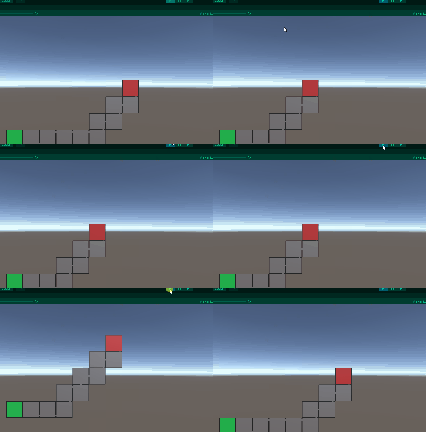
We use a system that detects the viable entrances to each room and ensures a connection from the starting room (seen in black and gray) to the boss room (seen here in red). The above uses rooms that have already been created as a test demo to ensure that the rooms and randomly being picked in their order.

Above you will see an example of our starting room connecting to the boss room even if the boss room is on a different y-axis from the starting room. These rooms are ones that have not been filled out by our team of level designers but as you can see the rooms have a clear path from left to right that will allow the player access.
Now that we have covered the basics of what this game requires to function at a basic level, lets talk playtest. There was a few things that were extremely unexpected that we found during our playtest. First, the initial set up for the campsite proved to confuse our testers. Due to the player starting to the right of the mines a large number of players never even found it before entering the castle. Changing the location of the player spawn to be the furthest left possible with the shop, mines, and castle all being to the right should remedy this problem almost immediately as moving left to right does generally feel more natural to players. It will also ensure that before the play can enter the castle they will see all aspects of the campsite that house the mines, shop, and castle.
Let's move on from the gameplay and talk the game look.
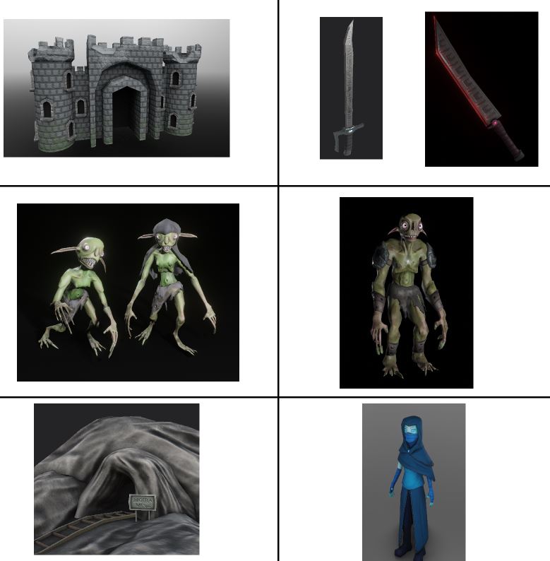
My initial concept for the game's look was a heavily cartoon stylized look. After seeing the work from our team I decided to adjust the style of the game to more naturally flow into their strengths as artists.
The style we have settled on is a bit closer to reality while still maintaining the fantasy elements. The big head, cartoon element did not quite mesh as well as this take on the concept. Thankfully this was a quick decision to make as it meant we did not have a lot to go backwards on and redo.
Thank you for reading this sprint's post. Next sprint I have some exciting elements about the game that I cannot wait to discuss.
Files
Get Citadel
Citadel
What Crawls Beneath?
| Status | In development |
| Author | CAGD |
| Genre | Action |
| Tags | 2D, Clicker, Dungeon Crawler, Hack and Slash, Procedural Generation, rouge-lite, Singleplayer, Unity |
More posts
- Citadel - Production Post MortemDec 19, 2021
- Lead Design Post MortemDec 16, 2021
- Citadel - Production Blog 5Dec 01, 2021
- Design Blog 5 - 11/16/21Nov 17, 2021
- Design Blog 4 - 10/28/21Oct 28, 2021
- Citadel - Production Blog 4Oct 28, 2021
- Citadel - Production Blog 3Oct 14, 2021
- Design Blog 3 - 10/14/21Oct 14, 2021
- Citadel - Production Blog 2Sep 30, 2021

Leave a comment
Log in with itch.io to leave a comment.