Dev Log 3
Hello again everyone, I'm Sam Boydstun, Lead Designer of Builder's Brawl and I'm here to deliver another update on the progress of our game at California State University, Chico. The team has been grinding away on the game and we've made a ton of progression from the last two week's sprint and also we have created our second digital prototype! More levels have been being added and tested, with models and textures coming along nicely. This marks the halfway point of our semester long development, and big changes have begun to be put in place both over the last week and in the coming two weeks!
Dev Log 3:
The Great Flaw and the Greater Solution:
In the last month we released our very first prototype to a ton of positive feedback from our peers. We play tested our first level and the game's basic mechanics and in the process learned a ton. Through the feedback, we refined our game to create our second prototype but with one key addition this time around, a point system.
The great flaw in the game's design was Builder's Brawl at it's heart, is a couch brawler. But in very first iteration there was no incentive to fight much less brawl. Players needed to reach the other side of the gap to win the game, but this only required building bridges, not fighting the other player. A smart player would only fight over the last plank to push his opponent out and walk over to victory. We needed to fix this and give players more incentive to engage.

Points Addition for Placing a Board and Kills
We had several options on how to give players incentive, but many of them changed the base mechanic and feel of the game. Eventually we settled on the idea of a point system that takes into account only a few variables, kills on the other player, boards placed and who gets to the other side first. Builder's Brawl already plays out in a series for a victor to be crowned, so having scores made sense with the general idea and gave players a reason to move in game. By making kills much higher in value than building, we created incentive without alienating the player type who just enjoys the game for the race feel of the building.

The Point Bar
To implement the scoring system we needed a point bar that would show what player was in the lead without cluttering the screen (We have a UI phobia). As a team we really didn't want to see points being tallied on the screen, but we did want a system in which players could understand where they were in the game and how they were competing. What we came up with works rather well in that it shows the player's head and is a calculation of total points, the head to the farthest right has the lead and the largest share of points.
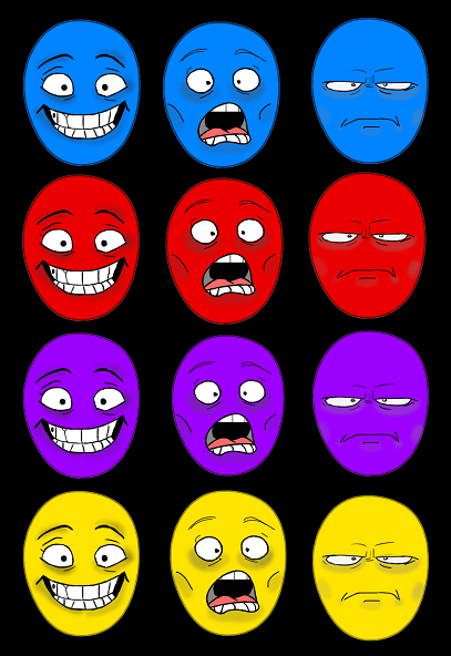
The Faces of Builder's Brawl
With each player's head occupying the point bar at the same time, we chose to color coordinate them and give them three basic expressions, the winning player, the losing player, and the two angry brawlers in the middle. Furthermore, because points are tallied off of only a select few things, at the end of the match we created icons to go along with how many kills and how many boards each player had placed.

Boards Placed Icon / Kills Icon
At the end of every "round," players see an end screen that shows their kills, their boards placed and whether or not they got to the other side of the gap first. The key point here is there is no direct tally of all the points, just an amount of information that will make one feel comfortable of where they are at and a measure of how active they have been in the game. At the end of the entire series (after 3 rounds) there will be a full point total which will then declare the final winner.
The Art Style:
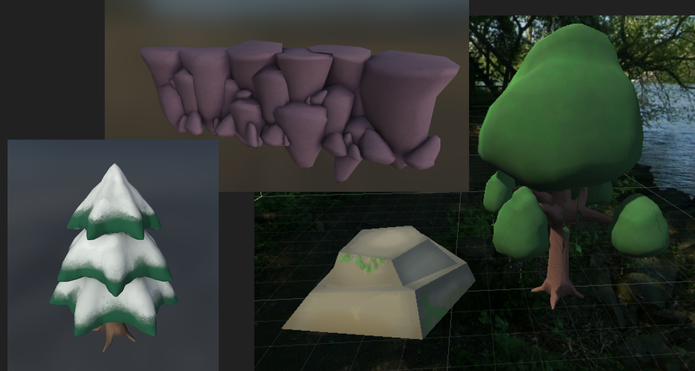
One of the main challenges of this sprint was to take a step back and think about whether or not our art style was going in the direction that we had originally pictured it. Now that models and texturing were coming in, it was the right time to give a 2D artist control of our style and let them set the precedence for the rest of the team. We settled on a matte style that relied more on cell shading than complex texturing. Builder's Brawl is a cartoony game and most of its models are intended to look low poly. Our style moving forward is now directed.
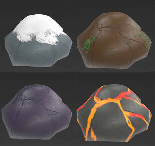
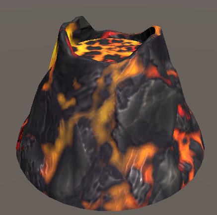
Shared Asset Boulder with Level Specific Textures (Left to Right - Snowy Mountain/River/Railroad/Volcano)
Last development blog we also talked about creating shared assets that would be universal across Builder's Brawl as to cut down on the amount of bottleneck we were experiencing at the modeling level. During this time period we set forth to put textures to each of these assets that were level specific and fit within our art style.
The Railroad Level:
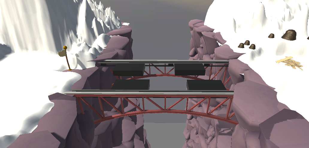
Our third level went into heavy production this time around, and many of its main set piece models were brought in. The railroad level pits players against one another over a bottomless gorge. The concept behind the level is to force the builders into close proximity while also forcing them to build across broken railway sections. Conflict is the name of the game here. Terrain textures are coming in this next week and its awesome to be able to say we have almost our third level into polish mode.
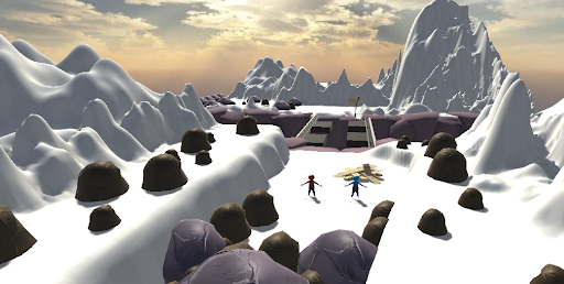
View of the Railroad Level from Player Spawn
The Volcano Level Cont'd:
Last time I posted a development blog we were just beginning testing on the volcano level with the main set piece of the volcano itself just being finished modeling. Its exciting to now be able to show off the level in it's almost completion and with all of its models and textures imported. Our second prototype focused heavily on this level as a bolster to our amount of content that play testers could give feedback on.
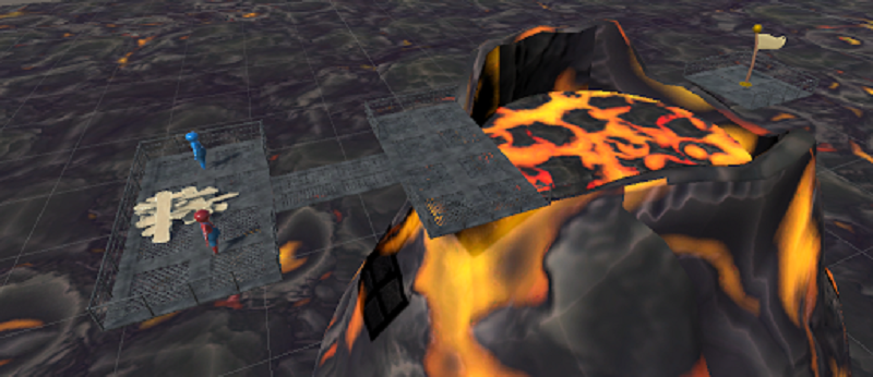
The Volcano Level
Board Slam
One of the main development points for us moving forward as a team was to expand on the combat system. Builder's Brawl is focused around stun and knockback mechanics and in the second prototype we added another ability, board slam. Much of the gameplay happens while players are carrying a board to the gap and we wanted to give them the means to both defend themselves and attack opponents. A board slam fits perfectly in this niche, and will eventually add a ton of character to the game as the players get smashed flat in hilarious fashion.
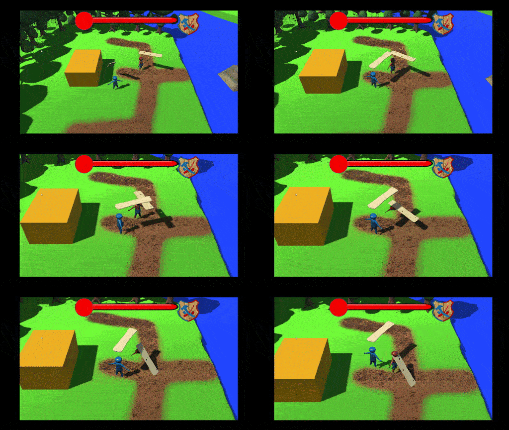
With push and board slam now in the game we have the basis for combat and the main player to player interaction. The last ability that we will make for the game will be a charge and then the entire combat system will be formulated with several weeks to test and refine the feel.
Animation Progress:
The rig for our character model was finished a week or so ago but in the time since has undergone several new revisions. With each new animation we wanted to put in, it broke something on our rig and our rigger has been working tirelessly on updates. This has held back our animation progress with all of the animations that were already finished now having to be redone. However, we have more than enough time to fix this and the main branching points of idle and run are completed.
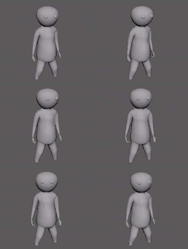
The Idle Animation
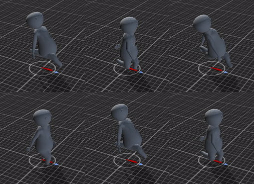
The Run Animation
As always, the Builder's Brawl team wants to extend a hearty thank you for reading our development log. This next period of work has some big changes coming into effect from the refinement of the point system and the full implementation of the series system that will include three rounds to crown a victor. Also Builder's Brawl will finally capture the meaning of BRAWL with the game evolving from two players to FOUR players! We can't wait to get into heavy gameplay testing in the next week with these new game defining changes.
Until then,
-The BB Team
Get Builders Brawl
Builders Brawl
You are clumsy and average, the worst builder you know.. luckily so are they
More posts
- Builder's Brawl PostmortemDec 21, 2019
- Dev Log 10 - w/ BurndownNov 13, 2019
- Dev Log 9Oct 28, 2019
- Dev Log 8Oct 17, 2019
- Dev Log 7Sep 29, 2019
- Builder's Brawl Continues Development!Sep 16, 2019
- Builder's Brawl - PostmotermMay 17, 2019
- Dev Log 6Apr 29, 2019
- Dev Log 5Apr 16, 2019
- Dev Log 4Apr 02, 2019
Leave a comment
Log in with itch.io to leave a comment.